ShuffleKit runs in your phone's browser with the same account, projects and cards as on a computer, laid out for a thumb. You can fill in cards, change designs with your fingers, export print sheets to the share sheet, and playtest at the Playtable. Everything saves as you go, so you can start a game on the train and pick it up later on a laptop. This page walks through each part of the app at phone size and says what still needs a bigger screen.
When you get the phone layout
The phone layout is used whenever the window is narrower than 768 pixels, which is any phone held upright. A tablet, or a phone turned on its side wider than that, gets the computer layout. Nothing is stored differently: a card you edit on your phone is the same card on your computer.
Panels that sit beside the page on a computer open as sheets from the bottom of the screen on a phone. Drag a sheet's handle down, or tap the dimmed page above it, to close it.
The menu and the top bar
The bar at the top of every page has three parts:
- The menu button at the left opens the app menu over the whole screen. A red dot on it means a support reply is waiting for you.
- The page's name, such as Cards, Playtable or Print & Ship.
- The page's own controls at the right. On Cards these are the Data and Design tabs, on Shufflo a clock button that opens Chat history, on the Generator a Session / Library switch, and on the Playtable a menu naming the section you are in (Table, Recordings or Results).
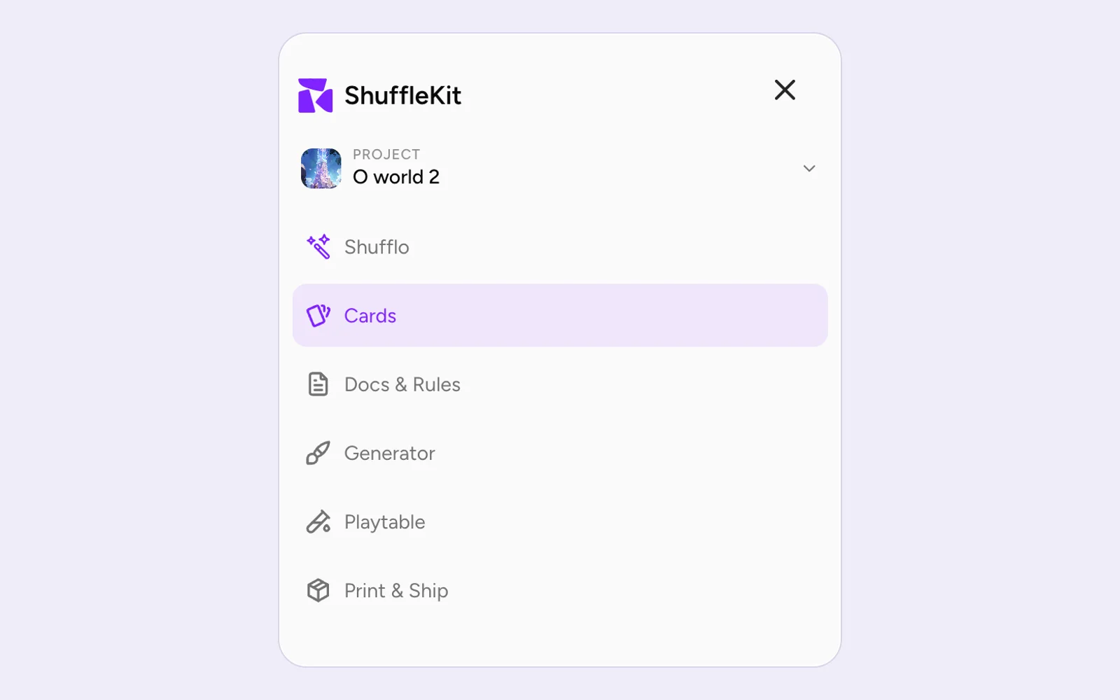
The menu holds, from top to bottom:
- The project picker. Tap it to switch projects, open Project overview or All projects, or start a New project.
- The tools: Shufflo, Cards, Docs & Rules, Generator, Playtable and Print & Ship. With AI features turned off in Settings, Shufflo and Generator are not listed.
- At the bottom: Support (with a count of unread replies), Help & tutorials, Upgrade or the name of your plan, and your account.
On a computer the support box is the round button at the bottom right of the screen. On a phone it is the Support row in this menu, and it opens as a sheet.
The first time: Start here
The first time you open your cards on a phone, a Start here checklist sits above the gallery with a count such as 1 of 3:
- Fill in a card opens the first card's fields so you can type its name and text.
- Change how every card looks opens the design that draws your cards in the phone editor.
- Get more cards from Shufflo opens Shufflo with a request for more cards already written, for you to check and send.
Each step ticks itself off once you have done it, whichever way you did it. The list goes away when all steps are done, or when you tap ×. With AI features off there are two steps instead of three. The list is not shown in a project you can only view, or to anyone who has already finished or skipped the guided tour on a computer.
Your cards: the Data tab
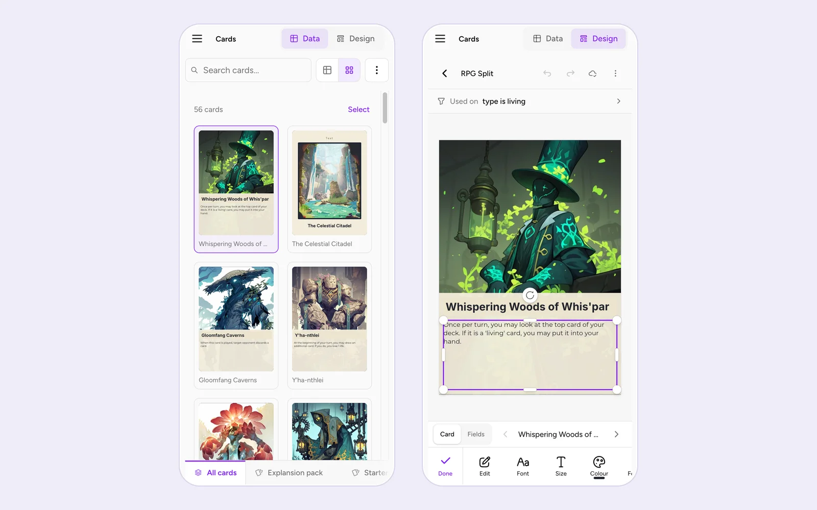
The Cards page opens on the Data tab, in Gallery view. Under the top bar are a search field, a two-button Sheet / Gallery switch and a ⋮ button. Above the gallery a line counts the cards (24 cards) beside Select.
The collection rail with your decks is at the bottom of the screen. It tucks away while you scroll down and comes back when you scroll up; on a phone it is the only way to switch decks.
The gallery
- Tap a card to open the preview sheet on it (see The preview sheet below).
- Press and hold a card for its menu: Select, Edit fields, Edit design (or Open Design tab when no design draws it yet), Duplicate card and Delete card….
- The dashed Add card tile at the end adds a card.
Edit fields opens every field of that card as a form in a sheet. The ‹ and › beside its heading step to the previous or next card, which is the quick way to fill in a whole deck.
Selecting cards
Tap Select above the gallery, or press and hold a card and choose Select. Select turns into Done, every tile shows a checkbox, and each tap ticks a card. A bar floats above the collection rail:
- × stops selecting.
- The count reads Tap cards to select until you tick one, then 3 selected.
- All ticks every card in view; once they are all ticked it reads None.
- Copy duplicates the ticked cards.
- Delete asks first, and inside a deck lets you remove the cards from that deck or delete them from the project.
Everything else you can do to a selection is in the ⋮ sheet. Selection follows your search, so you can search for a word, tap All and act on just those cards.
The ⋮ sheet
The ⋮ button beside search opens the page's actions as a sheet, in this order:
- Undo and Redo for the sheet's edits.
- With cards selected, a section headed with the count, with Clear to drop the selection. It holds Duplicate, Save snapshot of the cards, Set status on them (Draft, Active, Archived), Use this design for them, adding them to a deck or a new one, Export them, and Delete.
- File: Import (from CSV or Excel, from a Google Sheet, or a new project from a PDF or Illustrator file) and Export (Export all while cards are selected).
- View: Sort, Filter status, and in Sheet view Columns, Row height and Totals row. Panel sections turns the preview panel's tabs on or off.
- Danger zone: Clear all project items..., or the clear action for the deck you are in.
Rows with an arrow open a page of their own inside the sheet, with a back button at the top.
Sheet view and the cell bar
Tap the table icon in the Sheet / Gallery switch to see your cards as a spreadsheet. Then:
- Tap a cell to select it. A bar docks at the bottom of the screen with the column's name and the cell's value, an undo arrow, and Edit, which opens every field of that card as a form (View in a project you can only view).
- Tap the selected cell again to type into it. On an image cell the second tap reads Tap again to upload.
- While you type, the bar sits on top of the keyboard: the column's name, × to throw the edit away, ∧ and ∨ to save and move to the previous or next field, and Done to save and close. A phone has no
Esckey, so × is how you cancel. - The square eye button at the bottom right opens and closes the preview sheet.
Pressing Return on the phone keyboard saves a text cell rather than starting a new line. Add line breaks inside a cell on a computer, with Shift+Enter.
The preview sheet
The preview panel that sits beside the sheet on a computer is a sheet from the bottom on a phone. Tap a card in Gallery view, or the eye button in Sheet view, to open it. Its tabs read Card, Shufflo and Notes.
The Card tab shows the selected card drawn with its design, with the filmstrip of the collection under it and Why this layout? for a card that came out with an unexpected design. The buttons beside the card turn it over to its back and switch to the card's fields, where ‹ and › step between cards.
Tap a part of the card, such as its title or picture, to open a sheet about that part:
- The value row, labelled with the column's name (such as Name on this card), changes the value for this card only. On a picture it offers Replace and Adjust, or Add image when the card has none.
- Filled in from column shows which column every card reads that part from. Tap the column to pick another one or make a new one. This changes every card that uses the design, and the sheet says how many.
- Edit in Design opens the phone design editor with that layer already selected.
On a touch screen nothing in this sheet grabs the keyboard when it opens, so a tap to look doesn't cover the card. See Component Preview & Details for what the preview shows.
Designing on your phone
The design list
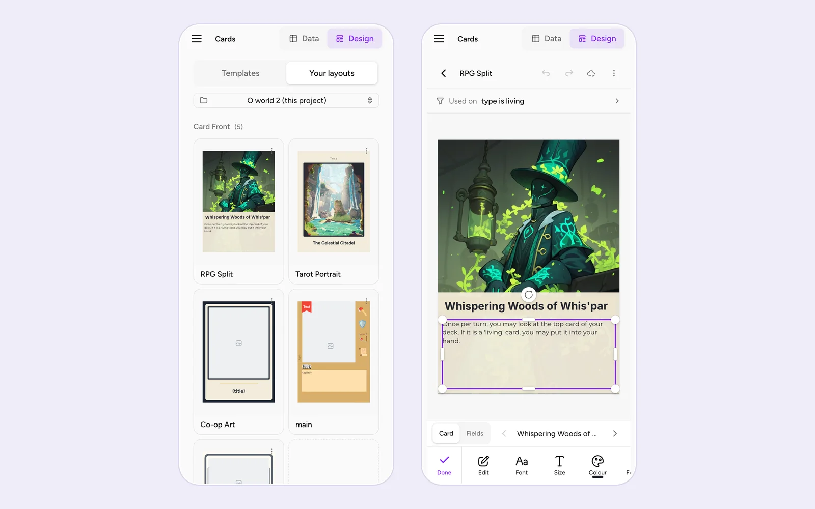
Tap Design in the top bar. The tab opens on a list of the collection's designs, each tile drawn with the first card that design prints, grouped by face (front and back for a card). When the collection has templates, a full-width switch at the top chooses between Templates and Your layouts. Tap a design to open it, or the dashed New front / New back tile to make one.
The editor screen
The phone editor puts the card in the middle of the screen and the tools along the bottom:
- The header: ‹ back to the list, the design's name, undo and redo arrows, the save state (a spinner while saving, an amber dot for unsaved changes, a cloud when saved) and ⋮.
- The Used on row above the card says which cards get this design (see below).
- The card, drawn with a real card's data.
- A Card / Fields switch under the card. Card shows a real card with its name and a count such as 3/12, and ‹ › step through the cards that use this design. Fields shows the column placeholders instead, with the note The columns each layer shows. Designs open on Card; once you pick Fields, the next design you open shows fields too.
- The tool bar along the bottom.
Changes save on their own about half a second after you make them, and again when you leave the editor.
Moving, resizing and rotating
- Tap a layer to select it. Tap a selected text layer again to edit its words.
- Drag a layer to move it. It snaps to the card's edges, its centre and the other layers.
- Drag a handle to resize it, or the round knob beyond it to rotate it. Rotation snaps to every 45°.
- Pinch anywhere to zoom, drag the space around the card to pan, and double-tap that space to fit the card on screen again.
Until you first select a layer, a line under the card reads Tap a layer to edit it · drag to move · pinch to zoom. It comes back for a few seconds if you tap the card where there is nothing to select.
Adding layers
With nothing selected, the bottom bar holds Text, Picture, Elements, Layers and Preview:
- Text adds a text box in the middle of the card and opens it for typing.
- Picture opens your image library.
- Elements opens the Add to this design sheet: A picture from your library at the top, then the same shapes, icons and other elements as the editor on a computer. A new layer arrives selected.
- Layers and Preview are covered below.
Tools for the selected layer
Selecting a layer swaps the bar for that layer's tools, with Done at the left to go back. The bar scrolls sideways when the tools don't fit. A tool opens a short panel between the card and the bar, so you can watch the card change; the tick at the panel's top right closes it. A dot on a tool's icon means its setting is in use, and a colour bar under Colour or Outline shows the current colour.
What a layer offers depends on what it is:
- Text: Edit, Font (with Your fonts and Upload a font), Size, Colour, Format (bold, italic, underline, strikethrough, letter case and alignment), Spacing, Box (background, border, corners, padding) and Effects.
- Picture: Replace (Picture on an empty one), and for a fixed picture that doesn't come from your cards, Crop, BG remover and Eraser. Then Adjust, Fit (Fill, Fit or Stretch), Corners and Flip.
- Shape: Colour, Outline (Line for a line), Style, Corners and Flip.
- Icon: Icon, Colour and Flip.
- Icon box: Icons (Sample icons when the icons come from a column), Colour, Size, Arrange and Flip.
Every layer then has Opacity, Shadow, Data, Cards, Position (line it up with the card's edges or centre, nudge it, or type exact numbers), Order (To front, Forward, Backward, To back and Lock this layer), Duplicate and Delete. A deleted layer can be brought back from the undo button on the message that appears, or with the undo arrow.
Connecting a layer to a column
The Data tool picks the column a layer reads from, so each card fills it in with its own value. On a text layer that is already connected, Edit doesn't show a text box: it says Each card fills this in from Name. with a Change column button that opens Data. Text where some words are styled differently from the rest shows its words with Edit as plain text; that keeps the box's font, size and colour and drops the per-word styling.
You can also connect from the preview sheet on the Data tab: tap the part of the card, then the column under Filled in from column.
Which cards use this design: the Used on row
The Used on row above the card names who gets the design: its rule, Every card, or Cards no other design claims. It turns amber when no card uses the design. Tap it to open Which cards use this design, set the rule under Use it when, add more with Add another rule, and tap Save rule. Layout Conditions covers the sheet step by step. The row hides while a tool panel is open, to leave room for the card.
Showing a layer on some cards only
The Cards tool decides which cards draw the selected layer. Choose Show when or Hide when, then the property, operator and value. With no rule the layer always shows; Clear rule removes one. See Element Visibility.
The layer list
Layers opens the list of every layer, headed with the count, with Add a layer at the top. Each row names the layer and what it shows: Shows Name, From your card data, Some cards only, Hidden or Locked. The eye button shows or hides a layer, and the ⋯ on a row has Lock or Unlock, Bring forward, Send backward, Duplicate and Delete. Tap a row to select that layer on the card.
Checking the result
Card under the canvas is the quickest check. Preview in the bottom bar opens the cards as they print, one at a time: swipe sideways or use ‹ and ›, and tap the card or the Back button to turn it over. Edit data takes you to that card on the Data tab. Share image makes a picture of the card and opens the share sheet; if that takes too long for the browser, a message says Your image is ready with a Share button.
What the phone editor leaves to a computer
⋮ in the editor's header has Full editor on a computer. It opens a sheet that says what a laptop adds:
- Select several layers and change them together
- Group layers into folders
- Style single words inside a text
- Change the card size
- Draw slots for cards on a board
Email me the link sends you a link to this design, which opens it in the editor on a computer, and Copy link copies it. Keep editing here closes the sheet.
In a project you can only view, the editor shows View only — you can look, but not change this design. above the bar, and there is no undo, redo or adding.
Exporting from a phone
There is no Print & export button on a phone. Open ⋮, then Export, and pick a format: All as CSV, All as JSON, Card Images (PNG / JPEG / SVG)..., PDF Print Sheet... or Tabletop Simulator.... To export only some cards, select them first and use the Export row in the selection section.
The export window folds everything under the format and Cards to export into a More options row that reads back the current settings, for example Grid · A4 · Portrait · Corners 0% · Back: Auto · Deck quantities. Tap it to change them. A page too small for the card adds Scaled to N% to that row. The empty-fields and print-check notices stay outside it, where you can see them.
Picture and PDF exports are built first and handed over after, from a fresh tap. When the files are ready, a line such as 12 images ready. Share puts them in Photos or any app. sits above three buttons:
- Done closes the window.
- Save ZIP for several files, or Download for one.
- Share 12 images, Share image, Share SVG or Share PDF opens the phone's share sheet. On an iPhone this is the way to put images in Photos, or to send a PDF to Files or a printer.
More than 10 files, or more than about 50 MB, is too much for the share sheet. Then the line reads Too many to share at once, so Save downloads them as a ZIP. and only the save button is left. A browser that refuses to share gets the same single button. CSV, JSON and Tabletop Simulator exports download straight away.
Print the PDF at Actual size (or 100%) so the cards come out at their real size. See Import & Export and Print and Play at Home.
Print & Ship on a phone
Open Print & Ship from the menu. Its two panels take turns as tabs at the top:
- Your game holds the box list and the game's details.
- Preview shows the deck or component you open.
Tapping a row in the box list switches to its Preview. Sending the order switches back to Your game so you can follow the progress. Everything else works as on a computer; see Print & Ship.
Playtesting on a phone
Setting up
Open Playtable from the menu. The top bar has a menu for the section you are in: Table, Recordings or Results. On the setup screen, On the table and Game options are two panes with a switch between them, and the start buttons stay pinned to the bottom of the screen. See Start a Card Playtest.
At the table
A bar across the top of the table has three buttons:
- Draw with the number of cards left in the deck.
- Hand with the number of cards in your hand. It shows or hides your hand along the bottom of the screen.
- More opens every menu of the computer's toolbar in a sheet: the rules, voice, scenarios, checkpoints and the rest.
Someone only watching the game sees More alone.
Your fingers do the rest:
- Tap a card or piece to select it. Tap the deck to draw.
- Pinch to zoom and drag with two fingers to move around the table.
- Press and hold a card for about half a second to see it large.
- Drag a card up out of your hand to play it, or along the hand to reorder it.
- Drag a table card to the bottom edge to take it into your hand. A band reading Drop to add to hand lights up when you are over it.
- Notes: tap a note to select it, then tap again to write.
The selection bar
Selecting something brings up a bar at the bottom of the table, above your hand. At its left, a chip such as 2 selected × clears the selection. The rest of the bar scrolls sideways, most likely action first:
- For cards: Flip, Tap, Flag, To hand, Rotate and Discard.
- For pieces: the piece's own action first (Roll for dice, Edit note, Rename and Reset for a counter, Draw and Fill for a bag), then Rotate, and Flip for coins.
- Then Duplicate, Tidy (with two or more selected), More (with one card selected), Lock and Remove (Delete for pieces).
A finger has no right-click, so More on a single card is the way to the card's menu: peek, show it to a player, a marker, a note, Edit card and back to the deck. A locked piece can still be tapped, and the bar then offers Unlock.
With voice chat on push to talk, hold the Hold to talk button instead of a key. See Playtable Controls for every action.
Shufflo on a phone
Shufflo is in two places:
- Shufflo in the menu opens the full chat page. The clock button in the top bar opens Chat history.
- On the Cards page it is the Shufflo tab of the preview sheet. Tap a card, or the eye button in Sheet view, then the tab.
The controls that appear on hover on a computer are always shown on a touch screen: Edit and Resend under your own messages, Good response and Bad response under Shufflo's, and Undo on an earlier reply that changed your cards.
If the screen locks or the connection drops while Shufflo is answering, the chat checks with the server when it can and shows the reply that was saved there, so the answer is usually still there when you come back. If nothing was saved it says Connection lost before Shufflo could reply. Nothing was changed. See Shufflo AI.
Other pages
- Docs & Rules: the type and project filters sit in a filter menu at the top. To delete a document, tap the ⋯ on its card and choose Delete document…. Shufflo in a document's title bar opens the assistant as a sheet.
- Generator: the gallery fills the screen, and the round brush button at the bottom right opens the Generator controls in a sheet. Session and Library are in the top bar.
- Settings: the tabs are a row at the top that scrolls sideways.
- Sharing a project: the Share button isn't on the Cards page on a phone. As the owner, open Project overview from the project picker, tap ⋯ and choose Share. See Collaborate on a Project.
What needs a computer
Most of ShuffleKit works on a phone. These parts need a wider screen:
- In the design editor: changing several layers at once, folders of layers, styling single words inside a text, the card size, and slots on a board.
- Line breaks inside a sheet cell.
- The guided tours. A phone gets the Start here checklist instead.
- Keyboard shortcuts.
Common problems
- I don't see the phone layout on my tablet. The phone layout is for windows under 768 pixels wide. A tablet gets the computer layout, with touch-sized buttons.
- Tapping a card in the gallery ticks it instead of opening it. You are in select mode. Tap Done above the gallery, or × in the bar.
- The decks at the bottom disappeared. The collection rail tucks away while you scroll down. Scroll up a little.
- The Used on row is missing in the design editor. It hides while a tool panel is open. Tap the tick on the panel, or Done.
- Share isn't offered after an export. The set is over 10 files or about 50 MB, or the browser doesn't share files. Use Save ZIP, or export fewer cards at a time.
- Shufflo's reply stopped partway. If it says Connection lost mid-reply, so this answer is incomplete., the part shown is all the server saved. Send the request again.