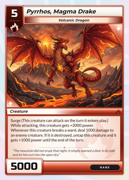
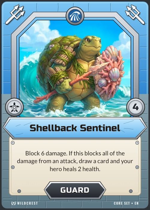
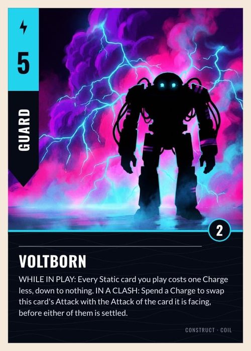
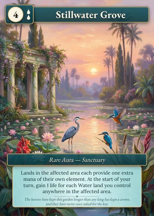
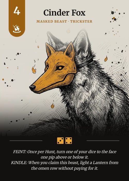
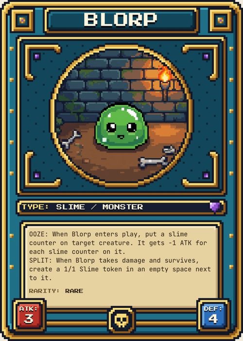
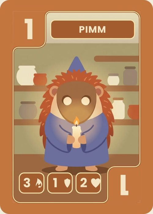
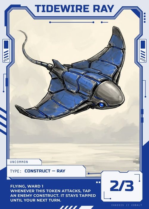
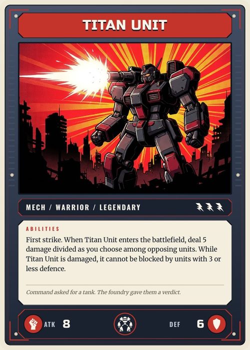
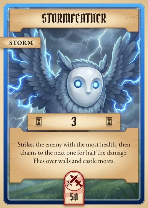
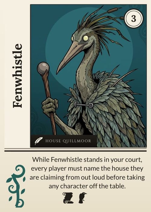
A card's colours can come from its data. Connect a shape's fill, a title's text colour or an icon's tint to a column, and each card paints that part in its own colour: red borders on fire cards, blue on water, green on nature, all drawn by one layout. Use it whenever cards differ only by colour, such as factions, rarities, card types or player colours. Change a colour once on the column and every card follows.
What can take a colour from data
These element fields accept a column:
| Element | Colour fields |
|---|---|
| Text | Text color (the whole text box) |
| Shapes: Rectangle, Ellipse, Triangle, Diamond, Pentagon, Hexagon, Star, Arrow, Chevron | Fill color and Stroke color |
| Line and the dashed, dotted and arrow lines | Fill color and Stroke color |
| Vector paths (a polygon shape after Convert to vector path) | Fill color and Stroke color |
| A single Icon | Tint color |
Each of these takes four kinds of column:
- Color: each card holds its own colour.
- Select: each option has a colour, set once on the column, and every card with that option gets it.
- Icon: the colour of the card's icon.
- Icon list: the colour of the first icon in the card's list.
Images, frames and Icon sets have no colour field. An Icon set's icons take their colours from the card's own cells, or from the set's Icon color setting (see Icons & Symbols on Your Cards). A text box's Background color and the highlighter are set on the layout only. Text content can show a Color column's value, but that prints the colour code as text rather than painting anything.
Three ways to hold the colour
Pick the column type by where the colour should be decided:
- A Select column with option colours when the colour follows a category. You set Ember's colour once, and every Ember card uses it. Recolour Ember on the column and every Ember card changes. This is the right choice for most games.
- A Color column when every card needs its own colour that isn't shared by a category, such as a player colour on each hero. Each card's cell has to be filled.
- An Icon or Icon list column when a card's symbol already carries its colour. A faction emblem in red can paint the hexagon behind it red, so one column sets both the symbol and the colour.
Setting option colours on a Select column
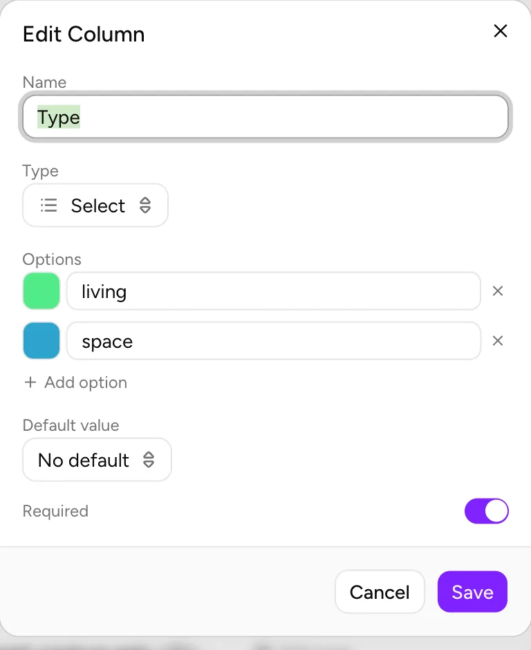
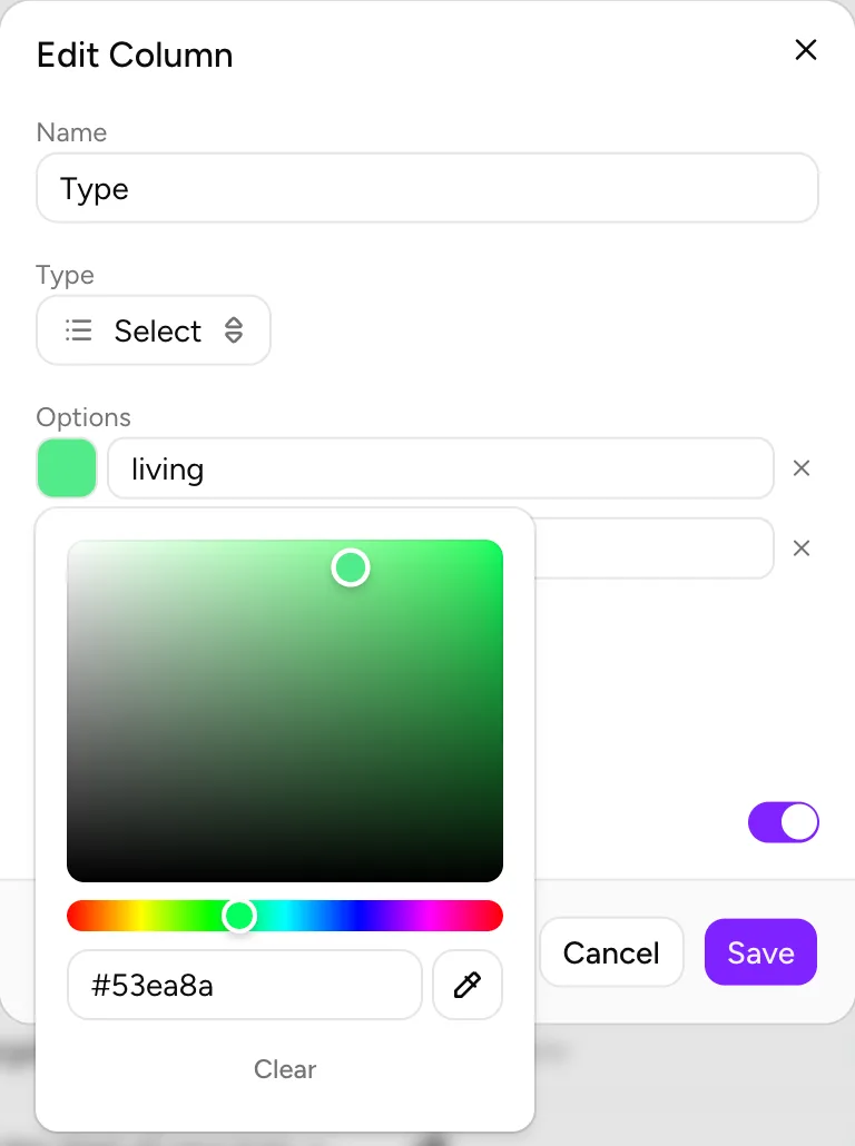
- Open the column's menu (the ⋮ in its header, or right-click the header) and choose Edit Column. For a new column, the same controls are under Options when you add it.
- Each option is a row with a colour swatch at its start (its label reads Color for Ember). Click the swatch and pick a colour in the colour square, type a hex code, choose one of your Recent colours, or use the eyedropper (Pick a color from the screen) to sample a colour from anywhere on screen.
- Clear at the bottom of the picker removes the option's colour.
- Click Save.
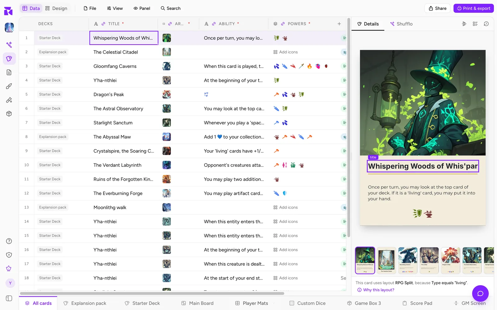
Option colours are solid; transparency is set on the element, with its own opacity. Renaming an option in the same dialog keeps its colour. The colour also tints the option's pill in the sheet, so you can see each card's category at a glance. Options you leave without a colour still work as values; cards with them simply keep the element's own colour.
Filling a Color column
Double-click a Color cell (or select it and press Enter) to open the colour picker. The cell saves when the picker closes, so dragging around the colour square makes one change, not hundreds. A Color column accepts any CSS colour, so a CSV import can fill it with values such as #c0392b or red.
Colours from an icon column
Every icon in an Icon or Icon list cell can carry a colour, set in Edit icon or Edit icons. Connect a colour field to the icon column, and the field paints with that colour:
- An Icon column gives the colour of the card's icon.
- An Icon list column gives the colour of the first icon in the list. Put the icon whose colour you want first.
- An icon with no colour of its own (shown as
autoin the cell's dialog) leaves the element in its own colour.
So a d20 column whose icon is red on fire cards can colour both the d20 and the hexagon behind it. Suggestions in the column list never offer an icon column for a colour field, since an icon column usually belongs on an icon. Find it under All columns yourself.
Connecting a colour field
- Open Design and select the element on the canvas or in Layers.
- Click the pill at the left end of the floating toolbar (Connect data). On a phone, tap Data in the toolbar.
- A colour field nobody has connected is one short line with the field's name and Connect a column. Click it.
- The row opens with what the field does (for example Each card's fill color from a color column, a select column's option colors, or an icon column's icon colors.) and the list of columns that fit. Pick one.
The list's top line says how many cards the change reaches (Changes all 24 cards using this layout). Create "…" at the bottom makes a new Color column and connects it in one step; you can change it to a Select later in Edit Column. Disconnect, at the foot of a connected field's list, puts the element back to its own colour on every card.
To see the result, switch on Preview in the canvas header and step through the cards. With Preview off, the canvas shows the element's own colour.
A shape has two colour fields. Connect Fill color and Stroke color to the same column for a solid faction badge, or to different columns, such as a faction fill and a rarity outline.
Reading the connected field
Once connected, the field shows the column's name, plus lines that explain what it will paint.
The sample line shows one card's value with a swatch of the colour it resolves to. With Preview on it is the card on the canvas (This card:); with Preview off it is the first card on the layout with a value, named after it. Empty on this card or No card has a value for this column yet means there is nothing to paint.
Option colors, under a connected Select column, shows each option with its colour. The first 12 options are listed, then +N more. Hover a chip for the option and its colour. An option with no colour has a hollow, dashed swatch, and a note under the chips says what that means:
- 2 options have no color: those cards keep the element's own.
- No option has a color yet, so this connection paints nothing. Set them on the column.
The empty-cards line counts the cards on this layout with no value in the column: 3 of 24 cards have no value and fall back to this element's own colour.
Wrong type. If the column's type changes after you connect it, for example from Select to Text, the field warns Connected to a Text column: values may not render as expected. with a Disconnect link.
Which colour wins
For text, shapes, lines and paths, a card's colour comes from the connected column, and the element's own colour fills in whenever the card has none to give: an empty cell, an option without a colour, an icon without a colour, or no connection at all.
A single Icon element has a third source, because the icon cell itself can carry a colour. The order is:
- Cell colour: a colour set on this card's icon in the Icon column the element shows.
- Connected colour: the column connected to Tint color.
- Element colour: the tint set on the layout.
A card that sets its own icon colour keeps it, even when Tint color is connected. When that happens on the cards of this layout, the Tint color field warns: Some cards set their own icon color in the cell, which takes priority over this tint. Order: cell color → connected color → element color. Clear the colour in those cards' cells (Reset in Edit icon) if the connected colour should apply.
A tint from the layout or from a connected column recolours a card's icon only when it's a single-colour glyph, such as anything from Game art, or the element's own icon. A full-colour emoji keeps its colours, so it isn't flattened into one solid shape. A colour set in the card's own cell always recolours it.
Worked example: one layout for every faction
Take a game with three factions, each with its own colour, and a front design with a border, a title, a cost badge and a faction emblem. Without colour connections you'd copy the design three times and give each copy a rule. With them, one layout does it:
- Make the column. Add a Select column named
Factionwith the optionsEmber,TideandGrove. In Edit Column, give each option its colour: red, blue, green. Fill in each card's faction in the sheet. - Colour the border. Select the border rectangle, open Connect data, and connect Stroke color to
Faction. - Colour the title. Select the title text and connect Text color to
Faction. Its Text content stays connected to the card's name. - Colour the cost badge. Select the hexagon behind the cost and connect Fill color to
Faction. - Tint the emblem. If the emblem is a Game art icon placed on the layout, connect its Tint color to
Faction. If each faction has its own emblem, make an Icon column instead, connect the Icon element's Icon field to it, and give each card's icon its colour in the cell; that cell colour can then drive the hexagon too (connect Fill color to the Icon column instead ofFaction). - Check it. Switch on Preview and step through a card of each faction. Look at Option colors under any connected field: a hollow swatch means an option you haven't coloured yet.
To change Tide from blue to teal later, edit the option colour once. Every Tide card, on every element connected to Faction, follows. A new faction is a new option with a colour; no new design is needed.
An option has one colour. If each faction needs two colours, such as a dark border and a light panel, add a second column for the second colour: another Select with the same options, or a Color column.
When a condition or a second design is better
A colour connection changes colour and nothing else. Reach for a rule instead when the factions differ in more than colour:
- Different artwork. A textured frame, an illustrated border or a background picture is an image, and images can't be recoloured. Give each faction its own design with a rule such as When Faction equals Ember (see Conditions), or keep one design and show the right picture with Show on some cards only (see Element Visibility).
- Different structure. If one faction's cards have a second stat, a different text box size or elements in other places, that is a separate design with its own rule.
- One extra element. If only one element appears on some cards, such as a crest on Ember cards, keep one design and give that element a visibility rule.
- Full-colour artwork icons. A connected tint won't recolour a multi-colour emoji. Use single-colour icons, set the colour in each card's icon cell, or use a different icon per faction.
Colour connections and rules mix freely: two structurally different designs can each colour their borders from the same Faction column.
On a phone
In the Design editor on a phone, select the element and tap Data in its toolbar to open the same connection panel; colour fields work as on a computer. The element's show and hide rule has a section of its own there instead of sitting under the connection panel. Edit Column, with its option colour swatches, opens as a sheet from the bottom of the screen.
Common problems
- The element stays the same colour on every card. The column's options have no colours yet (the panel says No option has a color yet, so this connection paints nothing.), or Preview is off. Set the colours in Edit Column and switch Preview on.
- Some cards keep the layout colour. Their option has no colour, their cell is empty, or their icon has no colour of its own. The Option colors box and the empty-cards line show which.
- The icon ignores the connected tint on some cards. Those cards set a colour on their own icon cell, which wins. The Tint color field shows a warning when this happens.
- The icon column isn't suggested for a colour field. Suggestions never offer one; open the field's list and pick it under All columns.
- An Icon list colours the shape with the wrong icon's colour. The colour comes from the first icon in the cell. Reorder the icons in Edit icons.