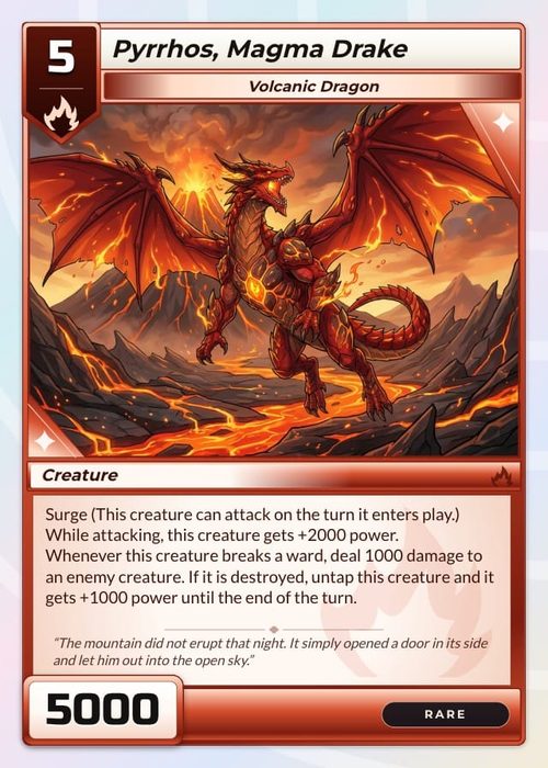
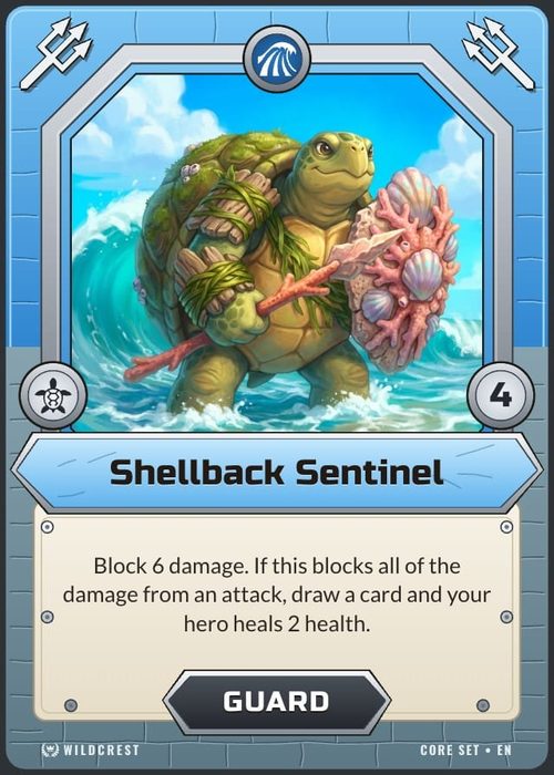
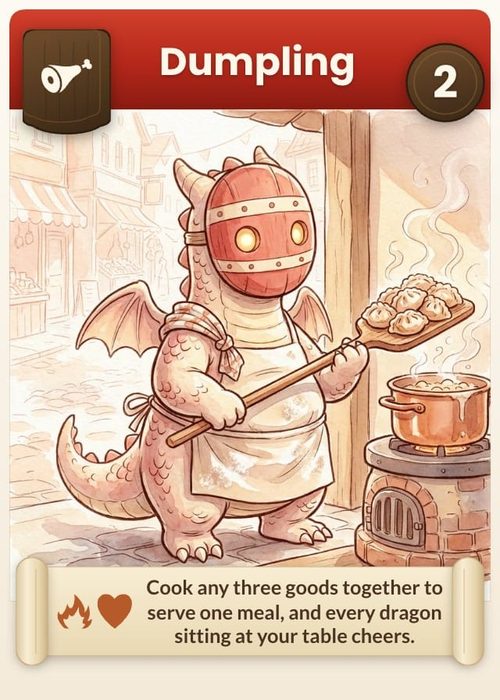
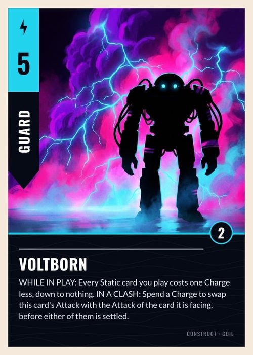
This walk-through takes one small card game from an empty sheet to a printed proof. Each step links to the tutorial that covers it in full, so you can stop at any point and go deeper.
If you came through the first-game guide, your project already has a card design and maybe some cards. Read along anyway: the sheet and the design are linked in a way that is easy to miss, and the rest of the work depends on it.
How the sheet and the design fit together
Open your project's Cards page. It has two tabs at the top, Data and Design.
- In Data, one row is one card and one column is one property of a card, such as its name or its artwork.
- In Design, a design is drawn once. Each text box or picture on it is connected to a column, and every card fills that spot with its own value.
A column that no element is connected to never reaches the printed card, even when every row has a value in it. When a card looks blank, that is the first thing to check.
1. Add the columns
Start with three properties. You can add more later.
- In Data, click the + at the right end of the column headers (its tooltip reads Add property).
- Type
Nameas the Column name, leave the type on Text, and click Add Property. - Add
Artworkwith the type Image. - Add
Typewith the type Select, and give it two options such asCreatureandSpell. A Select column needs at least one option before you can add it.
Make Type a Select, not Text. In step 5 a rule will read it, and fixed options keep a typo from sending a card to the wrong design.
Each column header carries a small link icon. Hover it and it says On the card or Not on the card yet for the design in the preview. Keep an eye on it as you go.
2. Fill in a few cards
Click Add card at the bottom of the sheet to add a row. Type a name, pick a Type, and click an empty Artwork cell (it reads Click to upload) to add a picture. Four or five cards with real values are enough to judge a design.
Click any cell and the panel on the right shows that card on the Card Details tab. Hover the card there and the column each element shows lights up in the sheet.
Full detail: Properties & Columns and Working With Cards.
3. Pick a design
Switch to Design. The rail on the left has five panels: Designs, Templates, Elements, Library and Layers.
If the first-game guide already gave you a design, keep it and go to step 4. To start from a ready-made one instead:
- Open Templates and pick a design from the Starters row.
- The dialog Use "…" template opens. Leave Connect to my properties on, so ShuffleKit wires the template's text and picture spots to your columns. It tells you how many it managed (Connects 2 of 3 properties) and which ones Won't be shown.
- If the front already has a design, the dialog also asks Which cards use it?. For your only design, choose Every card no rule claims.
- Click Add layout.
The Free plan allows 10 designs, and a template pack from the first-game guide may already use several. The dialog tells you when you have used them all.
Full detail: Layouts & the Design Editor.
4. Connect each element to a column
Templates connect what they can. Check the rest by hand:
- Click an element on the canvas, for example the title text.
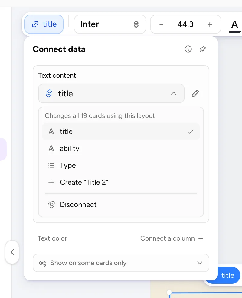
- Click the pill at the left of the toolbar floating over the canvas. A dashed pill reading Connect data means the element isn't connected yet.
- In the Connect data panel, open the field (Text content for text, Image source for a picture) and pick the column. The list says how far the change reaches, such as Changes all 5 cards using this layout, and puts its best guesses under Suggested.
- Repeat for the artwork frame and anything else that should change from card to card.
The Layers panel shows connected layers in blue with a link icon, which is the quickest way to spot one you missed. You can also connect from the Data tab: click the link icon in a column header and pick the element that should show it.
Full detail: Connecting Properties to a Component Layout.
5. Check every card in Preview mode
Elements show placeholder content until you turn on Preview mode at the right of the Design header. With it on, the canvas shows real cards and a bar under it steps through them: ‹ CARD 1 OF 5 › with the card's name. Click the number to jump to a card. Look at the card with the longest name and the one with the busiest text, since those break first. Click Exit when you are done.
Full detail: Component Preview & Details.
6. Give one Type its own design
Now make Spells look different from Creatures. The shortest route keeps every connection you made:
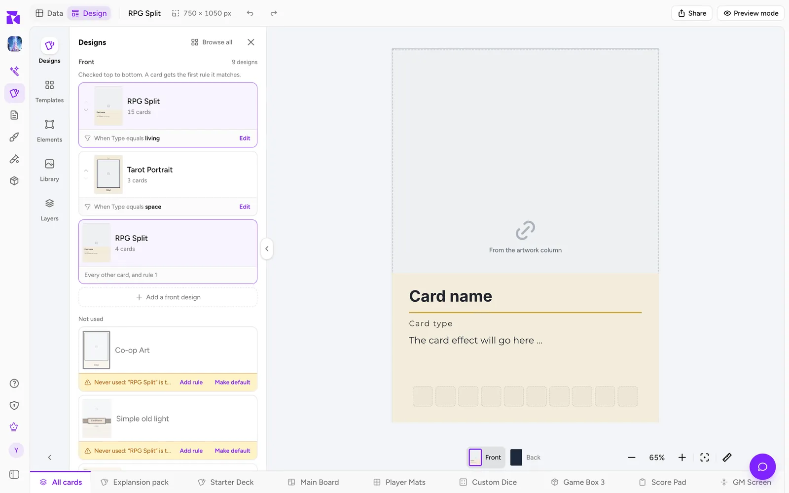
- Open Designs in the left rail. Your design sits under the front as the fallback, reading
Every card. - Hover it, open its ⋯ menu and choose Duplicate. The copy is named after the original with
(copy)on the end. - The copy has no rule yet, so it waits under Not used. Click Add rule in its amber strip.
- The rule reads as a sentence, Use "…" for cards where. Set it to
TypeisSpelland click Apply. The popover counts the cards it catches, such as 2 of 5 cards use this layout. - Open the copy and restyle it: a different frame colour is enough to tell the two apart.
Spell cards now use the copy, and every other card falls through to the original. Back in Data, select a Spell card. Under the preview a line names the design it uses and why, with a Why this layout? link. If a card shows the wrong design, that link lists every design and the reason each one did or didn't match.
You can also add a second design from Add a front design at the bottom of the front's list, using From a template or Blank design. Both ask Which cards use it?, where Only cards where… sets the same rule.
Full detail: Conditions and Layouts & Priority.
7. Make a deck and set quantities
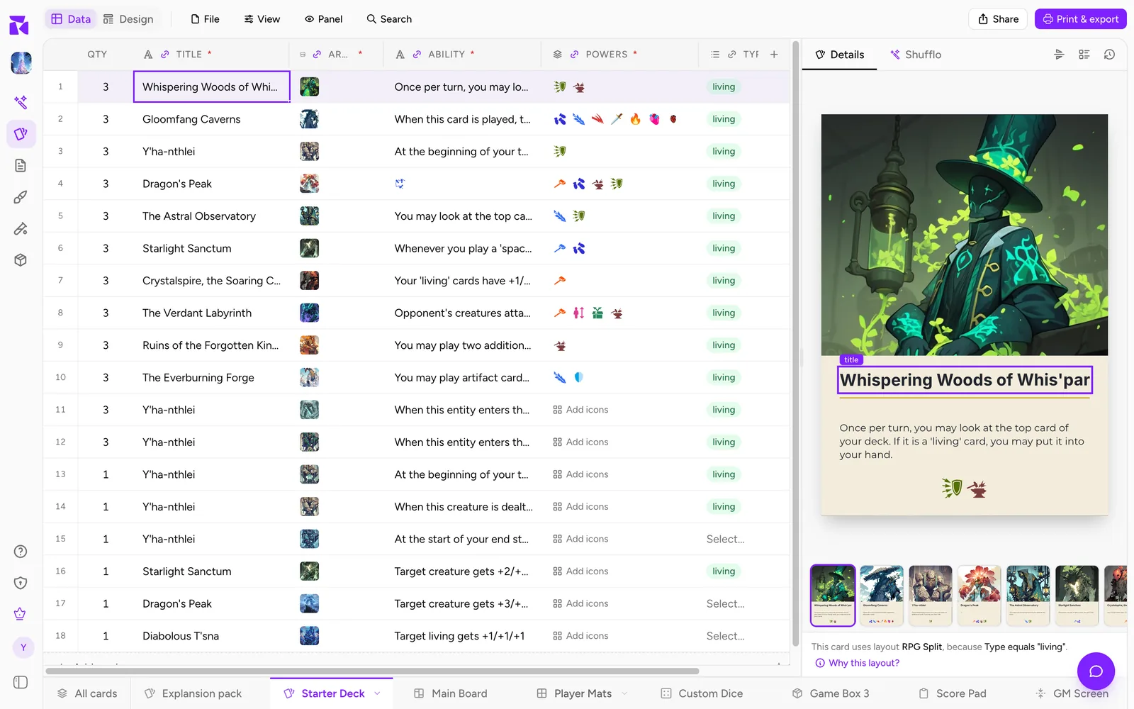
All cards at the left of the collection rail is your card library. A deck is a named set of those cards with a copy count for each one.
- Click the + at the end of the collection rail (its tooltip reads New collection). The dialog opens on What are you making? with Cards chosen.
- Name the deck (ShuffleKit suggests
Starter Deck), tick Add all 5 cards to this deck if you want every card in it, and click Create. - Inside the deck, the sheet has a QTY column. Click a number, type how many copies the deck holds (1 to 99), and press Enter.
Quantities follow the deck to the table and to the printer. To put a card in more decks later, click its DECKS cell in All cards and tick them in Add to decks.
Full detail: Card Collections & Quantities.
8. Playtest it
Open Playtable from the sidebar. The setup screen opens on your project with every deck that has cards in it ready as a draw pile, and each copy you set in QTY goes into the pile.
- Set a Starting hand under Game options, then click Start playtest to play solo. Solo is good for checking turn flow.
- Click Play online to open the table with an invite link. Copy it from the player list at the top left of the table (Copy invite link). Up to six players can sit at the table, and guests can join without making an account.
Online games are recorded, so you can replay them afterwards. Write down what you want to learn before you start, then fix the cards or the design and run the same setup again.
Full detail: Start a Card Playtest and Playtable Controls.
9. Print it
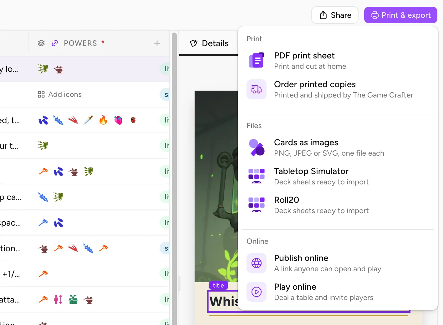
Back on the Cards page, the filled Print & export button at the right of the top bar has two print options:
- PDF print sheet lays your cards out on pages to print and cut at home. Open it from inside the deck and leave Include deck quantities ticked so a card with QTY 3 prints three times. Turn on Include crop marks and bleed if a print shop will trim the sheets. Print one page first, measure a card and check the text size in your hand; Print and Play at Home has the print settings.
- Order printed copies opens Print & Ship, which sends the game to The Game Crafter as a product you can order.
A crown marks an option your plan doesn't include. On Free you can open the export dialog and see your cards, but exporting a PDF needs Hobby, and ordering through Print & Ship needs Indie. The Playtable is open on every plan. See Settings & Plan.
Full detail: Import & Export.
Where each step is covered in full
| Step | Where in the app | Tutorial |
|---|---|---|
| Columns and cards | Data tab | Properties & Columns, Working With Cards |
| A design | Design tab, Templates | Layouts & the Design Editor, Layout Editor: A Full Tour |
| Connecting columns | Connect data panel, column header link icon | Connecting Properties to a Component Layout |
| Checking cards | Preview mode, Card Details panel | Component Preview & Details |
| A design per Type | Designs panel rules | Conditions |
| Decks and copies | Collection rail, QTY | Card Collections & Quantities |
| Playtesting | Playtable | Start a Card Playtest |
| Rules for testers | Docs & Rules | Docs & Rules |
| Printing | Print & export, Print & Ship | Import & Export, Print & Ship |