Tutorials
A step-by-step course through account setup and the game workspace: projects, collaboration, cards, boards, tokens, dice, Design controls and shortcuts, rules, artwork, complete playtesting, print-ready exports, AI-assisted design, and authorised admin operations. Follow it in order, or jump to the part you need.
Workspace Overview
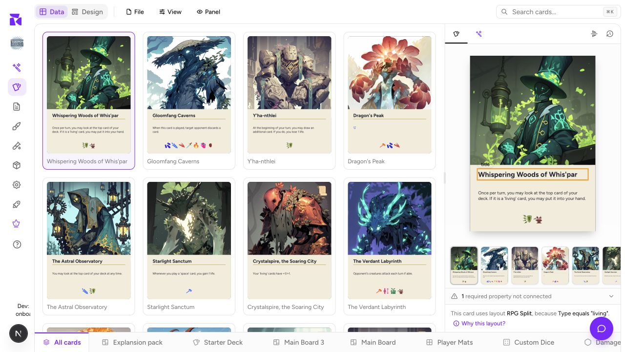
A guided tour of the ShuffleKit workspace: the Data and Design tabs, collection rail, live preview, and the controls shared by cards and game components.
Properties & Columns
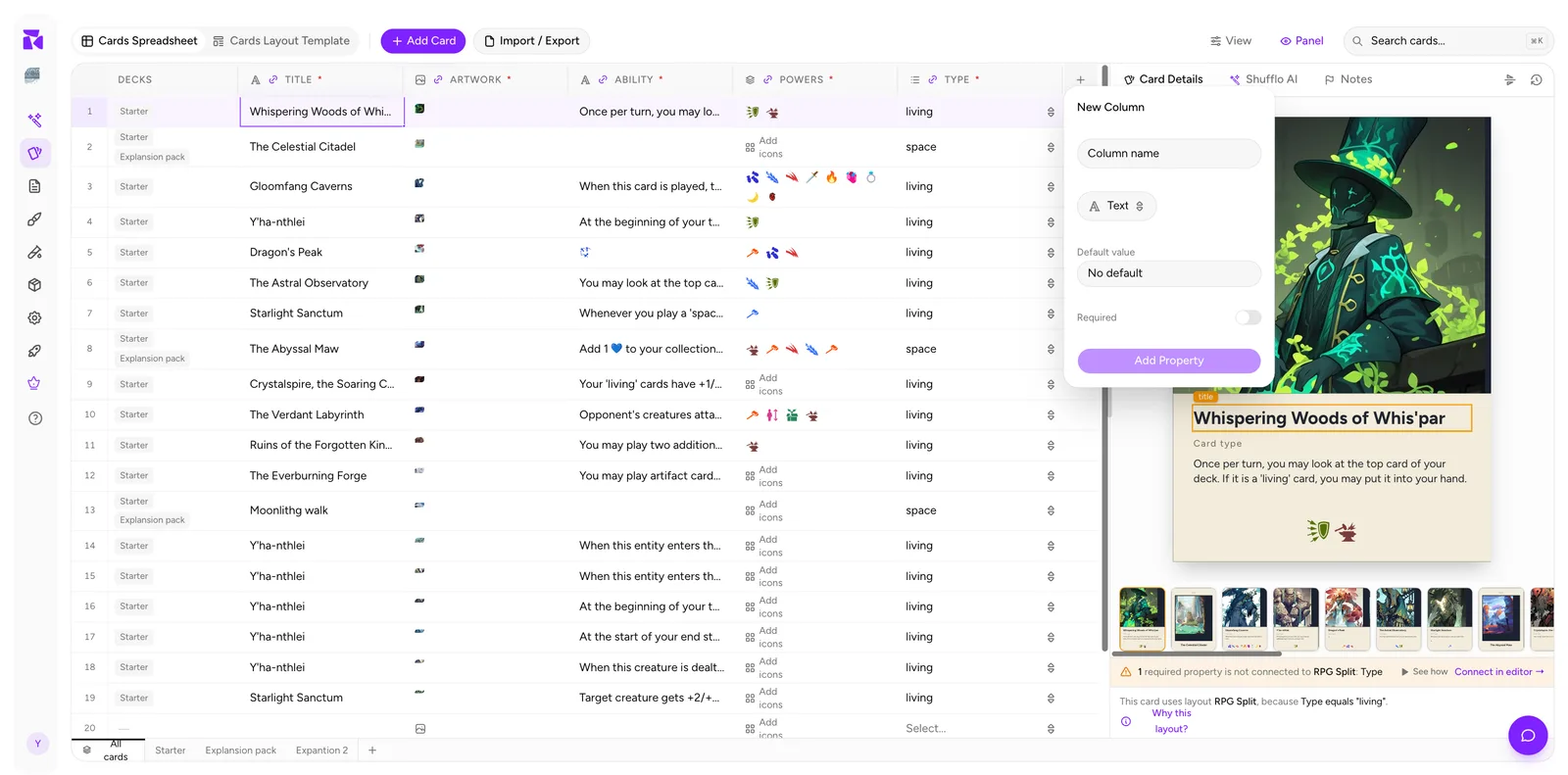
How to create, edit, reorder, freeze, and hide component properties, pick the right property type, and work with image cells in ShuffleKit.
Working With Cards
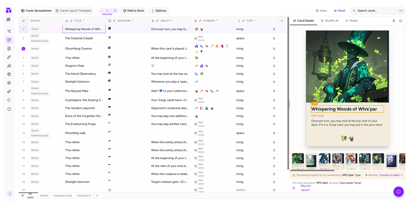
Adding, editing, duplicating, and bulk-editing cards in the ShuffleKit spreadsheet, plus card status and selection patterns that scale.
Components & Collections
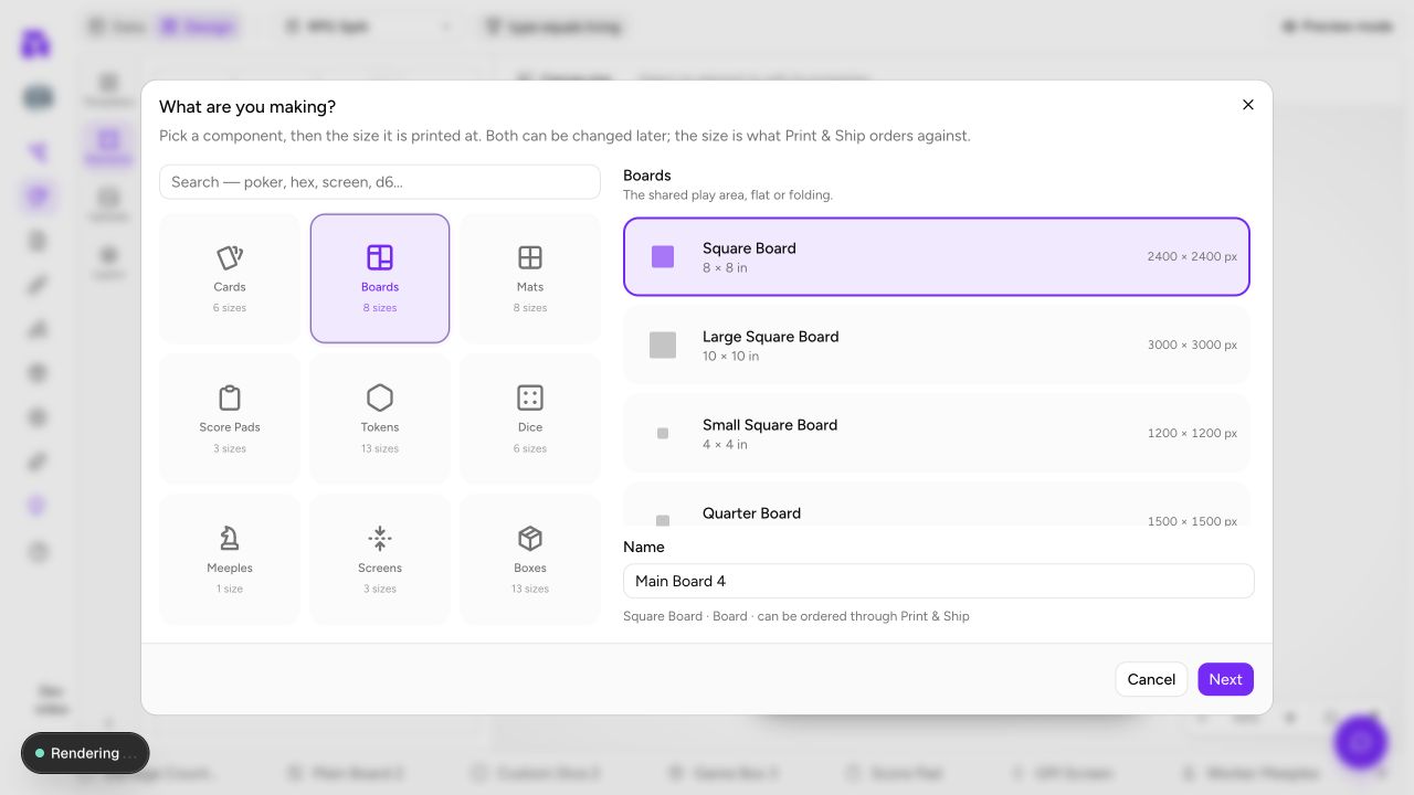
Create the right kind of game piece, choose its physical size, and understand how collections keep cards, boards, tokens, dice, and packaging separate.
Card Collections & Quantities
Organize cards into collections with per-collection quantities, status, and a workflow for core sets, expansions, and playtest builds.
Layouts & the Design Editor
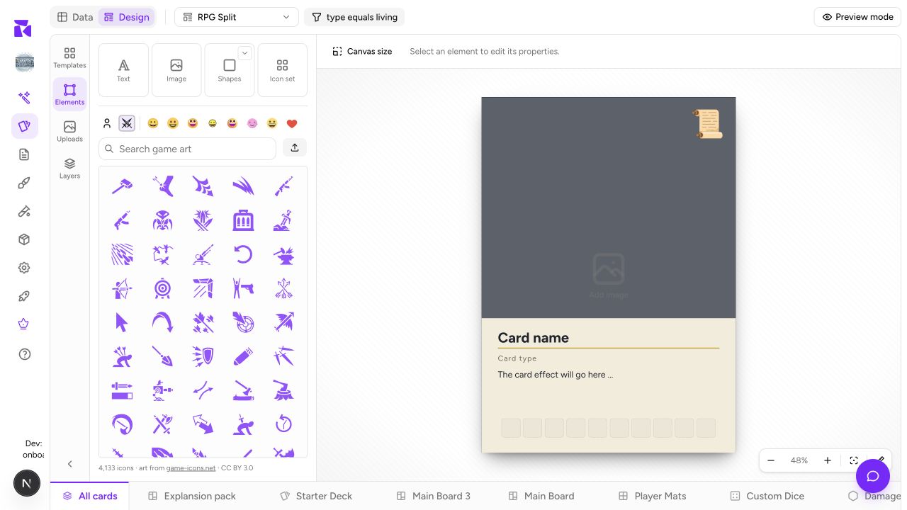
Tour ShuffleKit's type-aware Design editor: layouts, elements, layers, data binding, component faces, and Preview mode.
Conditions
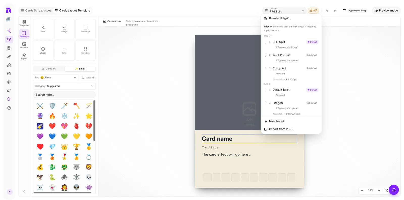
Make every item in a component collection pick its own design automatically with priority-ordered layout conditions, and show or hide single elements per item.
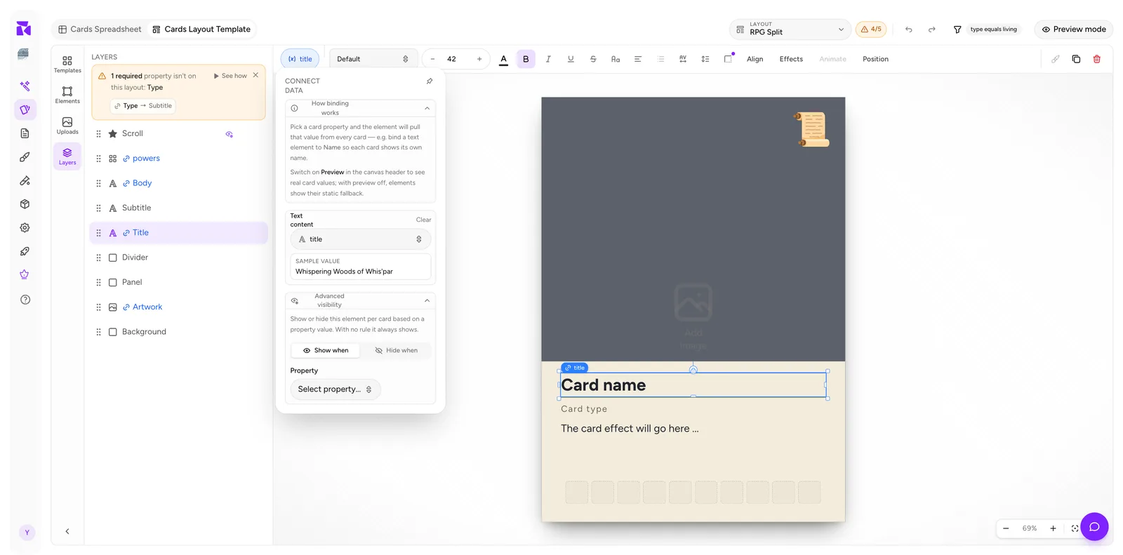
Connecting Properties to a Component Layout
Bind layout elements to component properties so every item renders its own data, read the connection counter, and fix 'not connected' warnings.
Component Preview & Details
Read the live component preview: the gallery or filmstrip, face switcher, layout resolution line, and the 'Why this layout?' debugger.
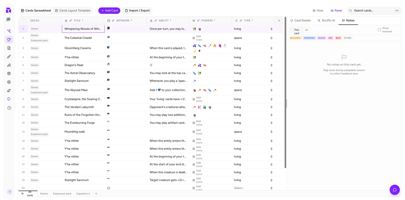
Notes & Version History
Capture playtest feedback as categorized card notes and protect your work with version snapshots before risky changes.
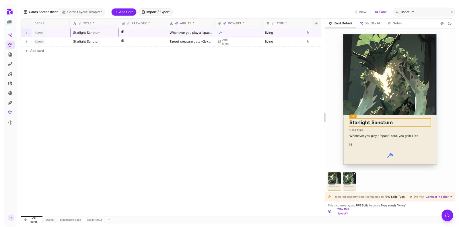
Search, Sort, Filter & View
Find any card fast with search, then shape the grid with sort, status filters, column visibility, and row height.
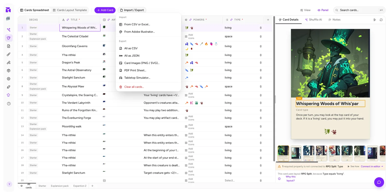
Import & Export
Import component data from CSV, Excel, a Google Sheet, a PDF or Illustrator, update cards by importing again, then export images, PDFs, and supported virtual-tabletop packs from the active collection.
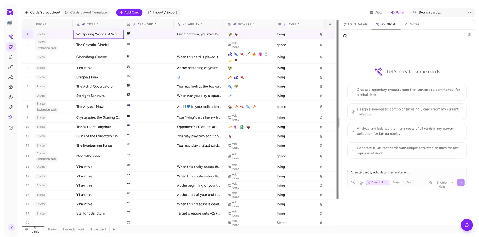
Shufflo AI
Generate, analyze, and balance cards with Shufflo AI: scope controls, prompt patterns, and habits for reviewing AI-generated cards.
Layout Editor: A Full Tour
Tour ShuffleKit's type-aware Design editor: templates, elements, uploads, layers, canvas size, binding, and Preview mode.
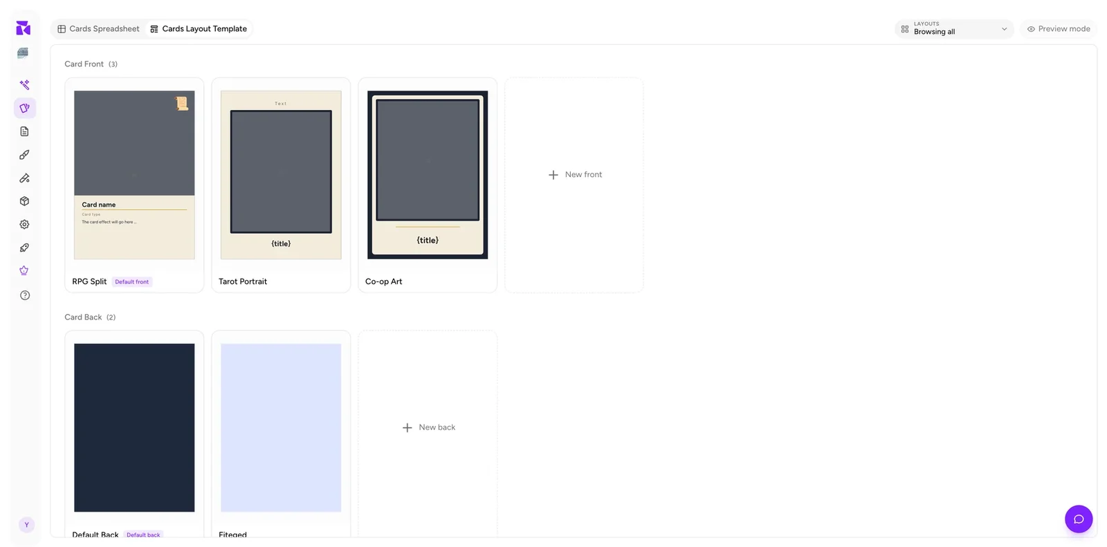
Layouts & Priority
How ShuffleKit organises component-face layouts into priority lists, how an item resolves to one, and how to reorder, create and default them.
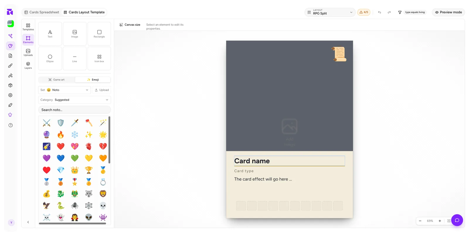
Conditions: The Deep Dive
Learn layout condition operators, priority rules, collection membership, AND clauses, and the Why this layout? debugger.
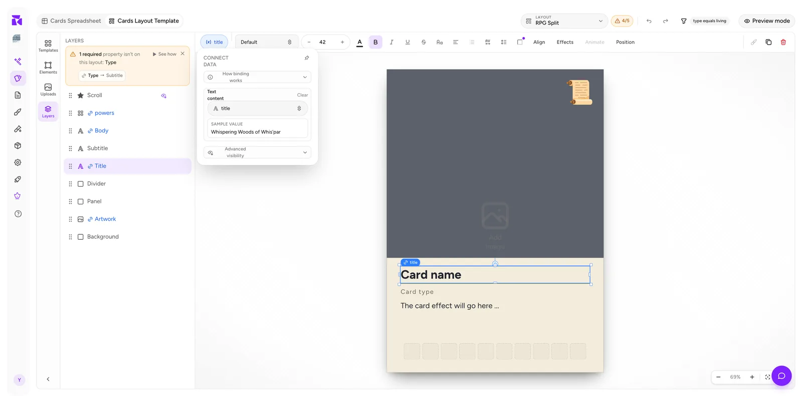
Data Binding
Bind layout elements to component properties so every item renders its own values, and read the connection counter that tells you what is still unwired.
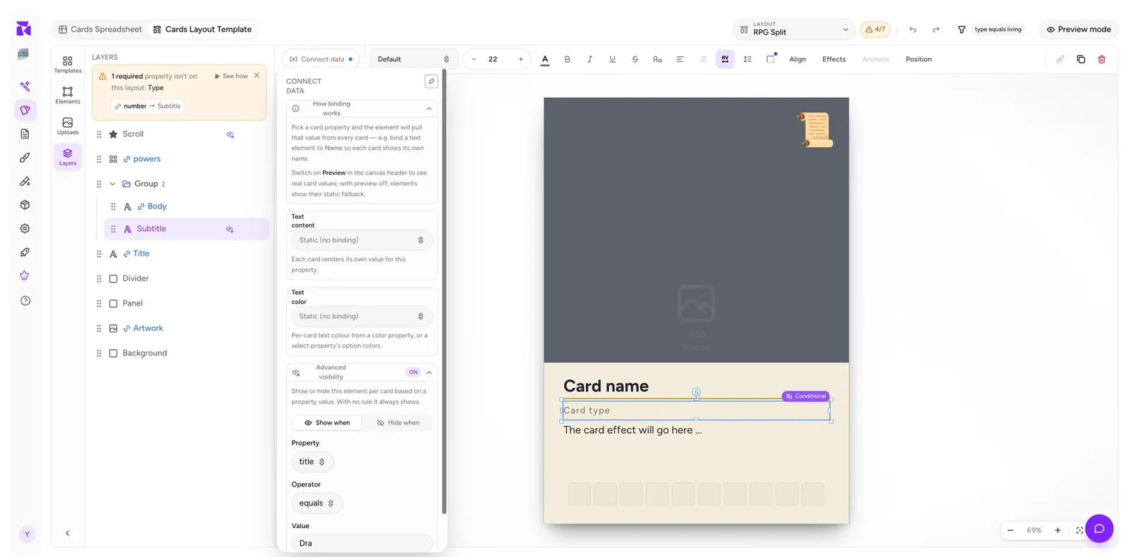
Element Visibility
Show or hide a single element per item with visibility rules, stack them on groups for two-condition logic, and keep your layout count low.
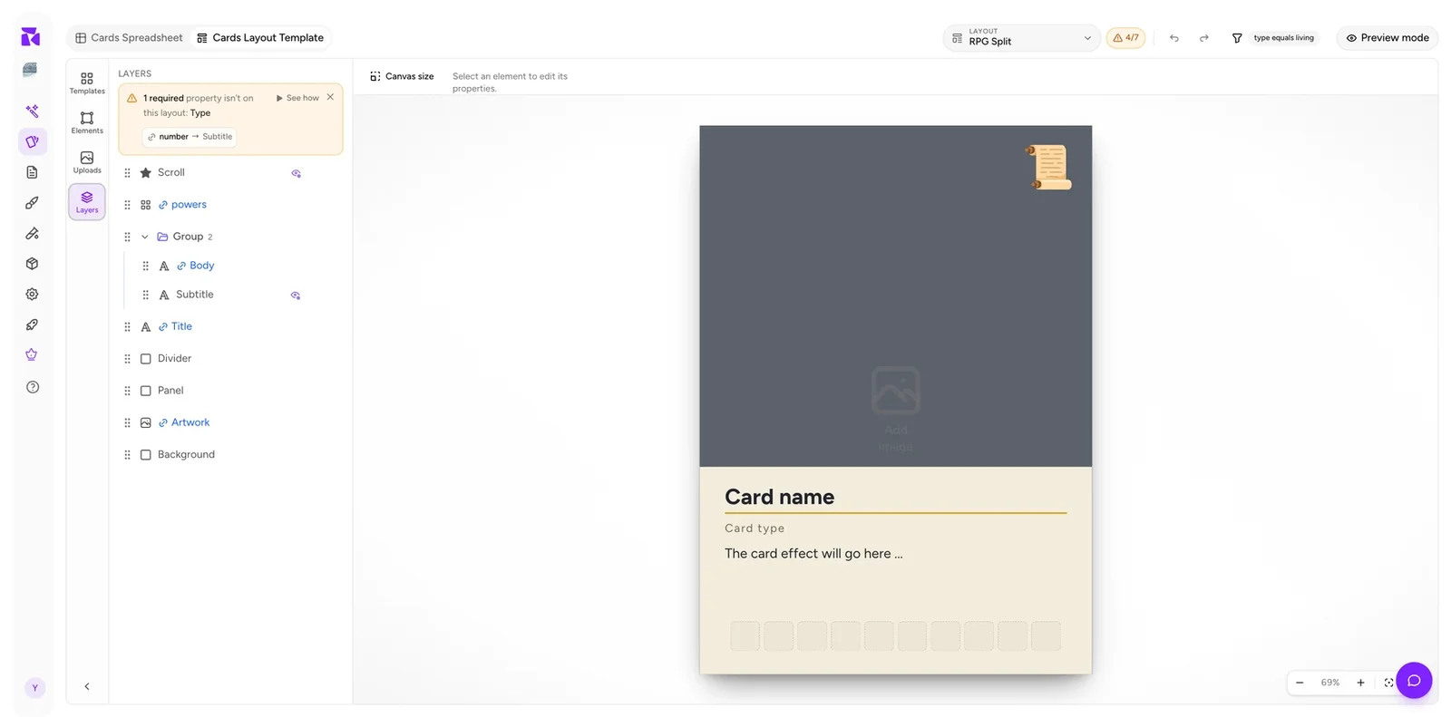
Layers & Groups
Read a component layout's structure in the Layers panel, use groups to move and hide elements together, and diagnose most layout problems from the layer list.
Elements & Styling
The element types you can place on a component layout, what each one binds to, and the controls for type, icons, alignment, effects and canvas size.
Playtesting Boards, Tokens & Dice
Put boards, mats, tokens, meeples, and custom dice on the Playtable alongside a card deck, then use their type-aware table behavior.
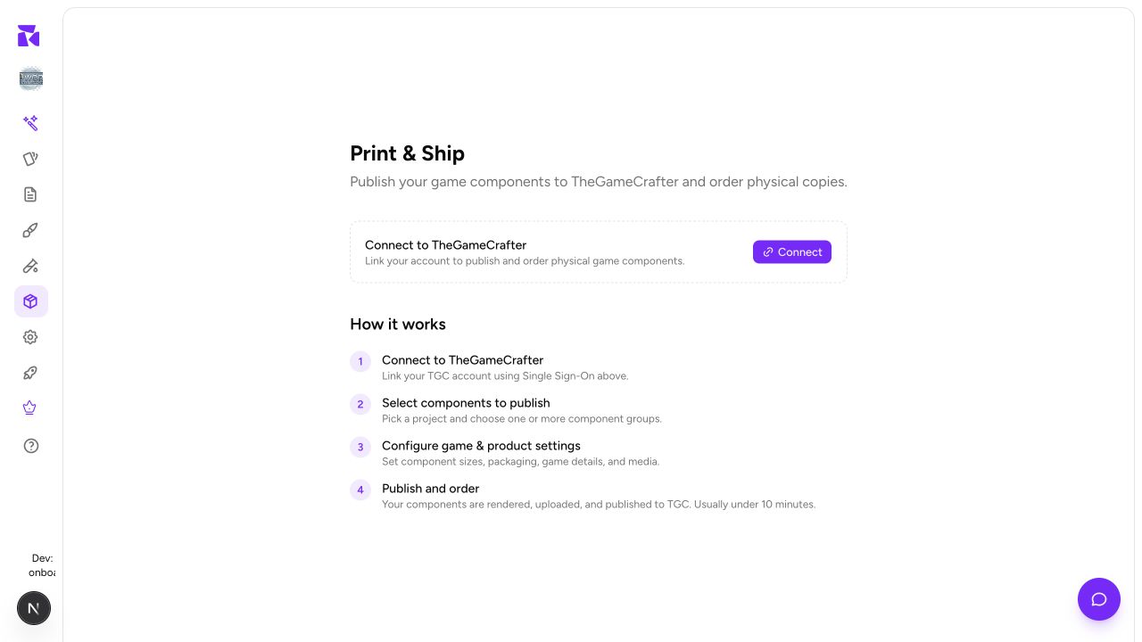
Print & Ship
Publish a finished game to TheGameCrafter: select component collections, check their print safety, complete the listing, and order a proof.
Projects & Workspaces
Create a ShuffleKit game project, switch workspaces, keep its details current, and use its overview as the home for cards, components, and rules.
Brainstorm a Game with Shufflo
Use the Shufflo Ideator to explore mechanics, themes, resources, factions, formats, and playtest questions while keeping the discussion scoped to a game project.
Write Rules & Game Docs
Create, import, organize, revise, and use AI assistance for rules, lore, card types, sets, keywords, balance notes, and art guides.
Generate & Edit Game Artwork
Create artwork from a prompt, tune the image settings, edit with up to five references, and move approved results into your game design workflow.
Start a Card Playtest
Choose a project and card collections, configure the opening game state, invite a player, and use the Playtable’s deck, hand, discard, and table controls.
Manage Your Profile, Plan & Security
Update your profile and theme, review plan usage, manage a subscription, protect your account, and understand the irreversible account-deletion step.
Upcoming Features & Feedback
Understand the current status of Crowdfund and the Artists marketplace, and register interest without mistaking an upcoming page for a live publishing workflow.
Create an Account & First Game
Sign up or sign in, confirm an account, recover a password, and complete the guided first-game setup with a CSV, AI, or empty starting path.
Admin: Templates & Icons
For authorised admins: maintain the shared layout-template catalog and SVG icon library without exposing unfinished or incompatible assets to designers.
Admin: Operations, Replays & Support
For authorised admins: use the overview, funnel, session replays, onboarding and AI-usage reports, demo controls, feature interest, and support inbox responsibly.
Design Editor Shortcuts
A complete keyboard reference for saving, navigating, selecting, arranging, grouping, drawing, transforming, and previewing component layouts faster.
Advanced Editor Controls
Master multi-selection, snapping, alignment, layers, groups, canvas settings, text, image, shape, icon, binding, appearance, and precision controls in Design.
Playtable Controls: Full Reference
Use every Playtable in-session control: navigation, selection, cards, decks, piles, counters, dice, coins, custom components, notes, reset, and multiplayer limits.
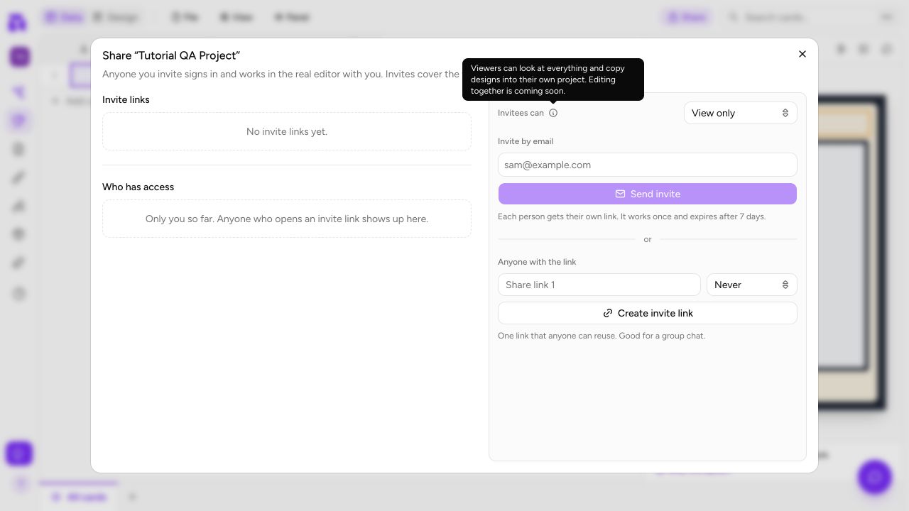
Collaborate on a Project
Invite a collaborator by email or link, understand the current view-only access, manage members, and distribute a safe project review link.
Ready to build your card game?