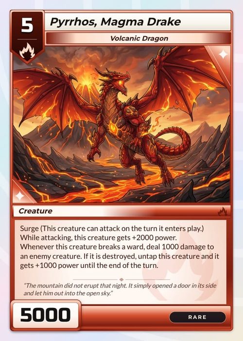
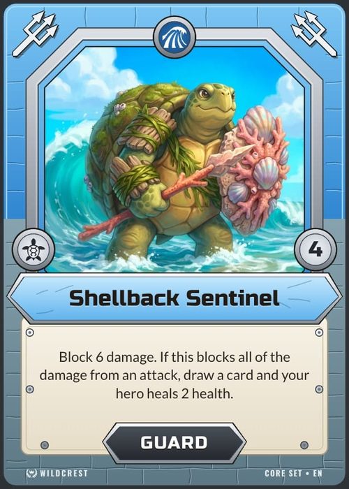
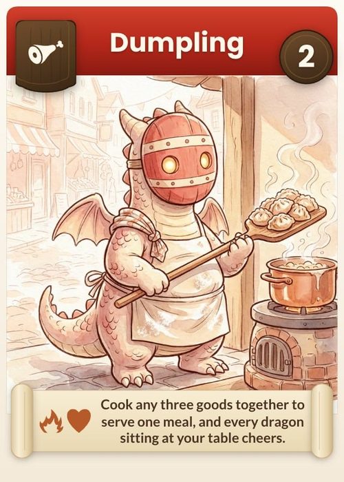
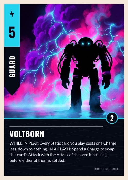
The Layers panel is the structural view of a component layout. It's also the best diagnostic tool in the editor. Most "why does this item look wrong?" questions are answered by reading it rather than by clicking around the canvas.
Reading a layer row
Each row carries, left to right:
| Part | Meaning |
|---|---|
| Grip handle | Drag to restack |
| Type icon | Text A, image, icon grid, shape, star, folder for a group |
| Name | Blue with a chain icon when the element is bound to a property; plain when not |
| Eye-with-cog badge | The element has a visibility rule. Hover for a plain-English summary |
| Eye button | Manual show/hide, design-time only. Appears on hover unless already hidden |
Two of those are diagnostics you should train yourself to scan:
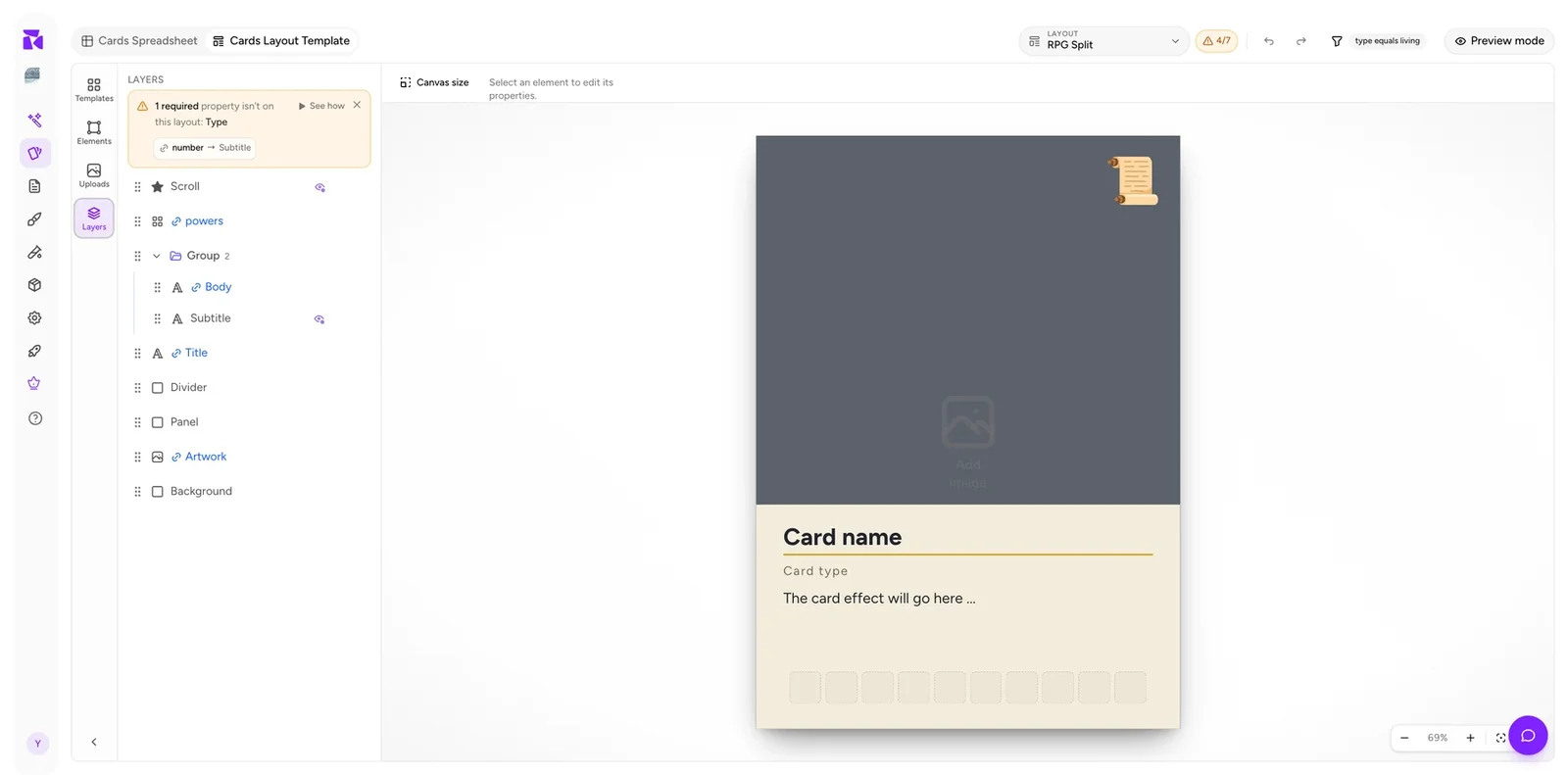
Blue vs plain names tell you what's bound. In the example layout, powers, Body, Title and Artwork are blue; Subtitle, Divider, Panel and Background are plain. Decoration is meant to be plain. A text element that's plain is usually a missing binding. See Data Binding.
The eye-cog badge marks conditional elements. Hovering gives you the rule without opening anything: "Shown when powers is empty", "Shown when title equals Dragon's Peak". On a layout you didn't build, hovering every badge is the fastest way to understand it. See Element Visibility.
Above the list sits the layout's coverage banner: "1 required property isn't on this layout: Type". It includes See how to replay the binding walkthrough and a dismiss button. When ShuffleKit can guess where an unused property belongs, it offers a one-click chip like number → Subtitle that binds it for you.
Stacking order
The list is top-to-front: the first row is drawn last and sits on top; the last row is the backmost.
A typical card reads bottom-up as: Background → Artwork → Panel → Divider → Title → Subtitle → Body → powers → Scroll.
That order explains something that confuses people about full-bleed art: the Artwork element is usually the full card size, with the text panel drawn on top of its lower half. The art isn't cropped to the top half. It is covered.
Drag a row's grip handle to restack. Since text sits above panels which sit above artwork, an element that "disappeared" has usually been dragged below an opaque neighbour rather than deleted.
Manual hide
The eye button on each row is design-time only. It hides the element while you work, on every card, and has nothing to do with conditional visibility.
Use it to get a large background or panel out of the way while you position something behind it. Don't use it to suppress an element you don't want printed. Delete it, or give it a visibility rule.
Groups
A group bundles several elements so they move, stack and hide together. In the Layers panel a group appears as a folder row with a member count and a collapse chevron; members are indented beneath it.
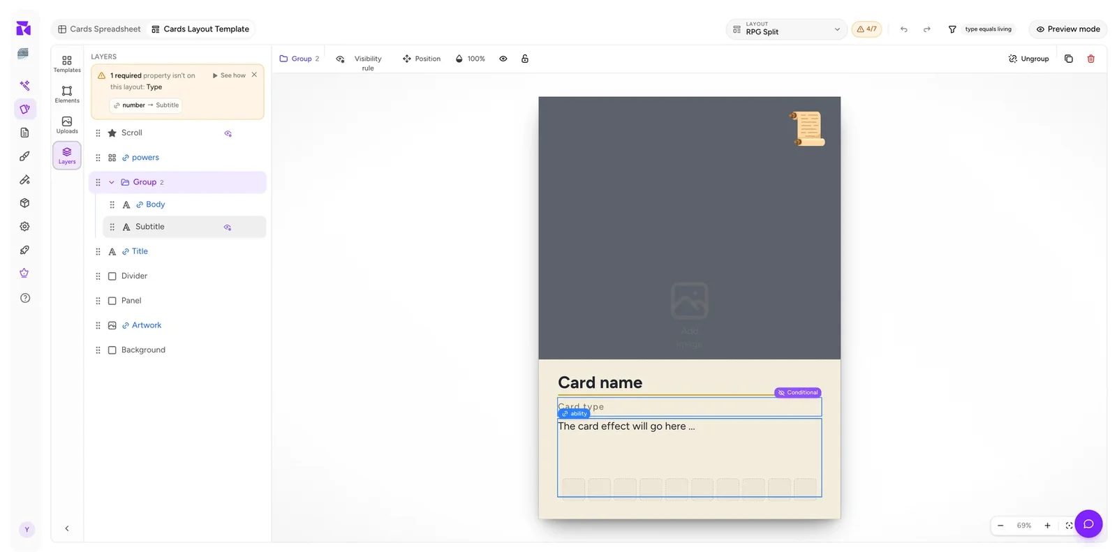
Select a group and the context bar changes to group controls:
- Visibility rule: one rule for every member at once.
- Position: X / Y / width / height of the folder's union box. Groups store no geometry of their own, so this is the only place to read or set it numerically.
- Opacity: a single percentage that fades every layer in the group together.
- Eye: hide the group at design time.
- Lock: prevent accidental selection and dragging on the canvas.
- Ungroup (
⌘⇧G): dissolve it, keeping the elements. - Duplicate (
⌘D) / Delete.
Double-clicking on the canvas descends one group level per click, so you can reach a member without ungrouping.
Creating a group
- Select two or more elements with Shift-click, a canvas marquee, or from the Layers panel.
- Click Group in the multi-selection toolbar, or press
⌘G(Ctrl+Gon Windows). - The elements become members of a folder row. Select that folder to move, lock, hide or give the whole group a visibility rule.
To dissolve it, select the group and choose Ungroup, or press ⌘⇧G (Ctrl+Shift+G on Windows). The elements remain. Only the grouping is removed.
Why group
To move things together. A title, its divider and its subtitle are one visual unit; grouping means repositioning them is one drag rather than three.
To hide things together. This is the more valuable reason. A rule on the group applies to every member, so a whole optional block containing a label, divider, and value is controlled by one rule instead of three that can drift apart.
To get two-condition logic. Element rules are single-condition, but group and member rules stack:
Show or hide every layer in this group per card based on a property value. Members' own rules still apply on top.
Group hidden → members hidden regardless. Group shown → each member evaluates its own rule. That's an AND, and it's the only way to get one on a single element.
To protect finished work. Lock a completed background group so you stop selecting it by accident.
Using layers to debug
A short checklist that catches most layout problems:
- Any text element with a plain (non-blue) name? Probably an unbound element that will print its placeholder on every card.
- Any element with an eye-cog badge you didn't expect? Hover it to see why it disappears on some cards.
- Any element manually hidden? The eye button is easy to leave toggled.
- Is something behind something else? Check the order before assuming an element was deleted.
- Does the group membership match the visual grouping? An orphaned divider outside its group is the usual cause of "the line shows but the text doesn't".
Combine that with the connection counter, the 4/7 badge in the header, and Preview mode, and you can diagnose almost anything without leaving the editor.