Four tools for finding cards and shaping the grid. All of them live in the top-right of the Data workspace.
Search
Click Search cards... or press ⌘K (Ctrl+K on Windows), and type.
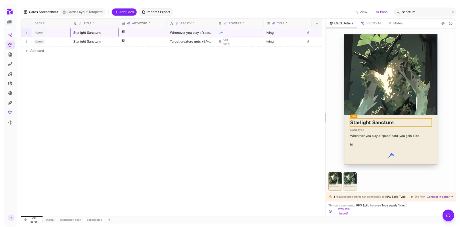
Search runs across all property values, not just titles, and it filters the grid live: 22 rows down to 2 in the example. That's what you want when you're looking for a keyword that could appear in either the name or the rules text.
Clear it with the × in the field.
A useful pattern: search to narrow → select all → bulk edit. See Working With Cards.
To get back to the full deck view, clear the search, then use View → Filter → Clear if a status filter is active. If you also changed the ordering, use View → Sort → Clear.
The View menu
Everything else is under View.
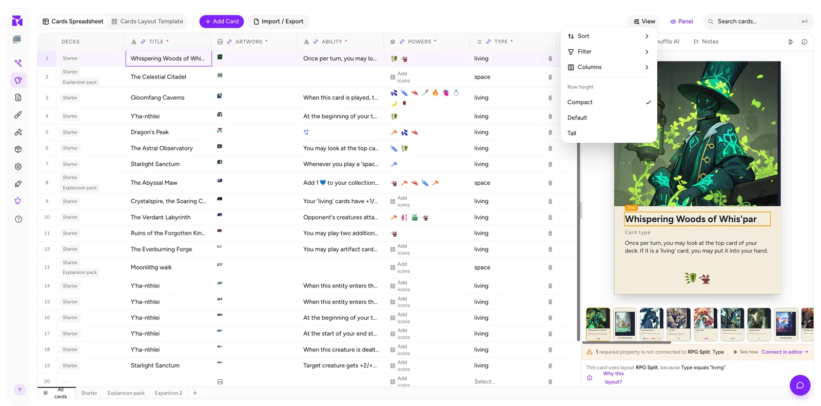
Four sections: Sort, Filter, Columns, and Row height.
Sort
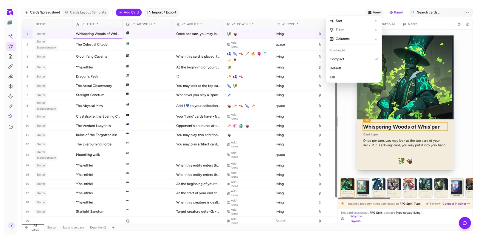
Pick any property to sort the grid by. On the All cards view you can also group by Deck, which clusters rows by the first deck they belong to. There's a shortcut on each column too: hover the header, open the ⋮ menu, and use Sort Ascending / Sort Descending.
Sorting is a view setting. It never reorders your stored cards, though an export scoped to the current view follows the order you see.
Filter
Filters by card Status: Draft, Active, Archived.
The most common use is hiding archived cards from a working view, or doing the opposite: filtering to Archived to dig out something you shelved months ago.
Combine with search: filter to Draft, then search for a mechanic, to see everything unfinished that touches it.
Columns
Two groups:
System: Status, Quantity, Decks. These exist on every project. Quantity only carries meaning inside a deck tab; Decks only inside All cards.
Properties: your own columns, each with a checkmark toggle.
Note the line under the heading:
Saved per view: decks follow this setup until customized
So: your column setup on All cards becomes the default for deck tabs, but each deck can diverge once you customise it there. In practice that means you can have a lean, art-focused column set inside a deck and a full data view on All cards.
Hiding a column here is non-destructive: the data stays, it's just off-screen. To remove a property for good you have to Delete Column from the column's own menu.
Row height
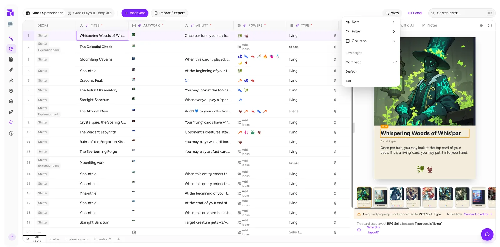
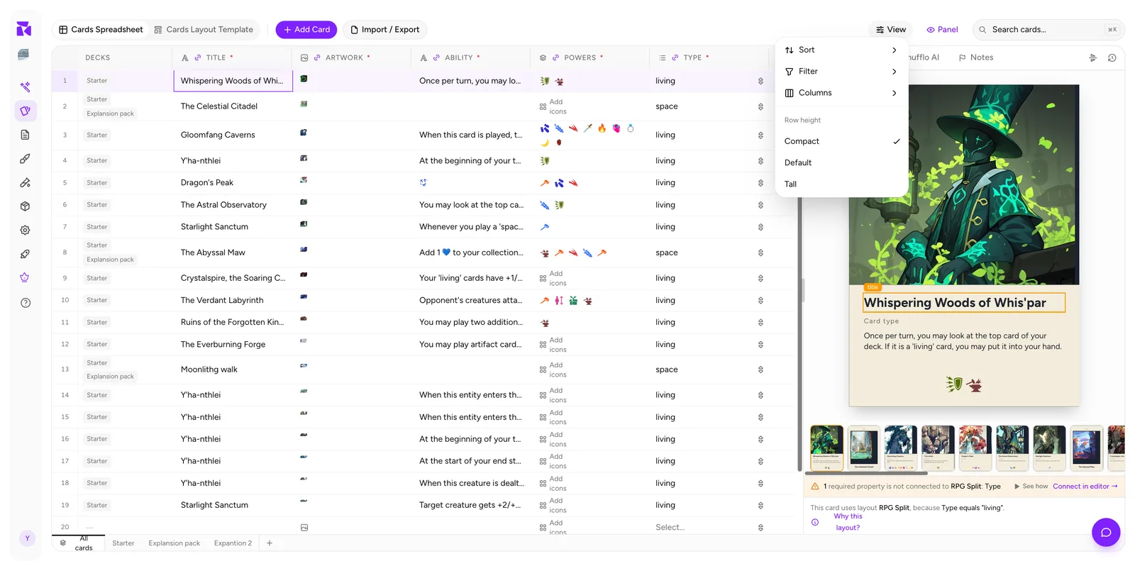
Three settings: Compact, Default, Tall.
- Compact: the most rows on screen. Best for data entry and scanning.
- Default: balanced.
- Tall: bigger artwork thumbnails and more room for multi-line rules text. Best for art review.
One choice applies everywhere; unlike columns, row height isn't saved per view.
Freezing columns
Not in the View menu: it's on the column itself. Open the column's ⋮ menu and choose Freeze column. The column moves to the far left and stays put while you scroll horizontally. One column at a time, remembered per project.
Freeze title on any project with more than about six properties. Scrolling right and losing track of which row you're on is the most avoidable annoyance in a wide spreadsheet.
Combining them
These stack. A realistic working setup for an art pass:
- Deck tab:
Expansion 2 - Filter: Status = Draft
- Columns: hide
abilityandpowers, showartworkandtitle - Row height: Tall
- Freeze:
title
Result: a tight, image-heavy view of exactly the cards that still need art. Switch back to All cards with everything visible for a data pass, and the columns remember their own setup per view.