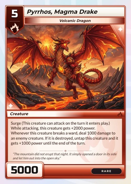
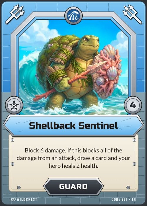
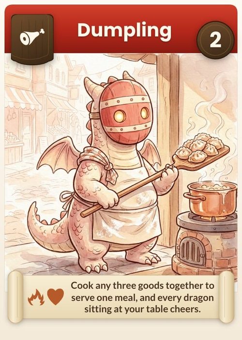
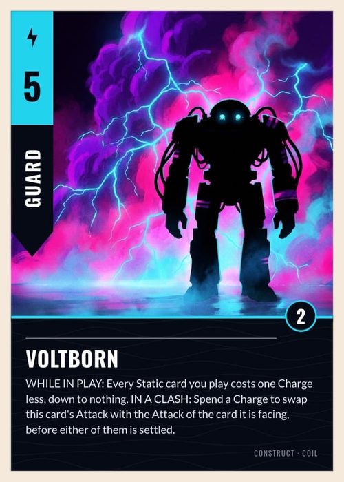
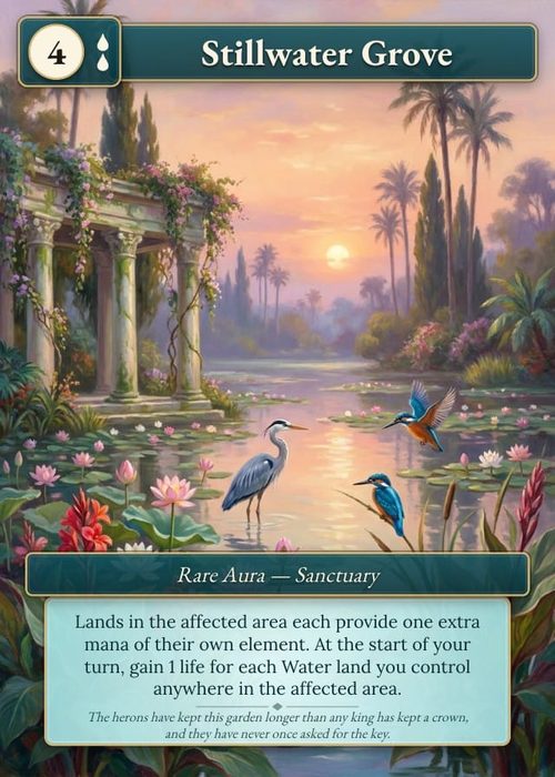
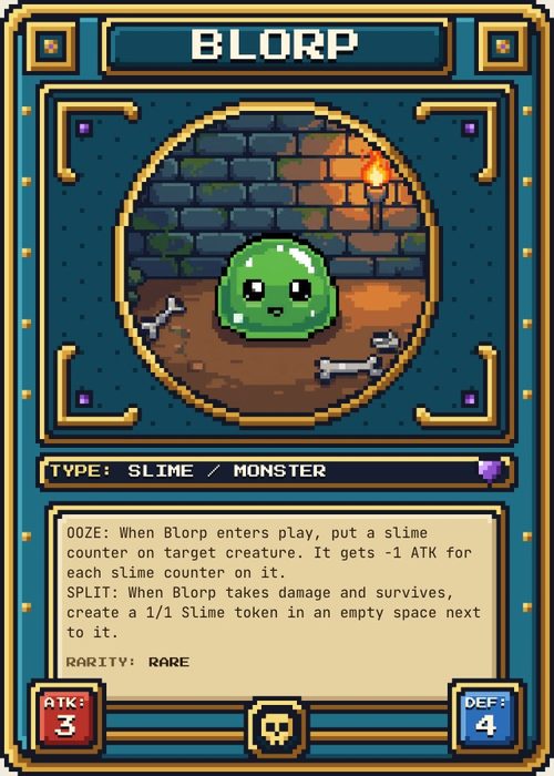
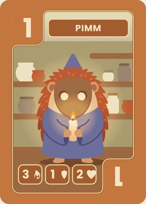
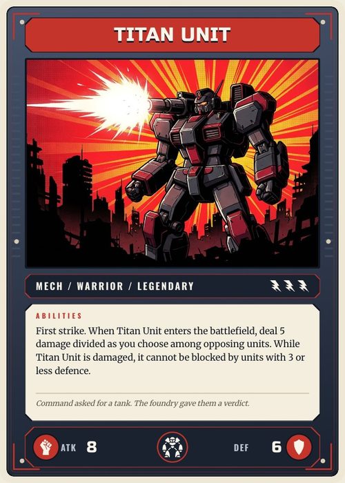
Binding is what makes a layout a template instead of a picture. An unbound text element says "Card name" on every item. A bound one says each item's actual name. The property picker only includes the active component type's schema.
ShuffleKit states the idea plainly in the editor:
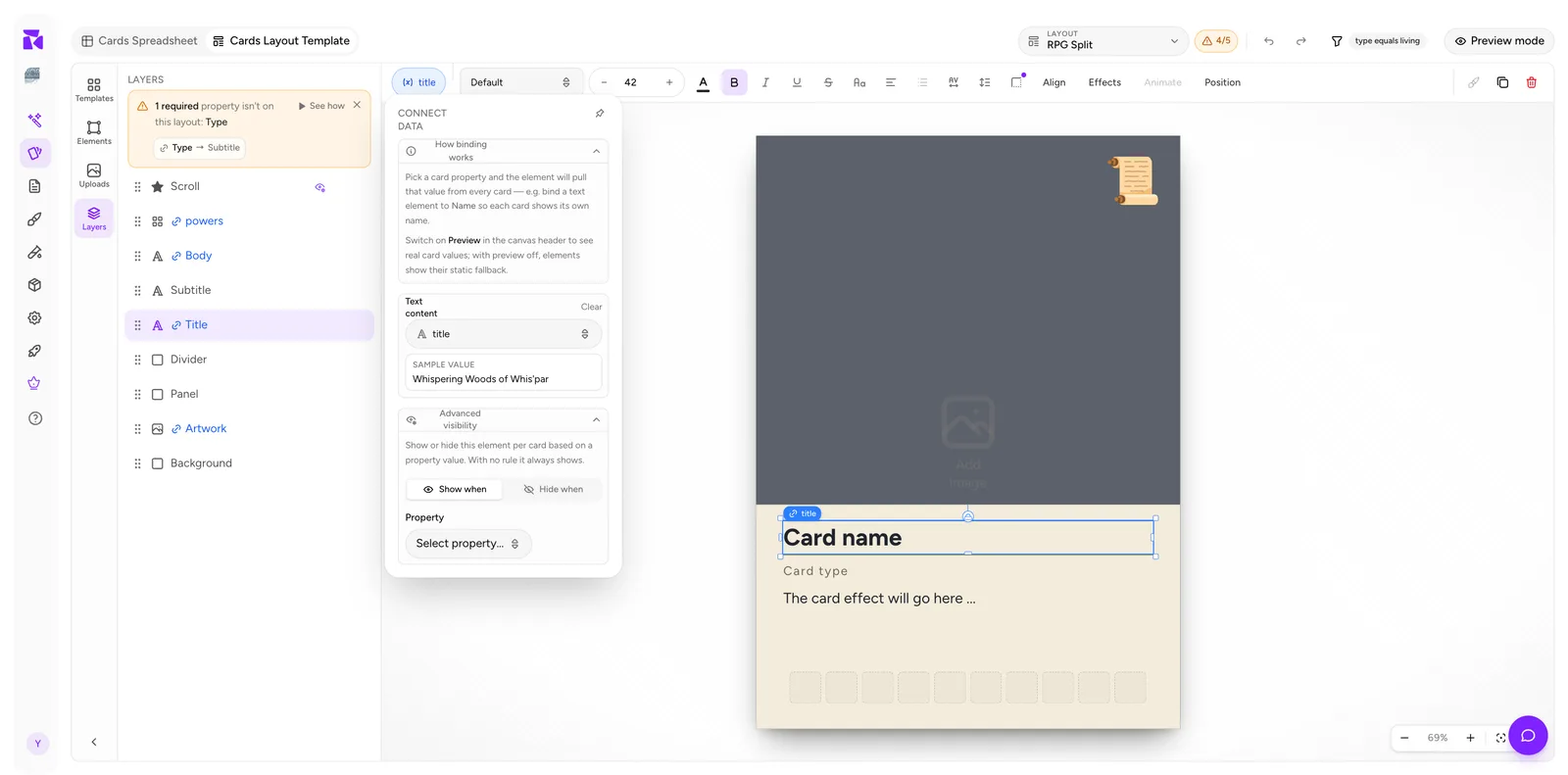
Pick a card property and the element will pull that value from every card: e.g. bind a text element to Name so each card shows its own name.
Switch on Preview in the canvas header to see real card values: with preview off, elements show their static fallback.
Binding an element
- Open Design for the active collection.
- Select the element on the canvas or from the Layers panel.
- Click the pill at the far left of the context bar.
- Pick a property under Text content (or the equivalent slot for that element type).
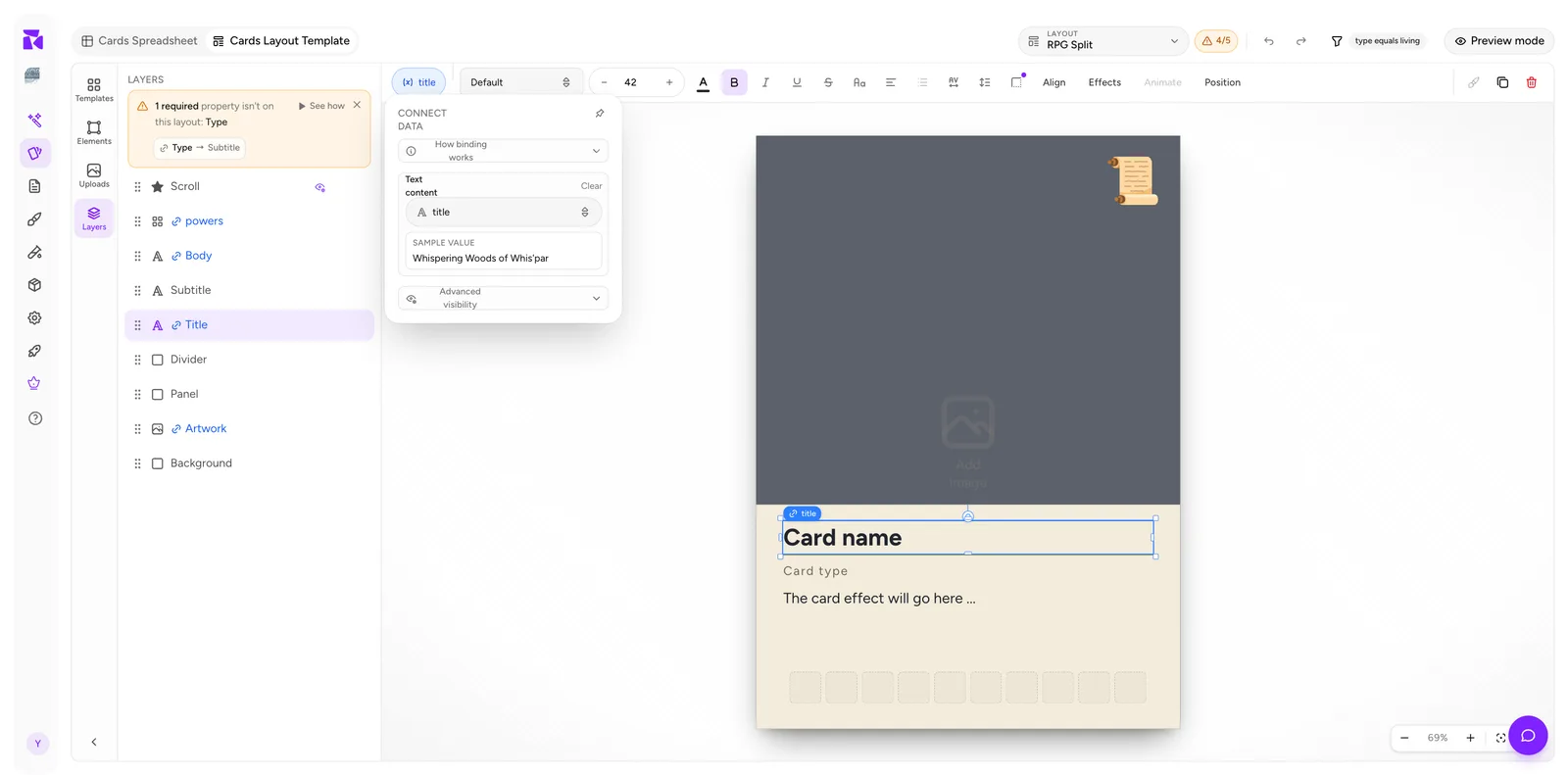
The popover gives you:
- How binding works: a collapsible explainer.
- One slot per bindable field: for a text element that's Text content and Text color. Each reads
Static (no binding)when nothing is bound. - Clear: break the binding and return to static content. It appears on a slot only once that slot is bound.
- SAMPLE VALUE: what the first card with a value would render here. Immediate confirmation you picked the right property.
- Advanced visibility: a separate feature covered in Element Visibility.
If no property of the right type exists yet, the slot offers a New … property button that creates the column and binds to it in one step, so you never have to leave the canvas.
Reading binding state at a glance
You never have to open the popover to know whether something is bound:
| Where | Bound | Not bound |
|---|---|---|
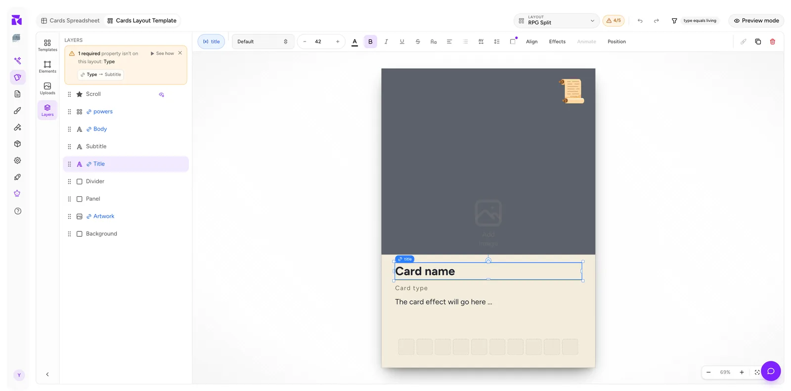
| Context bar pill | Solid, shows the property name (title) |
Dashed, reads Connect data |
| Layers panel | Blue name with a chain icon | Plain name |
| Canvas (selected) | Small blue property badge on the element | No badge |
The Layers panel is the fastest audit. Scan the list; anything black that should be blue is a missing binding.
The dropdown is type-filtered
This surprises people, and it's a feature rather than a limitation.
Select a text element and the Text content dropdown offers only text-compatible properties. In the example project, those are title, ability and Type. It does not offer artwork (an Image property) or powers (an Icon list). You can't accidentally bind a paragraph of rules text to an image slot.
The corollary: if a property you expect isn't in the list, the property's type is wrong for that element. Fix it in the spreadsheet. See Properties & Columns rather than hunting for the option.
| Element | Slot | Binds to |
|---|---|---|
| Text | Text content | Text, Number, Select, Yes/No, Color |
| Text | Text color | Color, Select |
| Image | Image source | Image |
| Rectangle / Ellipse / Line | Fill color, Stroke color | Color, Select |
| Icon | Icon | Icon |
| Icon | Tint color | Color, Select |
| Icon box | Icons | Icon list |
Two things people get wrong here:
Shapes are not inert. A rectangle, ellipse or line carries no content, but its fill and stroke both bind, so a faction-coloured panel is one layout, not one per faction.
Icon and Icon box are different elements. An Icon box takes an Icon-list property and lays out however many symbols each card supplies. A single Icon, dropped from the icon browser, takes an Icon property and can also take a per-card tint. If a card sets its own colour on the icon cell, that cell colour wins over the tint binding. The order is cell colour → bound colour → element colour, and ShuffleKit warns you when the two actually collide.
The Text color slot is described in the app as "Per-card text colour from a color property, or a select property's option colors." Bind it to a Color property, or to a Select whose options carry colours, and the type recolours itself per card, giving you a faction-coloured title without a layout per faction.
Static fallback content
An unbound element shows whatever you typed into it, such as Card name or The card effect will go here …. That's design-time scaffolding.
It matters for two reasons:
- It's what you see with preview off. Don't judge sizing by it: real names are longer.
- It never ships. A bound element ignores it entirely: an unbound one prints it on every card, which is almost never what you want.
The connection counter
The badge in the header, 4/7, counts how many of your card properties this layout actually shows. Click it:
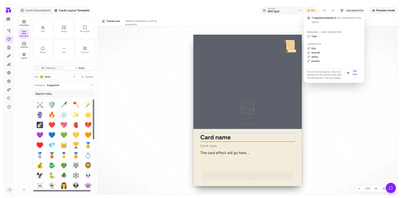
It splits into up to four sections:
- MISSING PROPERTIES: bindings pointing at columns that no longer exist. The pill turns red for these. They are broken references, not gaps.
- REQUIRED: NOT CONNECTED: required properties no element on this layout uses.
- OPTIONAL: NOT CONNECTED: the rest of the gaps. Still amber, because an unbound property simply won't appear on the card.
- CONNECTED: the ones that are wired up.
And repeats the fix:
To connect a property: select an element on the canvas, then click the dashed pill in the top toolbar.
The See how button beside it replays a short walkthrough.
The same warning appears on the spreadsheet side, per card:
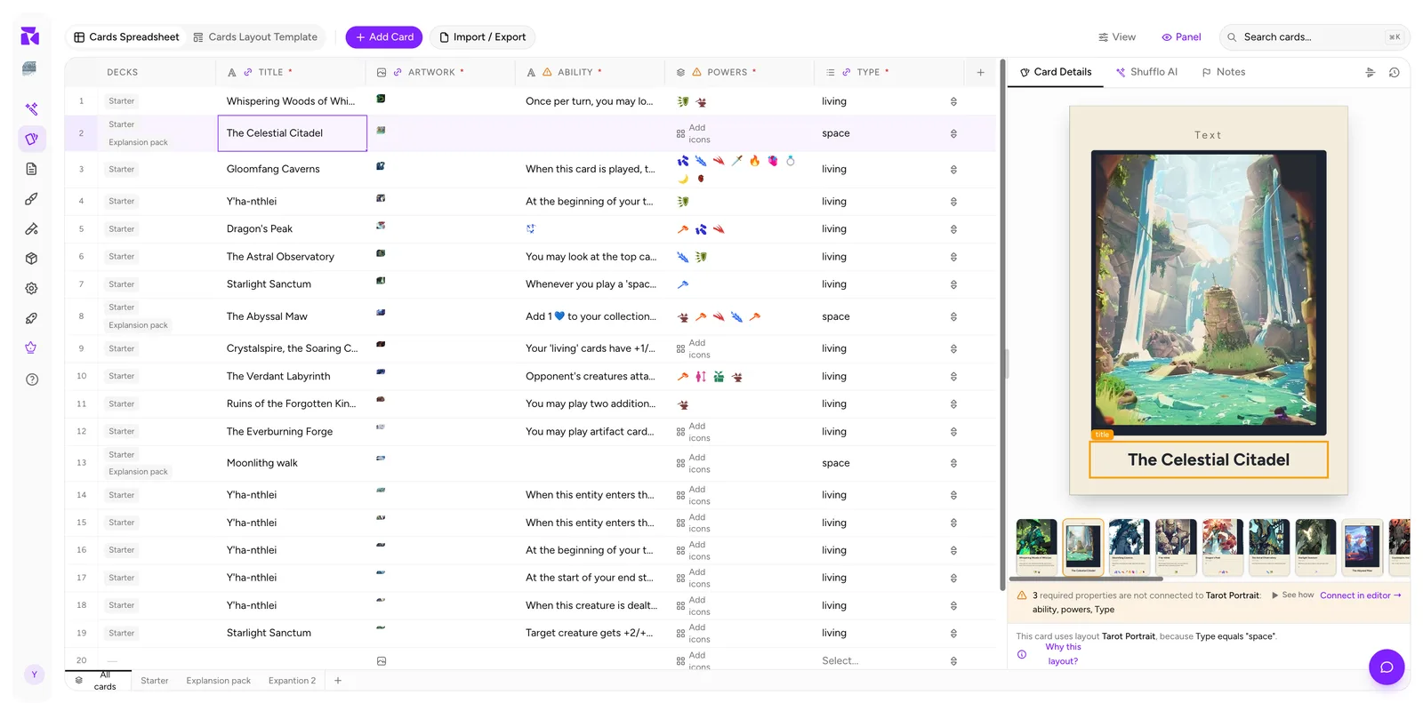
⚠ 1 required property is not connected to RPG Split: Type: See how · Connect in editor →
Connect in editor → jumps to the Layout Template tab with that layout loaded.
The Layers panel carries a third copy of the same information, plus one-click suggestion chips, such as number → Subtitle, that bind an unused property to the layer ShuffleKit thinks it belongs on. Chips disappear as you use them.
What the counter counts
Three things to internalise:
Everything in scope, not just required. 4/7 means seven properties are relevant to this layout and four are on it. Required ones are called out separately in the popover because they're the ones that matter most, but optional gaps count too.
Scoped to the layout's cards. Properties whose data only exists on cards this layout never renders are left out of the total. For example, monster-only stats on a spell layout do not make a conditional layout permanently amber over columns it has no business showing.
Per layout, and per card on the spreadsheet side. Each layout is wired independently; adding a new required property means visiting every layout to connect it, because nothing propagates. And the spreadsheet warning reflects whichever layout the selected card resolved to, so a living card on RPG Split might report one missing property while a space card on Tarot Portrait reports three.
When "not connected" is correct
The warning isn't always a bug. Two legitimate cases:
- The property only drives conditions.
Typedecides which layout a card uses: it doesn't need to be printed on the card. - The property is internal. Designer notes, a balance score, a source reference.
In both cases the honest fix is to turn Required off for that property in the spreadsheet. A permanently amber counter trains you to ignore it, which defeats the point. Reserve Required for properties that genuinely must reach the printed card.
Verifying with preview
Binding is only half-done until you've seen it with real data.
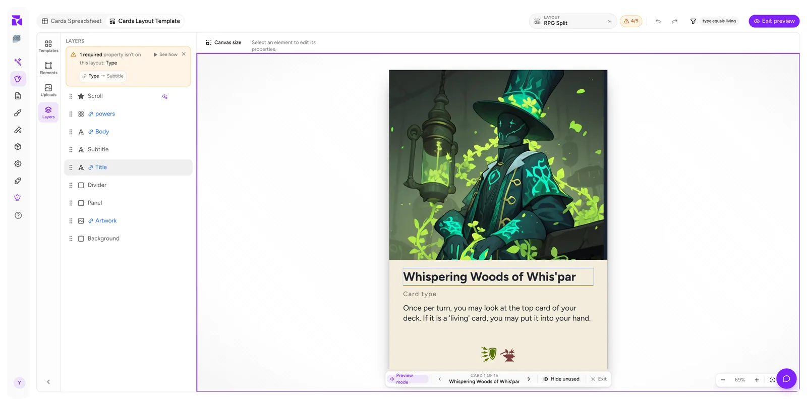
Turn on Preview mode and step through the cards with ‹ / ›. Watch for:
- Overflow: the longest title in the set, not the first one.
- Empty fields: does the layout look broken, or acceptably sparse? If broken, that element wants a visibility rule.
- Wrong property: a subtitle showing rules text means a mis-picked binding. The SAMPLE VALUE line in the popover would have caught it earlier.
- Icon overflow: a card with eight power icons where you designed for three.
A reliable workflow
- Define properties in the spreadsheet first; mark the printed ones Required.
- Build the layout's shapes.
- Open Layers and work top to bottom, binding each element.
- Watch the counter reach
N/N. - Turn on Preview mode and page through every card.
- Repeat for each layout. Bindings don't carry across.
Step 6 is the one that gets skipped. A five-layout project means the work in steps 3 to 5, five times.