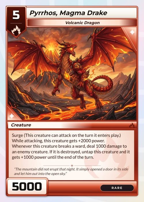
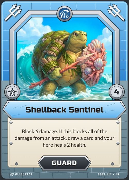
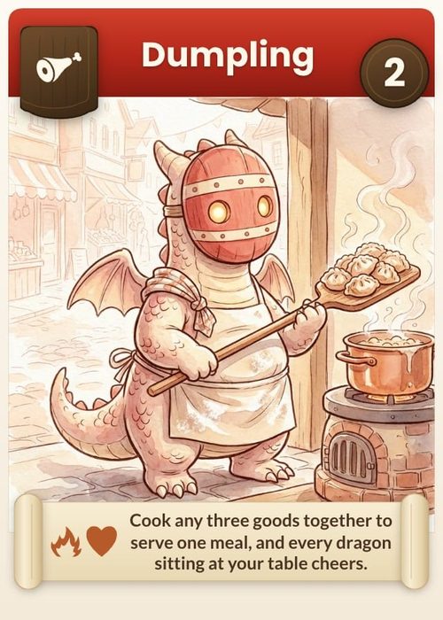
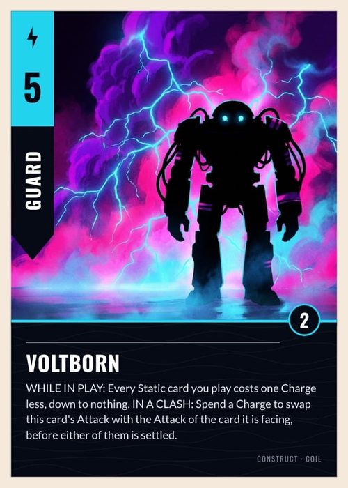
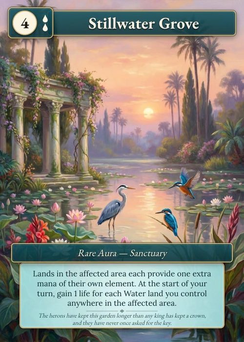
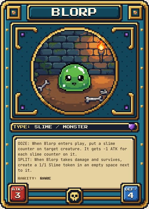
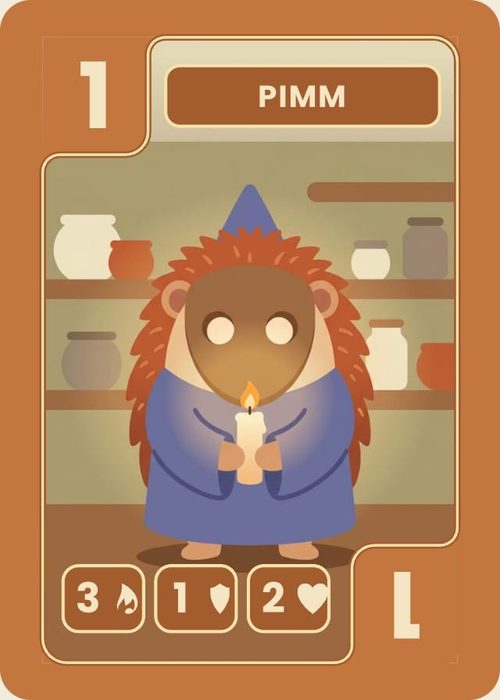
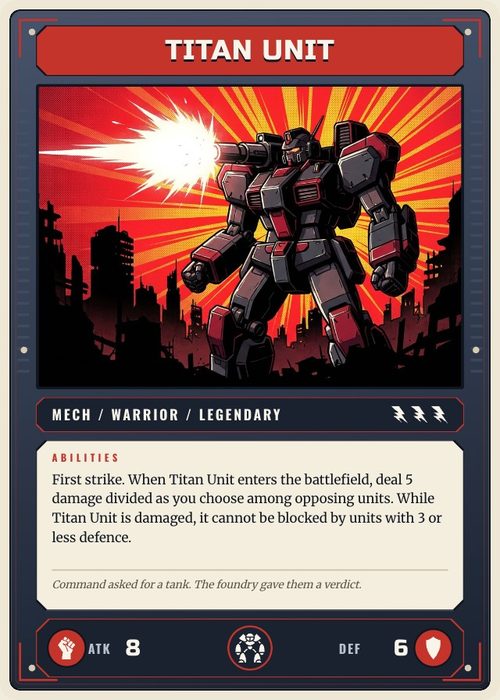
The Design tab is the component designer. Everything you place here is a template. It renders for the active collection's items, filled with each item's own data.
This tutorial maps the interface. The three tutorials that follow it go deep on the parts that actually make a layout intelligent: conditions, binding and visibility.
Opening it
Click Design at the top of the workspace. You stay on the same project and collection; you are just switching from data to design.
The editor works on a phone too. Tap a layer to select it, then edit its text, colours, effects and data connections, nudge it into place, and reorder, hide or lock layers from the layer list. Dragging, resizing and rotating on the canvas still need a mouse, so save those for a desktop.
The header bar
Left to right across the top-right of the window:
| Control | What it does |
|---|---|
| Layout and face selector | Which layout and component face you are editing. It only shows layouts for the active collection type. See Layouts & Priority. |
| Connection indicator | How many of the active component's properties this layout actually shows. It calls attention to required properties that are not connected. See Data Binding. |
| Undo / Redo | Step back and forward through edits (⌘Z / ⌘⇧Z). |
| Condition | The rule that decides which items use this layout. Reads Condition when empty. See Conditions. |
| Preview mode | Swap placeholder content for real component data. |
Every one of those is per-layout, not global. Switch layouts and all five change. The face is named for its component: Front/Back for cards, Outside/Inside for screens, numbered faces for dice, and Outside for boxes.
The left rail
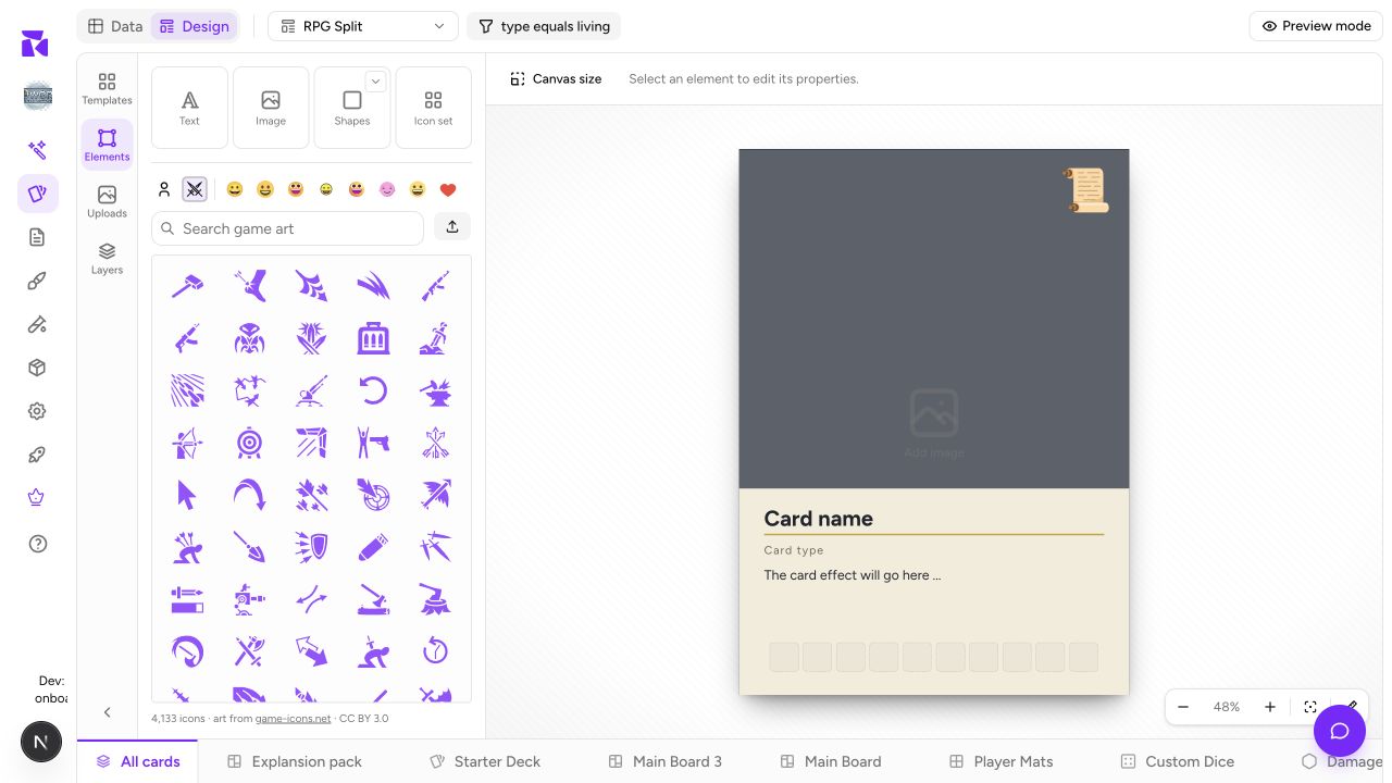
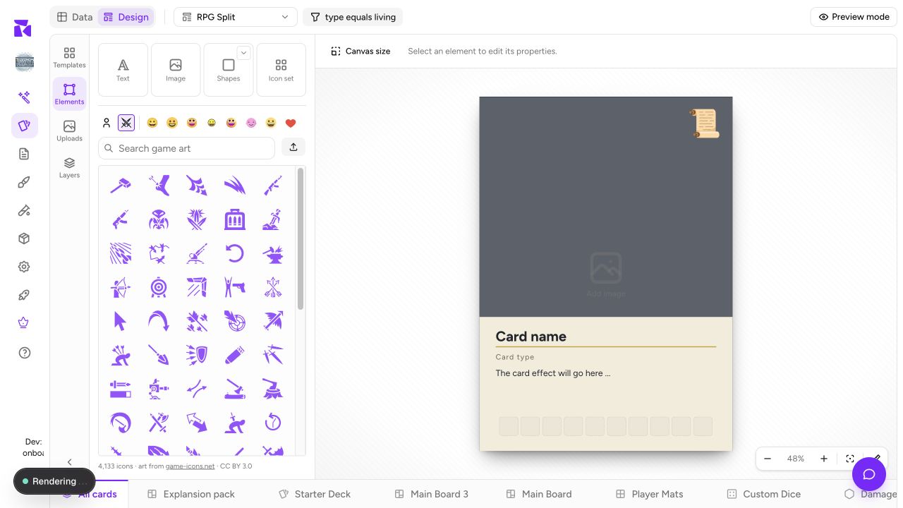
Four panels, stacked as icons down the far-left edge. Click an icon to open its panel, click the same icon again to collapse it, and drag the panel's right edge to resize it (double-click that edge to snap back to the default width).
Templates
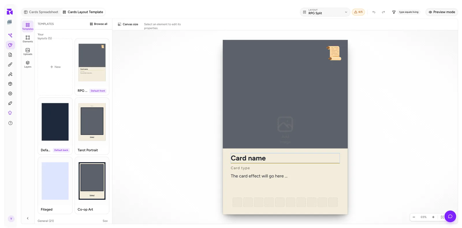
The switch at the top has two views.
- Templates: ShuffleKit's built-in designs, with a search field above them. Starters holds single designs, led by your project's genre, and previews four with a link to the rest. Below it, each pack gets a row of its designs. Clicking a design adds that one; Use pack adds the whole set, card back and routing rules included. Magic and Yu-Gi-Oh designs only appear in a collection at their exact card size, since neither size prints.
- Your layouts: every layout for the active component type, with its valid face and default badges, plus a New tile. Each thumbnail carries a menu for Set default, Rename, Duplicate and Delete. Browse all opens the same two views at full-window size. Its Your layouts view is split by the type's faces, with a New tile for each. Its Templates view has a search and a Show menu to narrow it to Starters, Packs or one set, and shows each pack as a card: open it to see every design, or Use pack. A shelf's See all in the panel opens Browse all on that shelf.
Starting from a template and deleting what you don't need is almost always faster than starting from a blank canvas. When you apply one, ShuffleKit offers to bind its elements to your properties on the way in, and tells you which properties it couldn't place.
Elements
The palette of things you can add:
| Element | Use for |
|---|---|
| Text | Titles, type lines, rules text, flavour text, stats |
| Image | Artwork frames, set symbols, logos |
| Rectangle | Panels, backgrounds, dividers, colour blocks |
| Ellipse | Cost bubbles, badges |
| Line | Rules and separators |
| Icon box | A slot for an Icon-list property |
Below the palette sits an icon browser. A strip of swatches picks the source — Your icons, Game art, then eight emoji styles after the divider (Noto, Twemoji, Fluent, OpenMoji and more) — and one search field runs across whichever is active, with an Upload button beside it for your own SVGs. Clicking any icon drops it onto the canvas as its own element, separate from the Icon box.
Uploads
Your own uploaded image assets, reusable across every layout in the project.
Layers
The stacking order, plus the fastest place to audit a layout. Covered in Layers & Groups.
The canvas
The active component face at working size, on a neutral backdrop.
- Click an element to select it.
- Drag to move: drag the handles to resize.
- Selected elements show their binding and any conditional badge directly on the canvas.
Zoom controls sit bottom-right: minus, the current percentage, + (⌘minus / ⌘+), a fit-to-canvas button (⌘0), and a rulers toggle with a px / in / cm / mm unit picker. All of it is view-only. It changes nothing about the card.
Canvas size
Canvas size is the size shown in the header, next to the layout picker. Click it to set the active component's dimensions from the selected catalog size or a custom size.
Set it before you build. Changing it later doesn't reflow your elements intelligently. They keep their absolute positions, so a size change scatters a finished layout. If you plan to print, pick the size that matches your intended stock now; see Print & Ship.
The context bar
The strip above the canvas is context-sensitive:
- Nothing selected: "Select an element to edit its properties."
- An element selected: that element's full property controls.
- A group selected: group-level controls (visibility rule, position, opacity, lock, ungroup).
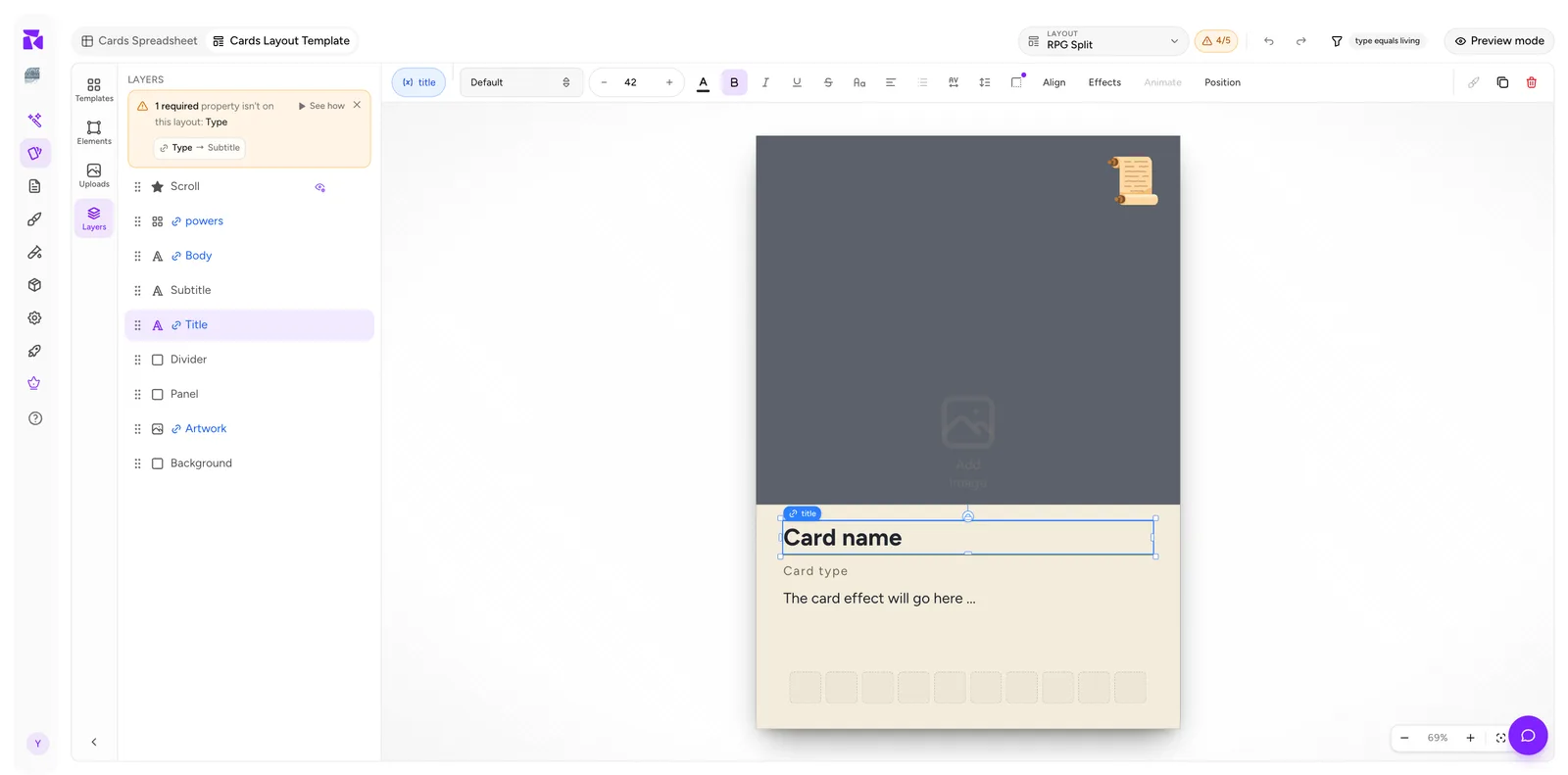
For a text element you get, left to right: the binding pill, font family, size stepper, colour, bold / italic / underline / strikethrough, letter case, alignment, spacing, then the Align, Effects, Animate and Position groups. At the far right: duplicate and delete.
The leftmost pill is the important one. It is the data binding, and it's covered in depth in Data Binding.
Preview mode
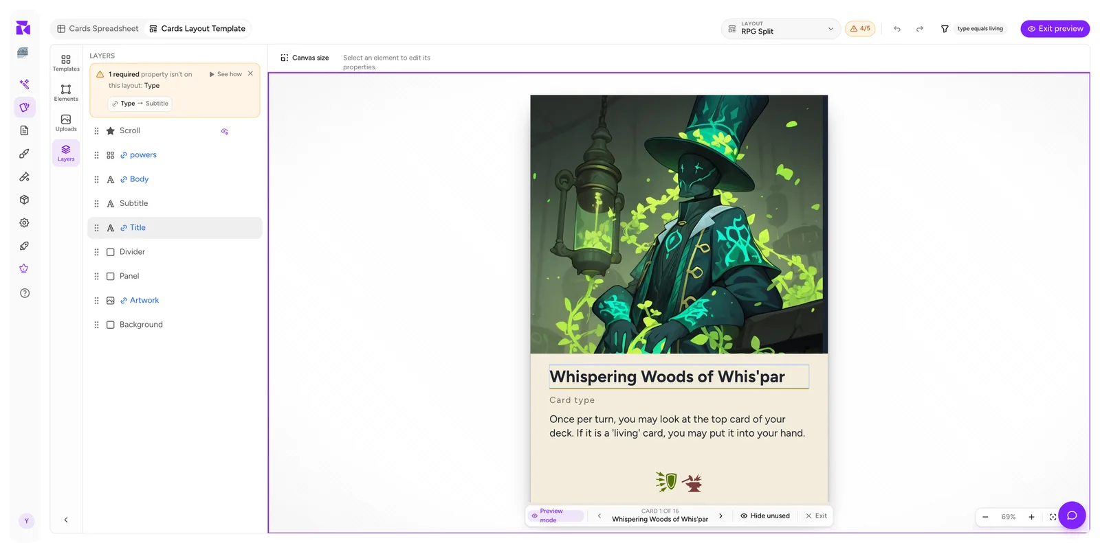
Click Preview mode and the canvas fills with a real item from the active collection. A navigator appears at the bottom:
‹/›: step through cards (the←/→keys do the same).- Item n of m, with its name beneath: note that
mcounts the items that match this layout's condition, not the whole collection. An item can match and still render on a higher-priority layout, so this is an upper bound rather than the exact print set. - Hide unused: collapse elements that have nothing to show. It's a toggle. Once on, it reads Printed view.
- Exit: back to editing.
If no card satisfies the condition, the bar says so instead: "No cards match this layout's condition."
Design with placeholders, verify with preview. Long titles, empty fields and busy icon strips are the things that break a layout, and none of them are visible until you page through real data.
A sane build order
- Set Canvas size.
- Pick a template or start blank.
- Lay out the big shapes: background, art frame, and text panel.
- Add text and icon elements roughly in place.
- Bind each one to a property, watching the counter reach
N/N. - Turn on Preview mode and page through every card.
- Add visibility rules for the elements that shouldn't always appear.
- Only then, add a condition if this layout is meant for a subset of cards.
Steps 5 and 8 are the two that people skip and then spend an afternoon debugging.