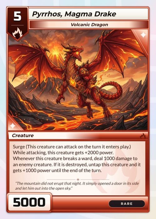
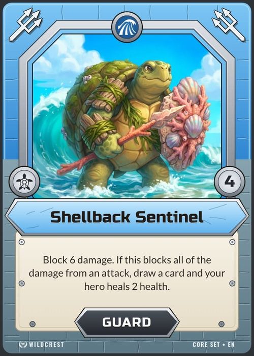
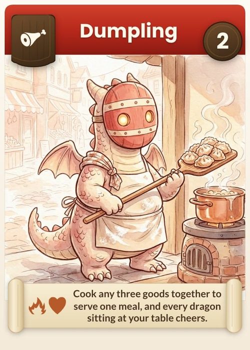
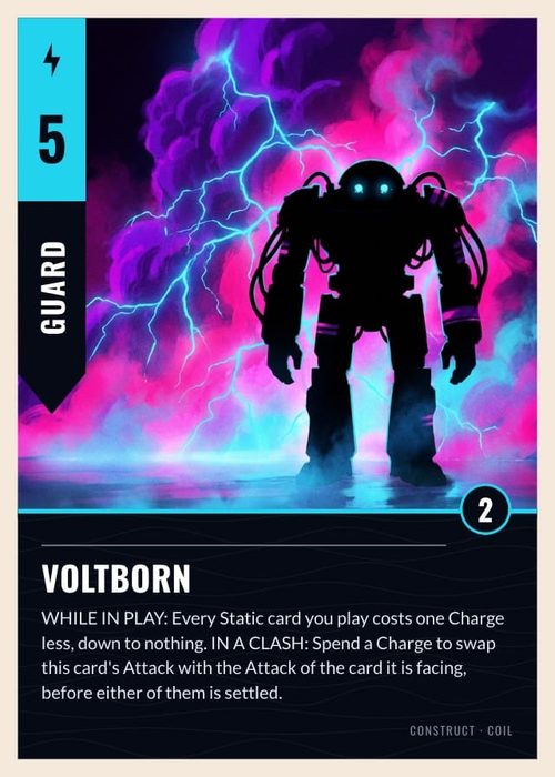
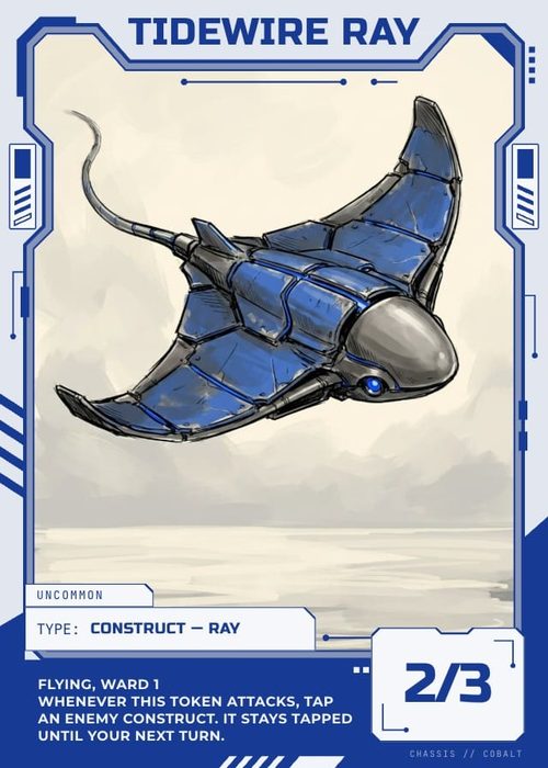
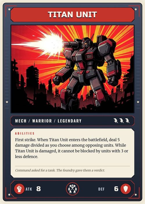
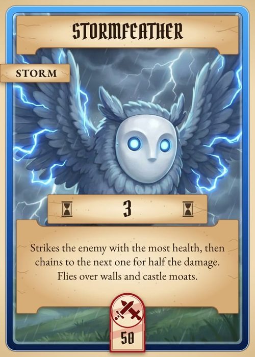
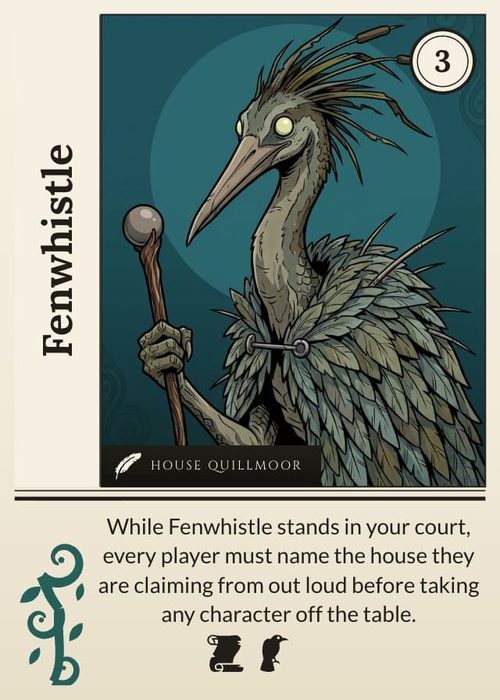
Layout conditions choose which design an item gets. Visibility rules decide whether one piece of that design appears on a given item. Like layout conditions, they only offer properties from the active component type.
This is the feature that keeps your layout count low. If two designs differ by a badge, that's one layout with a conditional badge, not two layouts to maintain forever.
ShuffleKit's own description:
Show or hide this element per card based on a property value. With no rule it always shows.
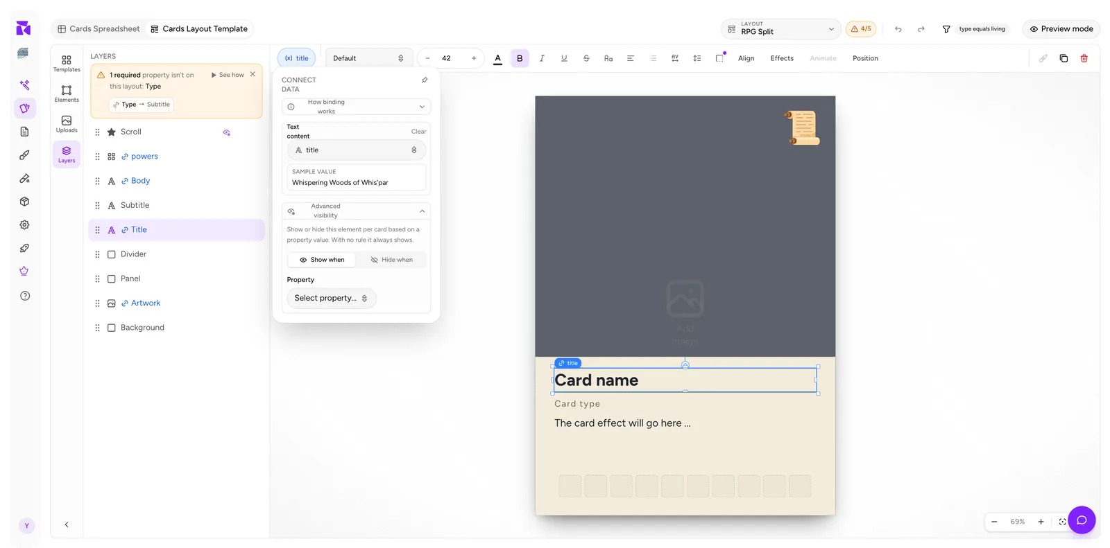
With a rule set, the section carries an ON badge and shows the three fields plus Clear rule:
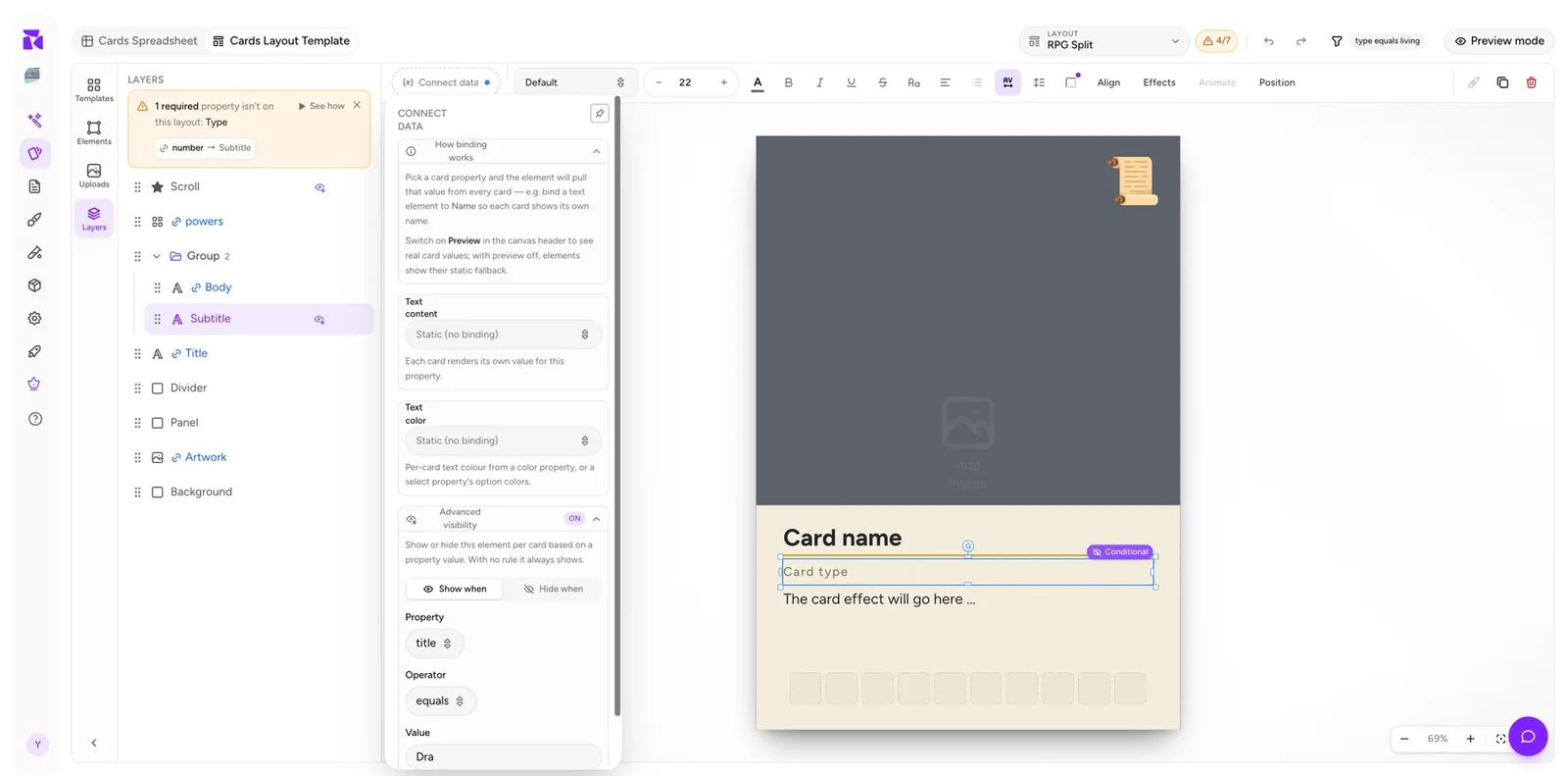
Adding a rule
- Select the element on the canvas or in Layers.
- Click its pill in the context bar to open CONNECT DATA.
- Expand Advanced visibility.
- Choose Show when or Hide when.
- Pick Property, Operator, Value.
The rule saves as you set it, but only once it's complete, so a half-finished edit never overwrites a working rule. Clear rule removes it and the element goes back to always showing.
When a rule is active the section header carries an ON badge, so you can tell at a glance whether an element is conditional without reading the fields.
Show when vs Hide when
Two ways to say the same thing, and the choice is about readability rather than capability.
| Reads as | |
|---|---|
| Show when | "This only appears for these cards." |
| Hide when | "This appears for everything except these cards." |
Pick whichever produces the shorter sentence. A legendary foil bar is Show when Legendary equals true. A watermark you want on everything but tokens is Hide when Type equals token. Writing either as its inverse works but reads backwards, and you'll misread it in six months.
The operators
The operator list is the same one layout conditions use, and it's driven by the property's type rather than by the fact that you're setting visibility. Pick a Text property and you get four operators:
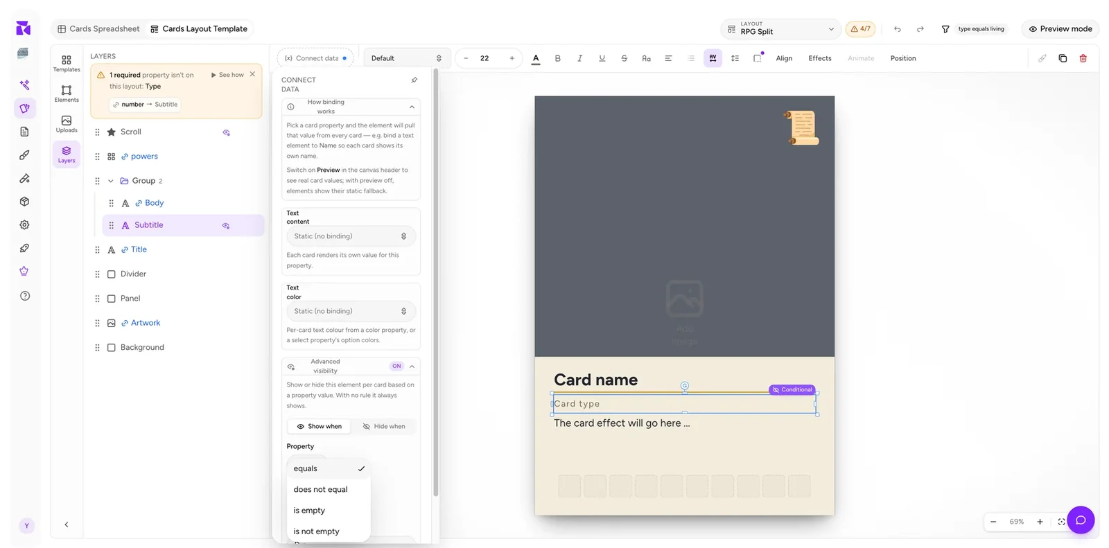
| Operator | Shows/hides when |
|---|---|
equals |
The property is exactly this value |
does not equal |
The property is anything else |
is empty |
No value has been entered |
is not empty |
Any value has been entered |
Pick a Select property instead and you also get is any of, with a checkbox list of that Select's options. That means "show for fire, water or air" is one rule, not three elements or a helper column. Pick a Number and you get greater than / less than and their inclusive variants. An Image or Icon list property offers only is empty / is not empty, which is the whole point of those two for visibility work.
Two real limits do apply here:
One rule per element. There's no "add condition" for AND-ing two properties on a single element. When you genuinely need that, group the elements and put a second rule on the group (below).
Card properties only. Layout conditions can also read deck membership; visibility rules can't. If an element should only appear in one deck, that's a job for a layout condition.
is empty is the workhorse
Most layouts have a couple of optional fields: flavour text, a subtitle, and a secondary cost. Left unconditional, the empty ones leave a hole, or worse, a stray divider line floating in white space.
The fix is one rule:
Flavour divider → Hide when Flavour is empty
Now the divider only exists on cards that have flavour text. The same pattern covers:
- A "Requires:" label that shouldn't print when there's no requirement.
- A cost bubble on cards that actually have a cost.
- A scroll ornament that fills the gap when a card has no power icons: literally the rule used in the example project: Shown when powers is empty.
That last one is worth calling out as a technique: instead of hiding an element when a field is empty, show a decorative one. Empty space becomes intentional design.
Group visibility rules
Select a group and the context bar offers a Visibility rule button of its own. The explainer states the important part:
Show or hide every layer in this group per card based on a property value. Members' own rules still apply on top.
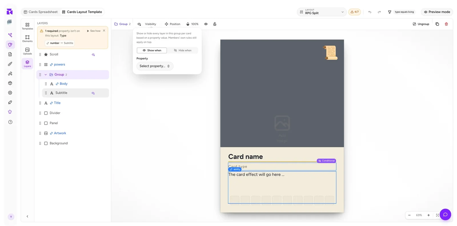
So the two levels stack, and they stack as AND:
- Group hidden → every member hidden, regardless of their own rules.
- Group shown → each member then evaluates its own rule.
That gives you two-condition logic without a per-element AND. A "legendary + creature" ornament set becomes a group with Show when Type equals creature, containing an element with Show when Rarity equals legendary.
Groups also give you a single opacity control, a position readout, a lock, a Hide group toggle and Ungroup.
Spotting conditional elements
You don't have to open popovers to find the rules in a layout. ShuffleKit marks them in three places:
On the canvas. A conditional element shows a violet Conditional badge when selected or hovered, next to the blue binding badge. In Preview mode, when the card on screen fails the rule, that badge turns dark and reads Hidden here, and the element dims, so you can see exactly which cards drop it.
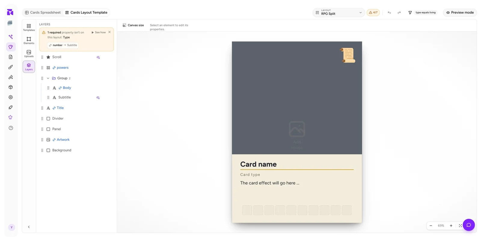
In the Layers panel. Conditional layers get a small eye-with-cog icon. Hover it and the tooltip states the rule in plain English: "Shown when powers is empty", "Shown when title equals Dragon's Peak". This is the fastest way to audit an inherited layout: scan the layer list for the badge, hover each one.
In the popover. The ON badge on the Advanced visibility header.
Manual hide is not a visibility rule
Each layer also has a plain Hide (eye) button. These are different things and it matters:
| Effect | |
|---|---|
| Hide (eye) | Design-time only. Hides the element while you work. Applies to every card. |
| Visibility rule | Runtime. Evaluated per card against its data. |
Use the eye to get a busy element out of your way while positioning something behind it. Never use it to "turn off" an element you don't want printed. Either delete it, or give it a rule.
Recipes
Optional flavour text
Flavour text and its divider → Hide when Flavour is empty
Rarity treatment on one layout
Foil bar → Show when Rarity equals mythic. Beats a separate mythic layout that duplicates everything else.
Filling an empty region
Ornament → Show when powers is empty. Cards with icons show icons; cards without show decoration.
Set symbol only on expansion cards
Symbol → Hide when Expansion is empty
One badge for several types
Badge → Show when Element is any of fire, water, air (needs Element to be a Select)
Two-condition badge
Group Show when Type equals creature, containing badge Show when Legendary equals true.
Proofing marker
A loud "DRAFT" bar → Show when Artwork is empty. Turns unfinished cards into something you can't miss in a print sheet.
Pitfalls
Testing with preview off. Rules only evaluate against real data. With preview off every element shows its static state, so a rule looks like it isn't working. Turn on Preview mode and step through cards.
Typos in the value. Same trap as layout conditions: a free-text property makes Legendary and legendary different values. Prefer Select or Yes/No for anything a rule reads. Select values come from a checkbox list, so they can't be mistyped.
Rules on the wrong element. Divider hidden but its label still showing is the classic. Group the pieces that belong together and rule the group.
Reaching for a rule when you need a layout. If half your elements carry the same rule, you've built two designs inside one layout. Split it into two layouts with a condition. It'll be easier to reason about and faster to edit.
Visibility or condition?
A quick test:
| Situation | Use |
|---|---|
| One or two elements differ | Visibility rules |
| The frame, colour scheme or overall structure differs | A separate layout with a condition |
| Elements are in different positions per card type | A separate layout |
| An optional field is sometimes blank | Visibility rule, always |
| The difference is which deck the card is in | A separate layout: only conditions can read decks |
When in doubt, start with visibility rules. Splitting one layout into two later is easy; merging two divergent layouts back together is not.