This guide is the complete companion to Layouts & the Design Editor. It focuses on the controls that make a layout production-ready rather than merely presentable.
Canvas and precision
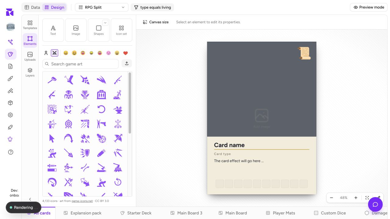
The size shown in the header, after the Condition button, opens Canvas size. Start from the collection's physical preset; changing dimensions after placing a finished design preserves absolute element positions and can force a cleanup pass. The zoom controls under the canvas also expose rulers and unit display (px, in, cm, or mm) for measuring without changing the document.
Dragging an element produces snap guides against useful canvas and element edges. Leave this on for consistent spacing. If an intentional placement must ignore a guide, hold ⌘ (or Ctrl) while moving or resizing. Hold Shift while dragging to move along one axis only, and hold Alt (Option) as you start a drag to leave a copy behind. Use rulers and print guides to check the final relationship to bleed, trim, safe area, fold, or cut shape, not the visual center alone.
For a shaped preset such as a meeple or a custom die-cut, open the layout menu in the header and choose Export shape guide as SVG…. The guide has separate canvas, cut-line, and safe-area layers: extend artwork to the canvas edge, keep important text within the safe area, and treat the magenta cut line as the shape that survives the die. It is a drawing guide for Illustrator or another vector tool, not artwork to import or print over a finished component.
Select precisely
Drag from any empty part of the canvas or the surrounding workspace to lasso the visible elements that intersect the rectangle. Hold Shift to add the new lasso to the selection; click empty canvas or press Escape to clear it. Hidden elements are intentionally not lassoed, so the next move always affects what you could see.
When elements overlap, ⌘-click on macOS or Ctrl-click on Windows/Linux cycles down through the stack beneath the pointer. The element context menu also offers Select underneath for one step down. This is safer than moving a foreground panel out of the way just to reach a background.
Multi-select, layer order, and groups
Select several elements and the toolbar at the top of the canvas shows how many, then Group, align left/center/right/top/middle/bottom, distribute across/down, Tidy up, duplicate, and delete. Distribution appears when there are at least three selection units, and Tidy up from two; a group counts as one unit so its internals stay together. With several selected, the align buttons line elements up with each other; turn on Align to the page to align them to the card instead.
Right-click an element for its menu, top to bottom:
- Connect data, a submenu of the columns this element can show.
- Copy, Copy style, Cut, Paste, Paste style, Duplicate and Delete.
- Group (with two or more selected) and Ungroup (on a group).
- Layer: Bring to Front, Move Up, Move Down and Send to Back.
- Flip: Flip horizontal or Flip vertical.
- Select underneath, when something sits below the pointer.
- Align: Left, Center, Right, Top, Middle and Bottom, then Distribute across and Distribute down (three or more) and Tidy up (two or more), which evens out the gaps in a row, column or grid.
- Replace image… and Crop on a picture, Edit text on text.
- Rename… and Show in Layers, which open the Layers panel on that row.
- Lock / Unlock and Hide / Show.
Right-clicking an element that isn't selected selects it first, so the menu always describes what you pointed at. The same menu opens from a row in the Layers panel. Keep backgrounds low, text and icons high, and use Bring to Front only when it describes the intended hierarchy. It should not be the fix for an unrelated overlap.
Groups have their own position, opacity, visibility, lock, and ungroup controls. Lock a finished frame or decorative cluster before editing nearby text. Hide is a design-time control; use Element Visibility when a group or element needs a rule based on card data.
With two or more selected units, resize the single blue bounding box to transform the composition as one. Corner handles preserve the selection's proportions; hold Shift while using a corner to release that constraint. Side handles change one dimension. Check the smallest selected element afterward: ShuffleKit preserves a usable minimum rather than shrinking a small icon or rule line into nothing.
The universal element controls
Every selected element exposes the following, in the toolbar at the top of the canvas:
| Control | Use it for |
|---|---|
| Binding pill (Connect data) | The leftmost control. Bind supported fields to project properties. Verify the binding and fallback rather than assuming a template guessed correctly. |
| Effects | Shadow color, X/Y offset, blur, and spread; text adds its effect presets. Keep shadows restrained around small rules text. |
| Position | Exact X/Y, width and height, rotation, a proportions lock, and the layer order. Its lower half is Appearance: opacity and blend mode. Use subtle blends sparingly because export and print must remain legible. |
| Copy style (the brush) | Pick up this element's look and paint it onto another. Double-click to keep painting until Escape. |
A second, smaller toolbar sits just above the selected element with Flip, Lock, Duplicate, Delete and ⋯ (the right-click menu), plus Crop, Replace image or Edit text where they apply.
Some popovers carry a pin. Pinning Position, Connect data, a shape's style, or an image's Adjust and More image keeps that section open in a panel on the right while you work, which helps when you are adjusting the same property across many elements.
Text: readable at real data lengths
Use the inline controls for font, size, color, bold/italic/underline/strikethrough, case, alignment, and spacing. The Text box control on the toolbar sets what the box does when its text changes. Auto grows the box with the text, and every new text box starts there. Fit keeps the box and shrinks the text, never past its minimum size. Fixed leaves the box and the text as they are, and Overflow decides what shows. A text box moves off Auto when you connect it to a column, so a long name gets the same box as a short one; the panel explains that Auto is off for connected text, and disconnecting the column is the only way back to it. Drag a corner to scale the text along with the box. The side handles re-wrap it at the same size. Check your longest value in Preview mode before you print.
Use the binding pill for card data, and keep static fallback text only when it belongs on every item. Insert an icon into text (the Insert an icon button appears while you are typing in the box) only when it stays readable at print size; for a repeated resource row, an Icon set is usually the stronger choice. A connected text box is styled as a whole, because each card prints its own words; bold or colour on a few highlighted words only works on static text.
Images, shapes, and icons
Images can crop, choose Fit, Fill or Stretch, sit in a shaped Frame, round their corners, flip horizontally/vertically, take filters and brightness/contrast/saturation adjustments from Adjust, and use the usual appearance, shadow, position, and data-binding controls. An image placed on the layout itself also has Replace and BG Remover. Check both a tall and wide source image in Preview: one crop mode rarely flatters every asset.
Shapes can use solid, linear-gradient, or radial-gradient fills, plus stroke color/width and, on a rectangle, linked or individually adjusted corner radii. Lines add dashed and dotted strokes and a choice of cap at each end. Use separate corners for a purposeful panel shape; link them when the visual should remain a simple rounded rectangle.
Icons come from Game art, your uploaded icons (Your icons), the icons the project already uses (This project), and eight emoji styles. A PNG or JPG you upload as an icon is cropped to a square first, with an option to remove its background. A single icon has Swap icon, Fit (Fit, Fill or Stretch in its box), a tint color, flip and opacity. An Icon set adds its icon list, icon size, Arrange (direction, alignment, spacing, whether to wrap onto more lines, and what to do when an icon repeats) and a switch to trim each icon's padding so icons from different sets match in size. Design icon rows with real maximum counts so they do not overflow when a card has five resources instead of two.
Check the editor's answer before publishing
On a front face, the notice at the top of the Layers panel tells you which required and optional properties the layout doesn't show yet, with one-click suggestions where it can guess. Check it whenever a template or layout is reused in a collection with different fields; the layout menu in the header also shows how many cards print each layout. Then use Preview mode, Hide unused, and real cards/components to test empty text, long text, missing art, variant faces, and high icon counts.
End with a print check for the actual component face. A perfect card front does not prove a board back, custom die face, screen inside, or box dieline is ready. The type-aware face selector and physical guides are the final guardrails.