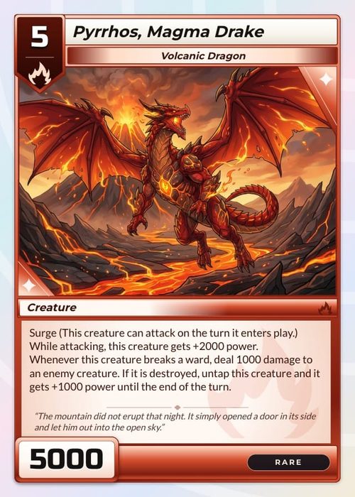
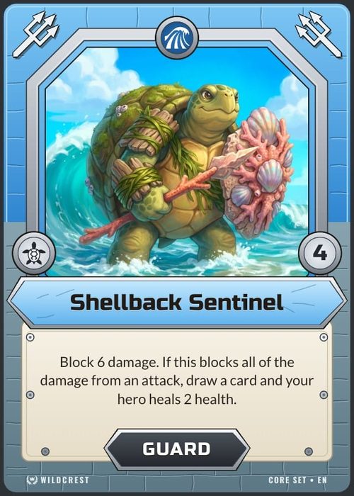
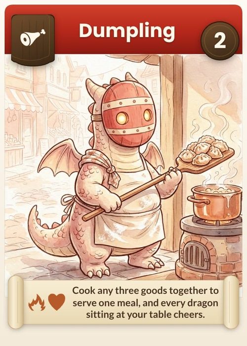
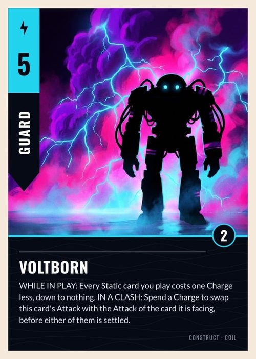
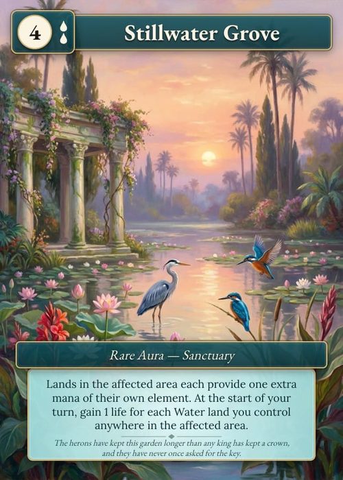
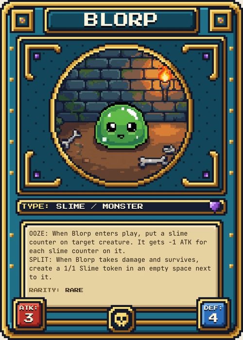
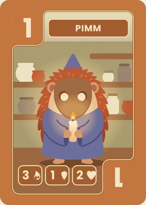
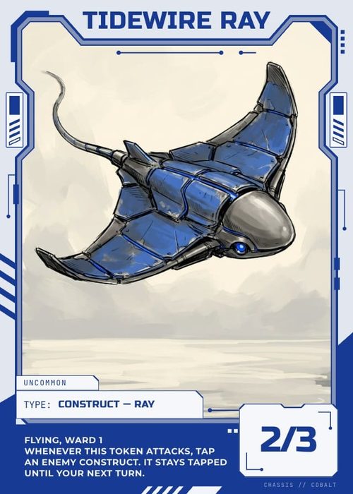
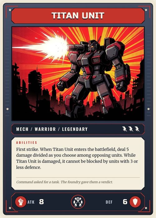
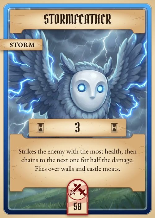
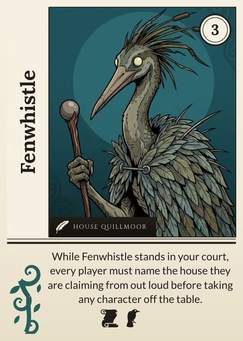
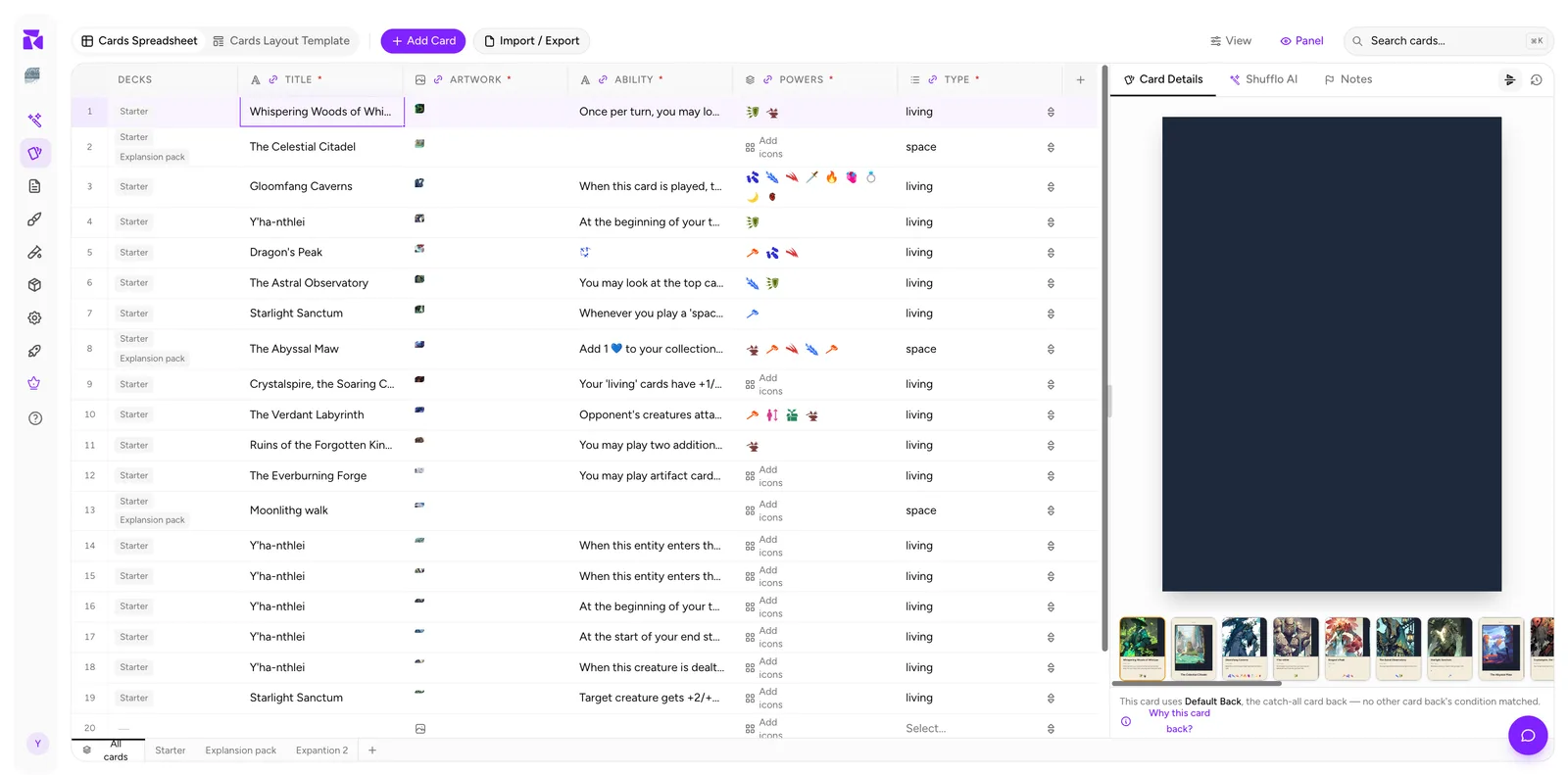
The live preview in the side panel is the proof of your work: the selected item, fully rendered, exactly as it will export and print. It follows the active collection, so the same space previews a card, board, token, die face, or other game component.
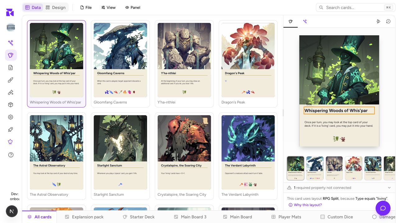
What's in the panel
Top to bottom:
1. The rendered item
The selected row or gallery item, drawn through whichever layout its conditions selected. It re-renders the moment you commit an edit in Data: change a title, press Enter, and watch it update.
2. The filmstrip or gallery selection
A card collection has a horizontal filmstrip in grid order, following the current collection, search and filters. Gallery-first components use their thumbnails as the navigator instead. In both cases, click an item to inspect it and scan for a visual outlier before proofing.
3. The connection warning (when applicable)
⚠ 1 required property is not connected to RPG Split: Type
4. The resolution line
This card uses layout RPG Split, because Type equals "living".
Plus a Why this layout? link.
Component faces
When the active component has more than one face, a face switcher appears in the preview. Cards, boards, mats, tokens and meeples use Front and Back; screens use Outside and Inside; dice use numbered faces.
The preview switches to that face. Each face resolves through its own condition list, and the explanation line changes to match:
This item uses Default Back, the catch-all layout for this face: no other layout's condition matched.
Switch back to return to the first face.
Why this layout?
When the wrong design shows up, click Why this layout?:
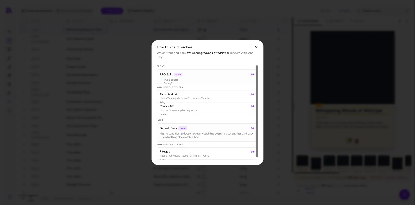
The resolution dialog breaks down the active component faces separately: the layout in use and the condition it matched, then WHY NOT THE OTHERS, every rejected layout with its reason and an Edit link.
If another layout also matches, the dialog calls out that the higher-priority layout won. A layout can therefore match a card in editor counts without being the layout that finally renders it. If you want the other design, raise its priority; if no layout matches, create or repair an unconditional default. A project with no usable back layout can legitimately show a plain dark back.
Full detail in Conditions.
Preview inside the layout editor
The side panel previews one item at a time while you edit data. Preview mode in the Design tab does the reverse: one layout, stepping through many items:
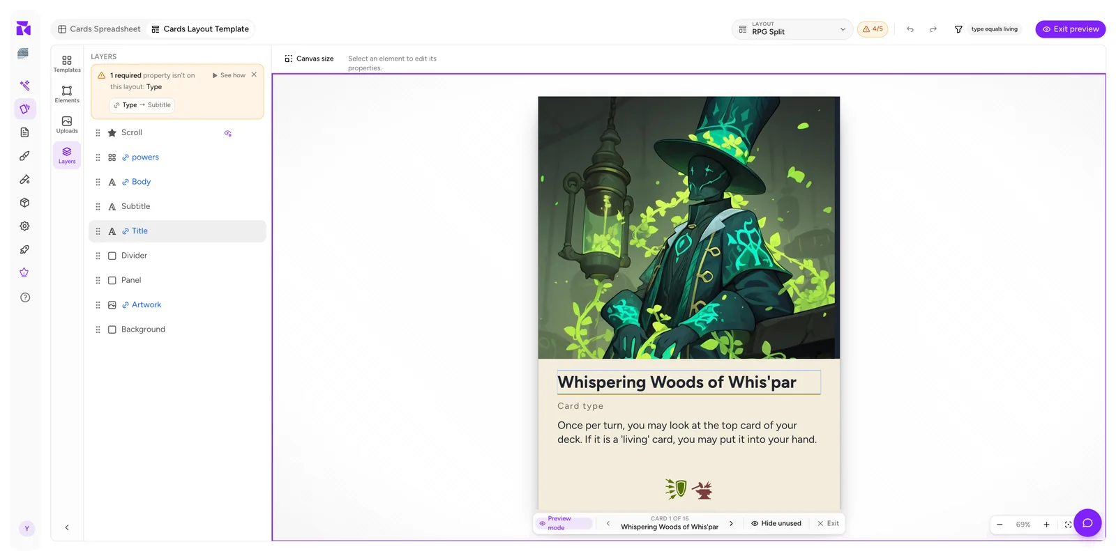
The bottom bar gives you ‹ ITEM 1 OF 16 ›, a Hide unused toggle and Exit. It only walks the items whose values match this layout's condition.
That count is a useful design set, not a final print count. Some of those cards may be claimed by a higher-priority layout when the project resolves the full priority list.
Use the side panel while writing component data. Use Preview mode while designing the face.
Making the preview bigger
Click Panel to collapse the side panel when you're doing data entry, and again to bring it back when you want to see results. On a laptop that toggle is the difference between five visible columns and eight.
Getting a real proof
The panel render is accurate, but before a print run take the extra step:
- Import / Export → Card Images (PNG / SVG)... and export a few cards at full resolution. See Import & Export.
- Or PDF Print Sheet... and print one page at 100% scale on paper.
Text that reads fine at panel size can be too small in hand, and that only becomes obvious at 1:1.