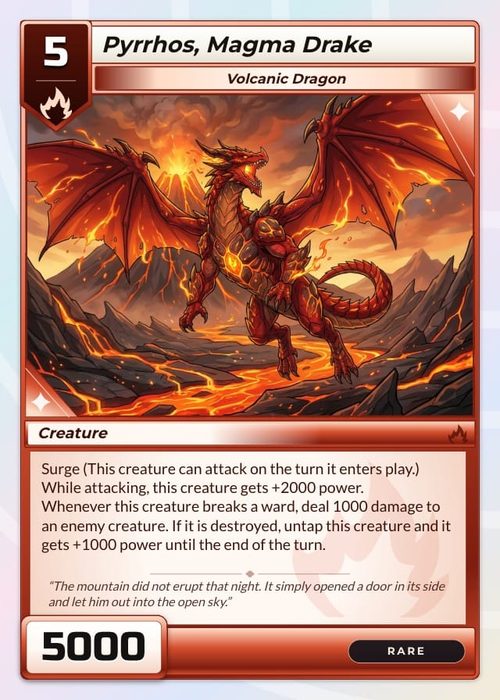
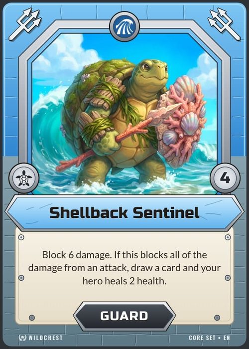
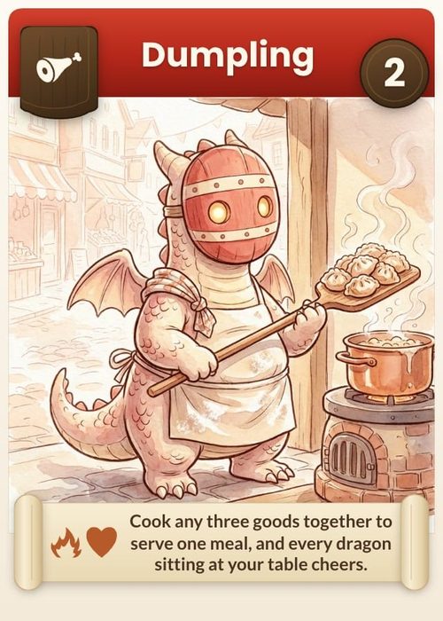
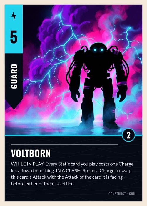
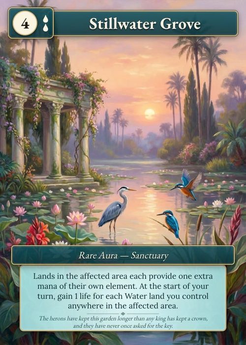
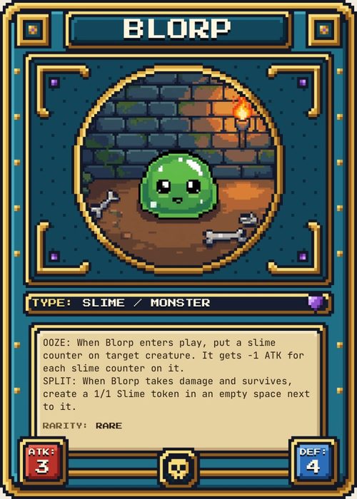
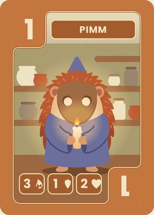
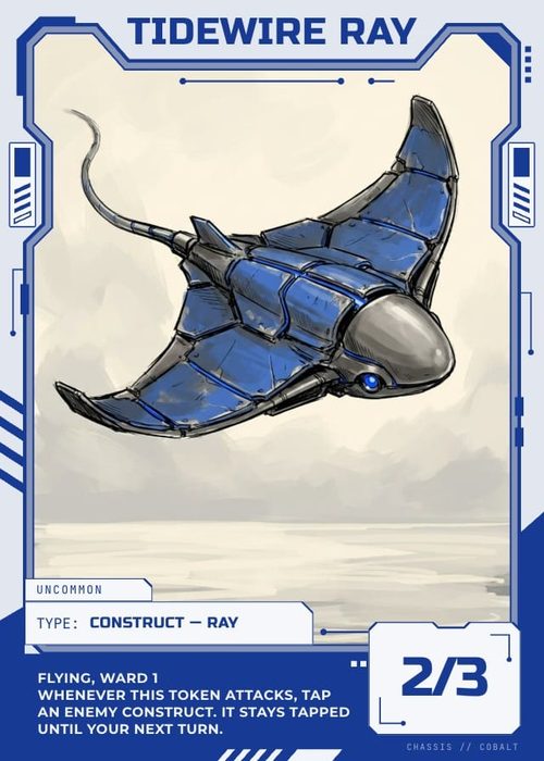
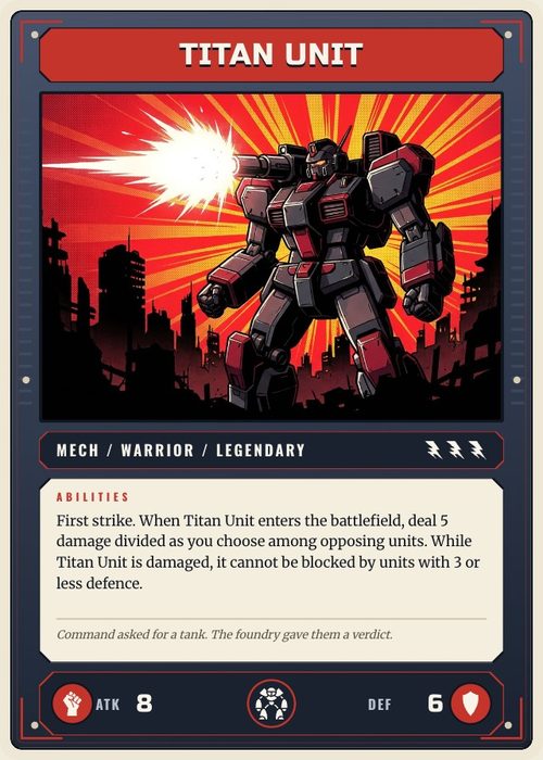
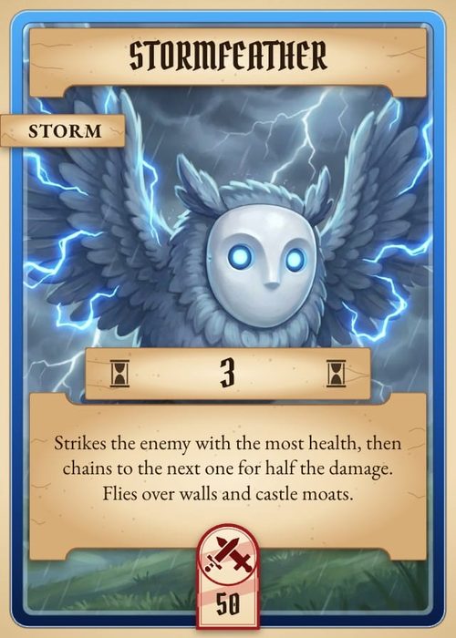
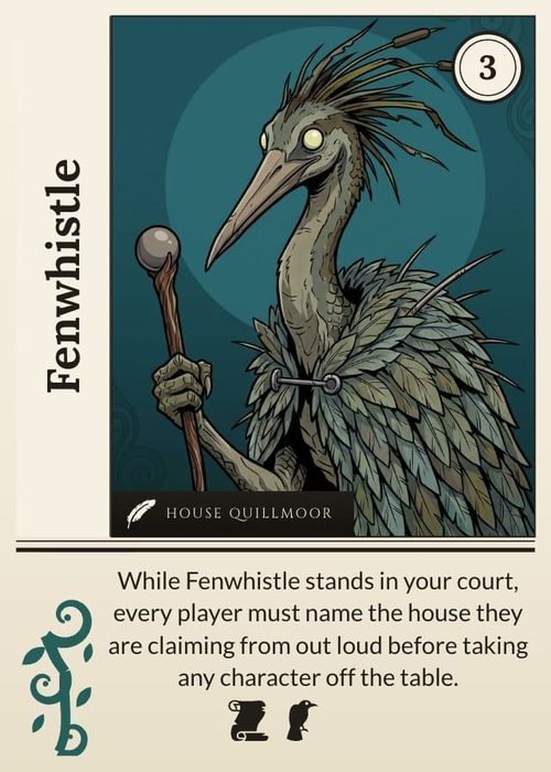
A layout is a reusable design for one component face: background, frames, text blocks, art windows, icon strips and guides. The active collection's data flows into it.
Open it with the Design tab at the top of the workspace.
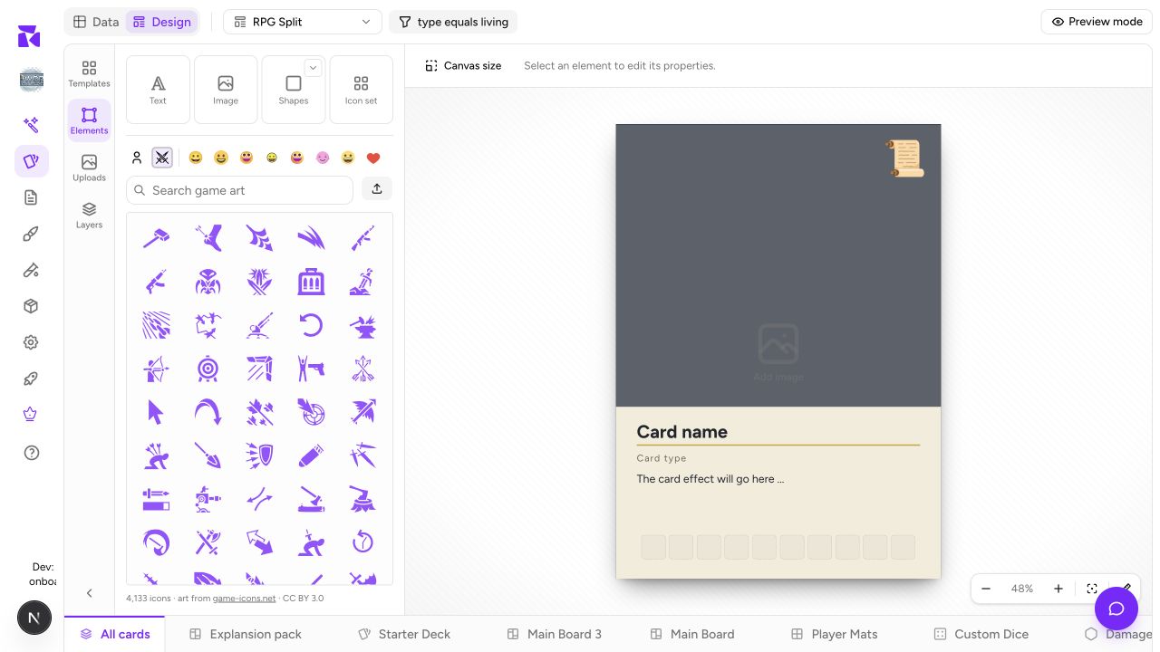
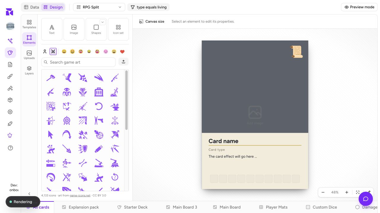
The layout editor works best on a desktop-sized screen, but a phone can edit too: tap a layer to change its text, style or data connection, nudge it, and reorder layers. Dragging and resizing on the canvas need a mouse, so if you are designing from a phone, do the data pass and the fine edits there and the big moves on desktop.
The editor at a glance
Left rail: four panels
| Panel | Contents |
|---|---|
| Templates | Ready-made designs and packs, and your own layouts behind a switch |
| Elements | Things to add: Text, Image, Line and Icon set, then shapes, line styles and image frames, plus an icon browser (Emoji, Game art, Your icons). One search covers all of it |
| Uploads | Your own uploaded assets |
| Layers | The stacking order of everything on the current layout |
Canvas: centre
The active component face at working size. Zoom controls sit bottom-right (minus / % / + / fit).
Header
- The layout and face selector only offers layouts for the active component type. A card collection shows Card Front and Card Back; a die shows Face 1 through its final face; a box shows its Outside face.
- Condition is the rule that decides which items use this layout. See Conditions.
- Preview mode swaps placeholders for real component data.
The connection indicator and undo/redo controls appear when they are relevant to your current selection and edit history. The important boundary is type safety: a board layout never appears in the card selector, and a die face cannot be mistaken for a card back.
Switching and creating layouts
Open the layout and face selector in the editor header:
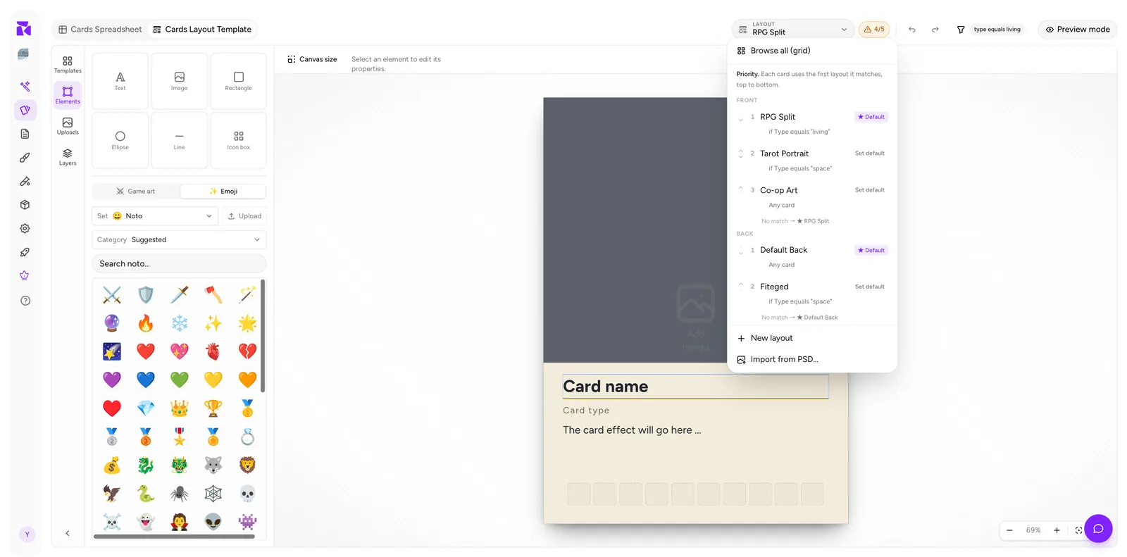
Layouts are grouped by the active component's valid faces and numbered by priority. Each row shows its condition (if Type equals "living") and whether it's the starred Default. The selector is type-aware: it cannot show a board layout while you are designing cards.
From here you can also:
- Browse all (grid): a visual picker instead of a list.
- New layout: start a fresh design.
- Import from PSD…: bring in a Photoshop file as a layout.
The Templates panel
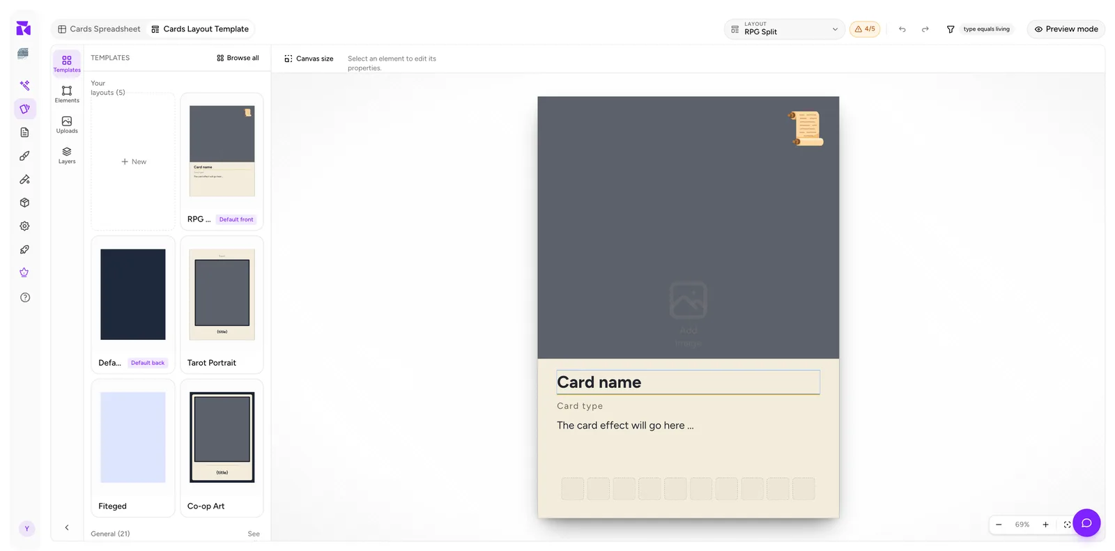
A switch at the top flips the panel between two views.
Templates, ShuffleKit's ready-made designs:
- A search field that matches names, descriptions, pack names and genres.
- Starters: single designs to build from, with ones for your project's genre first. It shows four; See all opens the full grid.
- Packs: one row per set, such as Rumpus or Orrery. Click a design to add just that one, or Use pack to add the whole set. A pack brings its card back and the rules that give each kind of card its own front, and in a project with no columns yet it also brings its columns and a few sample cards.
Your layouts, the ones in this project:
- Every layout for this collection, with
Default front/Default backbadges. - New: a blank layout.
- Browse all: the full-window grid, with the same Templates and Your layouts views. There, each pack is a card you can open to see all its designs.
Starting from a template and stripping it back is usually faster than starting from an empty canvas.
When you apply a template, ShuffleKit can try to bind its elements to your existing properties. Use that option when the property names and element roles already line up; leave elements unbound when you want to choose the connections yourself. Either way, review the connection counter afterward because a template may not find a property for every slot.
Adding and editing elements
- Open Elements in the left rail.
- Click a tile, such as Text, a shape, a frame or an icon, and it drops onto the canvas. You can also drag it to where you want it.
- Drag to position; drag the handles to resize.
Selecting an element swaps the top toolbar for its property controls:
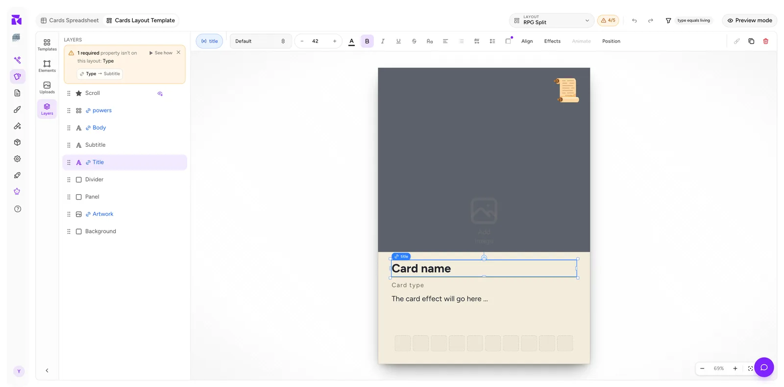
For a text element that's: the binding pill (title, see below), font family, size, colour, bold / italic / underline / strikethrough, case, alignment, spacing, plus Align, Effects and Position groups (an Animate group is there too, marked coming soon). At the far right: duplicate and delete.
The binding pill
The most important control on that toolbar is the leftmost pill. It shows which property the element pulls its value from, title in the screenshot.
- A solid pill means the element is bound to a property.
- A dashed pill means it isn't: it will show its static fallback text on every card.
Click it to open the CONNECT DATA popover. Full detail in Connecting Properties to a Layout.
Layers
The Layers panel lists every element top-to-bottom in stacking order. Drag the grip handles to restack.
Elements bound to a property show in blue with a chain icon (powers, Body, Title, Artwork in the screenshot); unbound ones are plain (Subtitle, Divider, Panel, Background). It's the quickest way to audit a layout for missing bindings.
Preview mode
Placeholder text is useless for judging whether real card names actually fit. Click Preview mode:
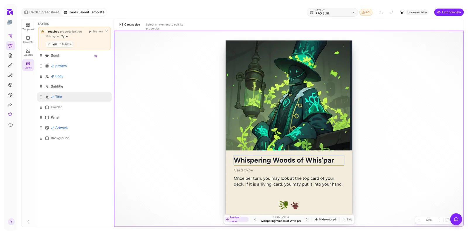
The canvas fills with a real card, and a navigator appears at the bottom: ‹ CARD 1 OF 16 ›, Hide unused, Exit.
Step through every card before you commit to a font size. Long names, empty ability fields and five-icon power strips are exactly the cases that break a design, and they only show up here.
Click Exit to return to editing.
Component faces
Faces are layouts too. Cards, boards, mats, tokens and meeples can use Front and Back; screens use Outside and Inside; dice use numbered faces; boxes and score pads use their single printable surface. Create each face from the same selector, and give it conditions when different items need different designs.
Canvas size
Canvas size is the size shown in the header, next to the layout picker. Click it to set the active component dimensions, whatever is selected. Right-clicking an empty part of the canvas and choosing Canvas size… opens the same panel. It begins with the physical size chosen in the component catalog. Set it before you build: elements keep their absolute positions when the canvas changes, so a finished layout can become scattered and need manual repositioning. If you are printing, choose the intended product size before you start; see Print & Ship.
For a complete first-layout sequence, including the recommended order for sizing, binding and previewing, see Layout Editor: A Full Tour.