The building blocks you place on a component layout, and the controls for making them look right.
The element types
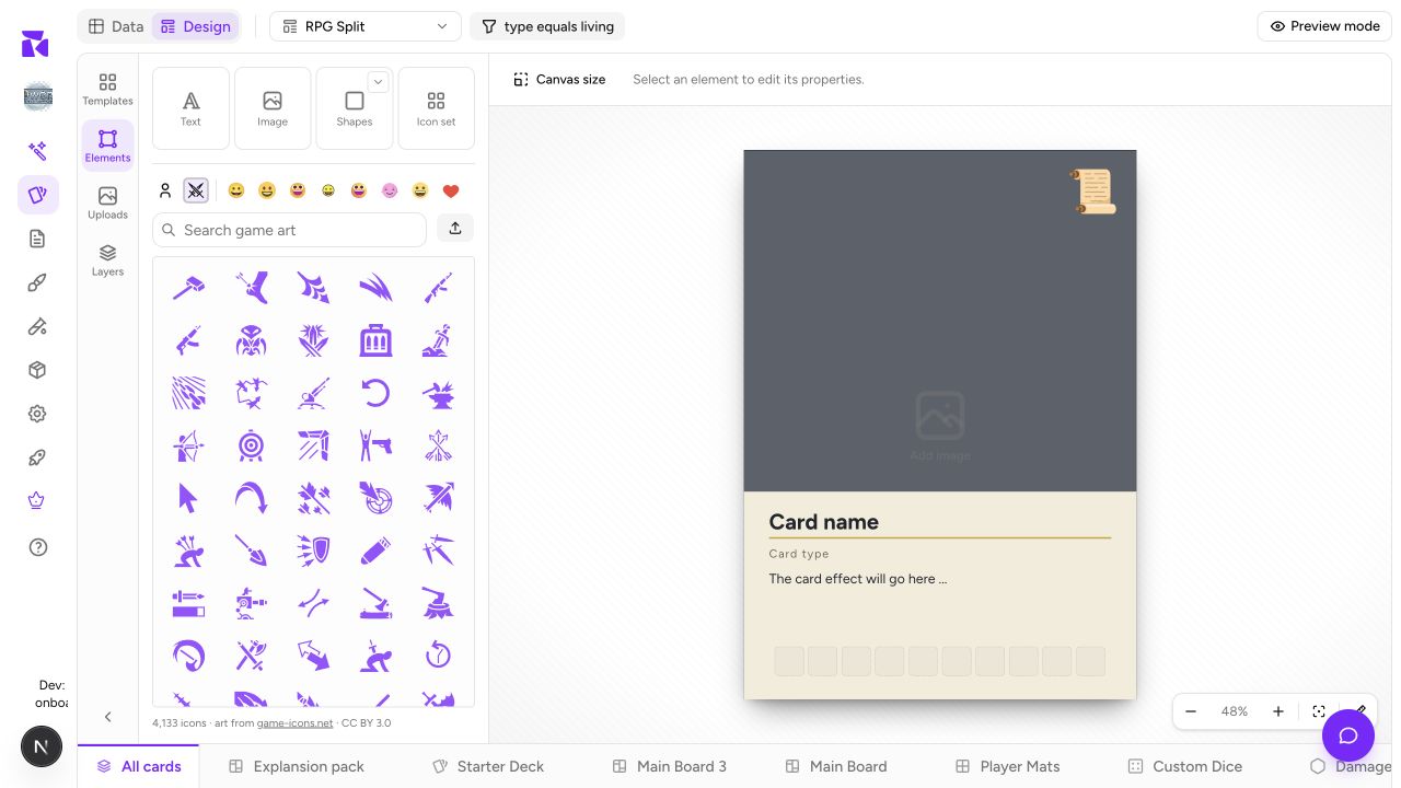
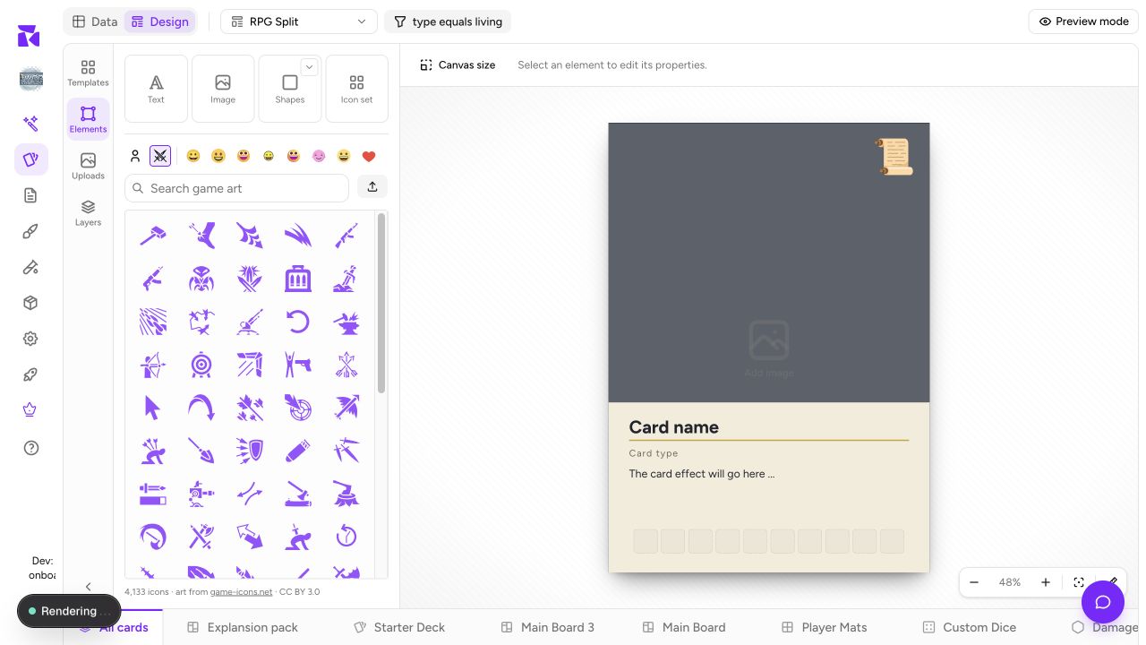
Open Elements in the left rail and click Text, Image, Line or Icon set to add it to the active component face. Below them are Shapes, Lines (dashed, dotted and arrows) and Frames, which are image slots already cut to a circle, hexagon or another shape. Click a tile to drop it in the middle, or drag it to place it exactly. The search box at the top looks through all of them and the icon library at once, and the shapes, lines, frames and icons you added last are kept under Recently used.
| Element | Use for | Binds to |
|---|---|---|
| Text | Names, labels, rules text, flavour, numbers | Text content: Text, Number, Select, Yes/No, Color. Text colour: Color or Select |
| Image | Artwork, diagrams, set symbols, logos | Image |
| Rectangle | Panels, text backgrounds, colour blocks, borders | Fill and stroke colour: Color or Select |
| Ellipse | Cost bubbles, badges, roundels | Fill and stroke colour: Color or Select |
| Line | Dividers and rules | Fill and stroke colour: Color or Select |
| Icon box | A slot for a card's own list of symbols | Icon list |
Plus one more that isn't in the tile grid: clicking any symbol in the icon browser below the palette adds a single icon element, which binds an Icon property and a per-card tint colour.
Rectangle, Ellipse and Line carry no content, but they are not inert: their fill and stroke both bind, so a faction-coloured card, a board region, or a token face can share one layout rather than needing a design per value. Everything on this list can be bound in some way.
Text elements
Select one and the context bar becomes a full type toolbar:
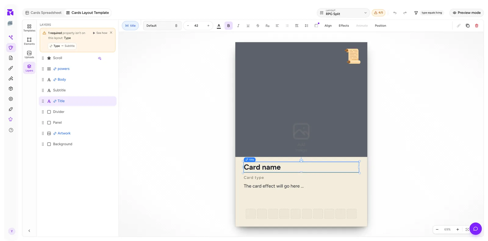
Left to right: the binding pill, font family, a size stepper (minus / value / +), text colour, B / I / U / S, letter case, alignment, line and letter spacing, then the Align, Effects, Animate and Position groups, and finally duplicate and delete.
Animate is greyed out. It's a placeholder for a feature that isn't built yet, not something you've configured wrongly.
Sizing text for real data
The single most common layout mistake is sizing type against the placeholder. Card name is short; Whispering Woods of Whis'par is not.
Turn on Preview mode, step to the longest value in your set, and size for that. If the longest name genuinely can't fit at a readable size, the fix is usually a wider text box or a shorter name, not a smaller font.
Image elements
Bind an Image element to an Image property and each item renders its own artwork.
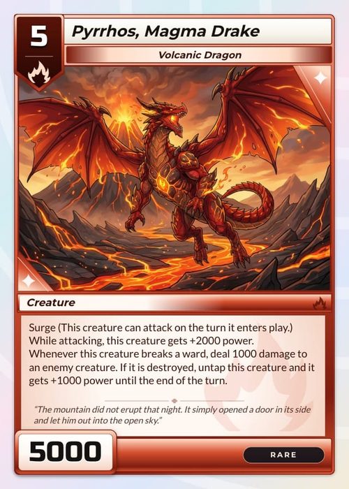
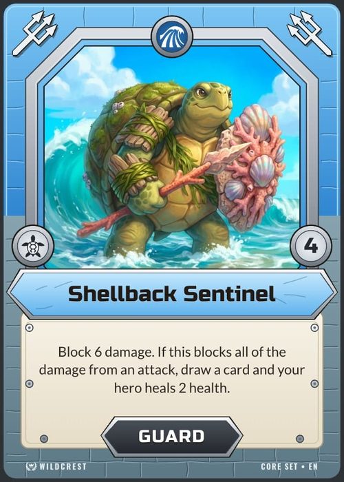
Worth knowing: an artwork element is often the full card size, with the text panel drawn over its lower half. That's why the Layers order matters. The art isn't cropped; it's covered.
For per-item framing adjustments, the crop is set on the item, not the layout: in Data, use the image cell's ⋮ → Adjust framing…. See Properties & Columns.
Icons
One icon browser sits under the element palette. A strip of swatches along the top picks the source, and a search field runs across whichever one is active:
- Your icons: SVGs and images you add with the Upload button beside the search field, reusable across the project.
- Game art: a library of game-oriented symbols (swords, shields, elements).
- Emoji: after the divider, eight swatches for the same emoji in different styles (Noto, Twemoji, Fluent, OpenMoji and more). Switching between them changes the look, not which symbols are on offer.
With nothing typed, each source lists everything it has, with game-relevant symbols first. Search filters that list.
There are two different ways icons reach a card, and it's worth being clear about which you want:
Fixed icons: placed directly on the layout. Identical on every card that uses it. Good for a set symbol or a decorative flourish. Give one an Icon binding and it can vary per card too, along with a bound tint colour.
Data-driven icons: an Icon box bound to an Icon-list property. Each card supplies its own symbols from the spreadsheet, and the box arranges however many there are. This is what you want for costs, keywords and power strips.
When designing an icon box, size it for the maximum number of icons any card carries, then check with Preview mode. An eight-icon card on a three-icon strip is a classic proof-stage surprise.
Uploads
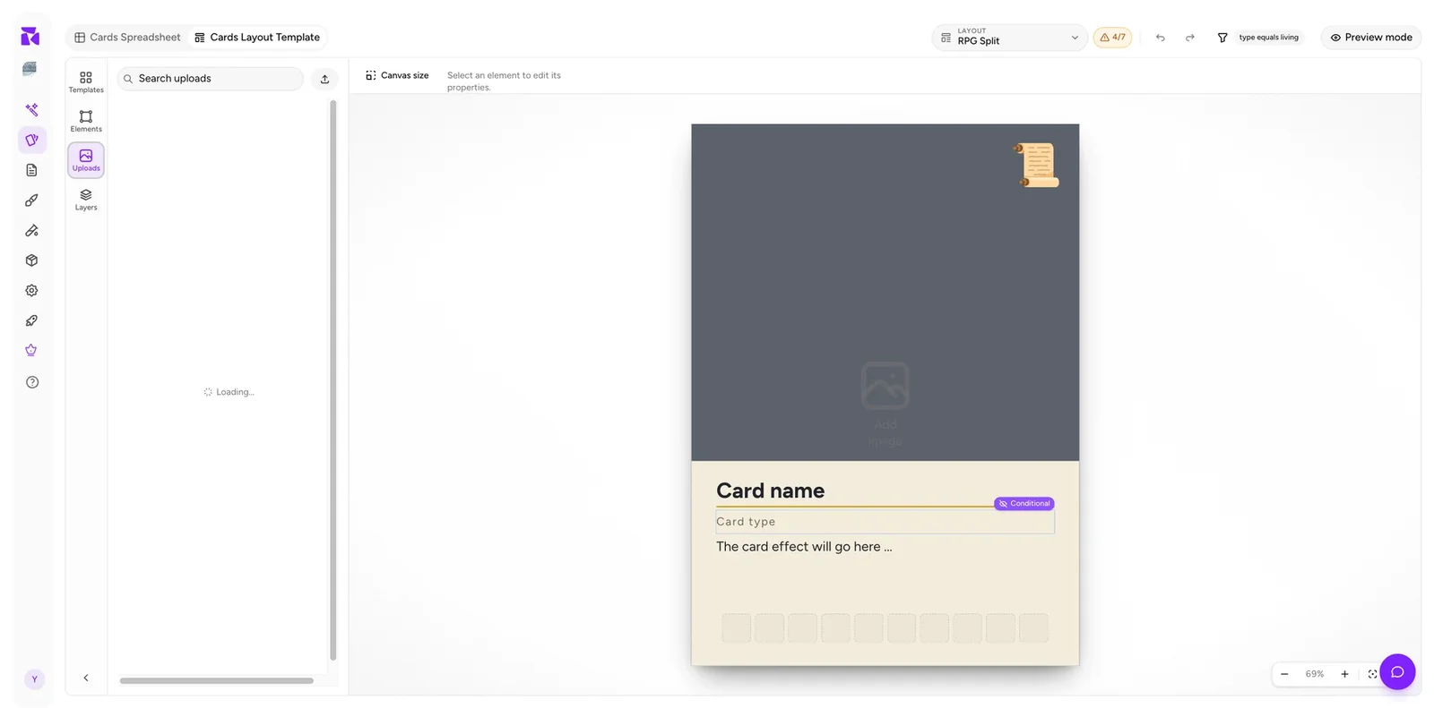
The Uploads panel holds your own image assets: logos, frames, and textures that are reusable across every layout in the project. Upload once and place many times.
Alignment and position
Align aligns the selected element (or several) against the canvas or each other. Use it rather than eyeballing: text that's one pixel off centre is invisible on screen and obvious in a printed row of cards.
Position exposes numeric X / Y / width / height. Use it when you want two elements to match exactly, or to place something at a precise offset from the card edge, especially for bleed-sensitive work. Turn on the rulers from the zoom cluster and switch their unit to in or mm when you're working to a physical measurement.
Effects
Effects covers per-element treatments: text styling and shadows for text, and shadow for everything else. Two cautions for physical cards:
- Soft shadows and glows read very differently in print than on screen. Proof before committing.
- Thin strokes can disappear at print resolution. Test at 100% on paper.
Neither applies to digital/VTT output, where you can be freer.
Canvas size
Canvas size is the size shown in the header, next to the layout picker (for example 750 × 1050 px). Click it to set the active component's dimensions. It begins with the size selected in the component catalog—Poker, a board, a token, a die face, a screen, a box, or a custom size.
Set it once, before you build. Elements hold absolute positions, so changing the canvas later scatters a finished layout rather than reflowing it. If the cards are destined for print, choose the size that matches your intended stock before you start; see Print & Ship.
Zoom
Bottom-right: minus, the current percentage, +, fit-to-canvas, and a rulers toggle with a px / in / cm / mm unit picker. ⌘minus, ⌘+ and ⌘0 do the first three from the keyboard. This is a view setting only. None of it changes the card.
Work zoomed-in for detail, then zoom to fit before judging balance. A layout that looks right at 200% is often top-heavy at actual size.
Undo and redo
In the header, beside the layout dropdown (⌘Z / ⌘⇧Z). They cover element edits within the layout you're working on.
They are not a substitute for version snapshots. Take one before restructuring a layout or reordering condition priorities, because those changes ripple across every card.