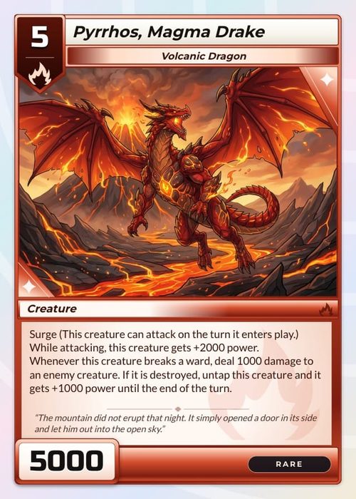
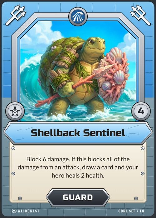
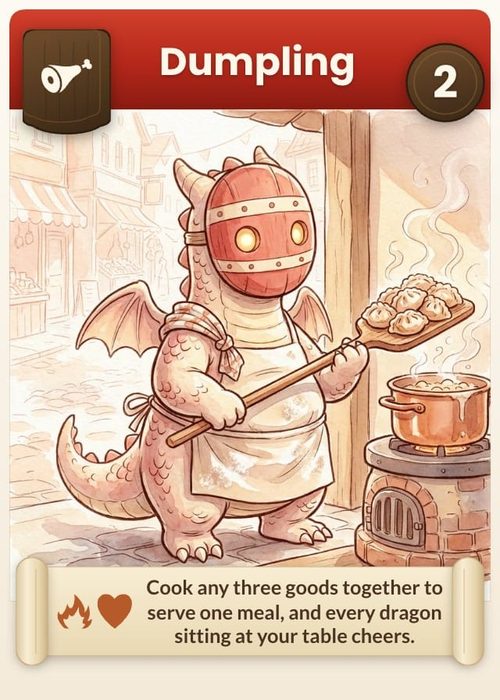
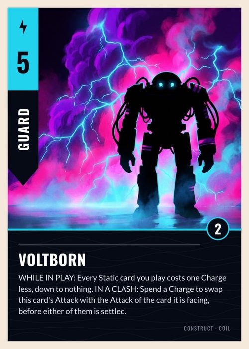
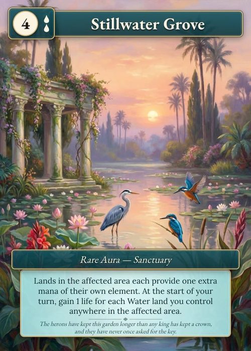
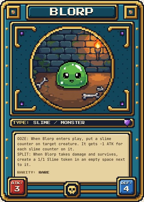
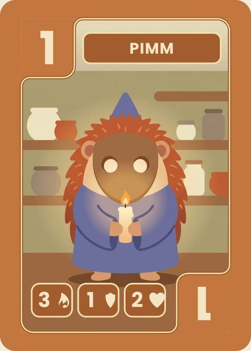
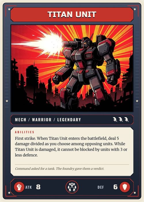
A property is one piece of data an item can carry: a card name, a board region, a token value, a die face, artwork, or rules text. In a Data grid a property is a column; in a layout it is something you can bind an element to.
Properties are scoped to the active component type. A board property does not appear as a column in your card collection, and a token layout only offers token properties to bind. Get them right early: layouts, conditions, previews and exports all read from them.
Adding a property
- Click the + at the far right of the column header row.
- Type a Column name.
- Pick a Type (see the table below).
- Optionally set a Default value, so new cards start with it filled in. (Image and icon properties don't take defaults.)
- Toggle Required if every card must have a value.
- Click Add Property.
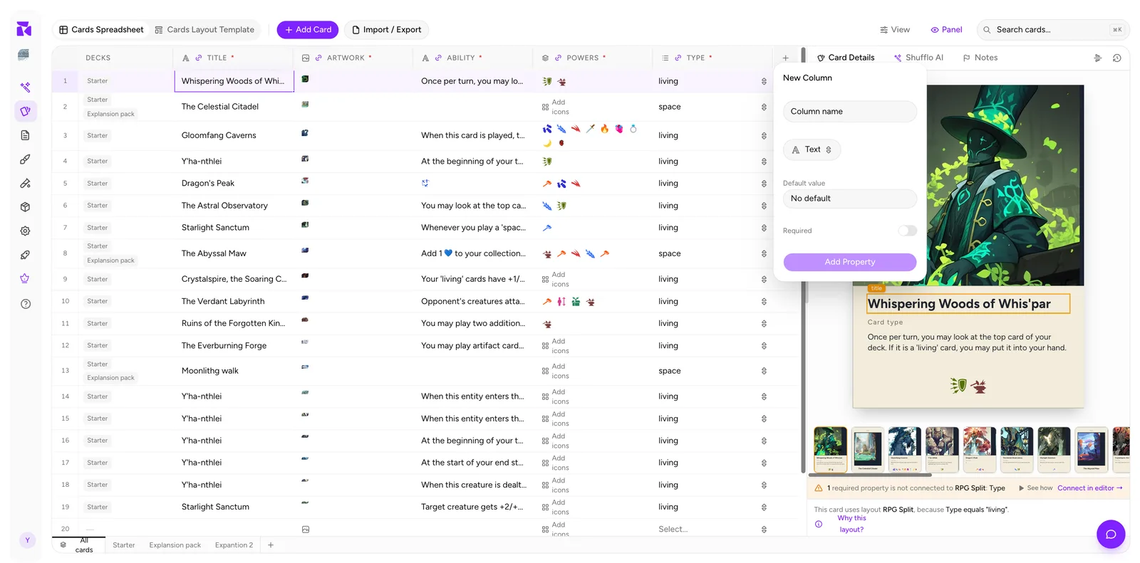
The column appears at the right end of the grid. Move it into place with Move Left / Move Right (below).
Property types
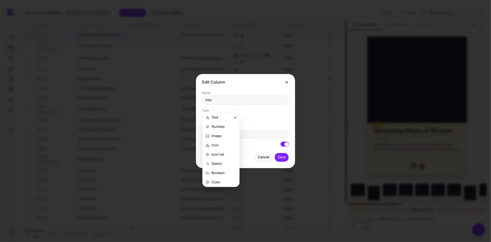
ShuffleKit has eight types. Pick the narrowest one that fits: it changes the cell editor, and it changes which operators you get in conditions.
| Type | Use it for | Cell behaviour |
|---|---|---|
| Text | Names, rules text, flavour text | Free text entry |
| Number | Cost, power, toughness, scores | Numeric entry |
| Image | Card artwork, symbols | Upload / replace / frame |
| Icon | A single symbol | One icon picker |
| Icon list | Cost pips, keyword strips | Multiple icons in order |
| Select | Card type, rarity, faction | Dropdown of fixed options |
| Boolean | Flags like "legendary" | On / off |
| Color | Faction or border colours | Colour picker |
Collection quantity is different from a Number property. QTY is a system value managed per collection, so do not add a custom quantity column just to control how many copies print. See Card Collections & Quantities.
Tip: if you plan to switch layouts based on a value ("all space cards use the Tarot layout"), make that property a Select, not Text. Fixed options mean no typos, and typos silently break conditions.
For a first card set, a small schema is enough: title as Text, artwork as Image, Type or Rarity as Select, and ability as Text. A board might instead start with region, artwork, and rules; a die can use a simple face label. Add Number, Icon, Icon list or Color properties when the component actually needs them. Every extra property is another value to keep consistent.
Select options are editable with the property. Open Edit Column, find Options, then use Add option to add a value or remove an old one. If you import a value that is not already in an existing Select property's option list, ShuffleKit adds it to that list, so scan the options after a large import for spelling variants.
Editing an existing property
- Hover the column header and click the ⋮ (column options) icon.
- Choose Edit Column.
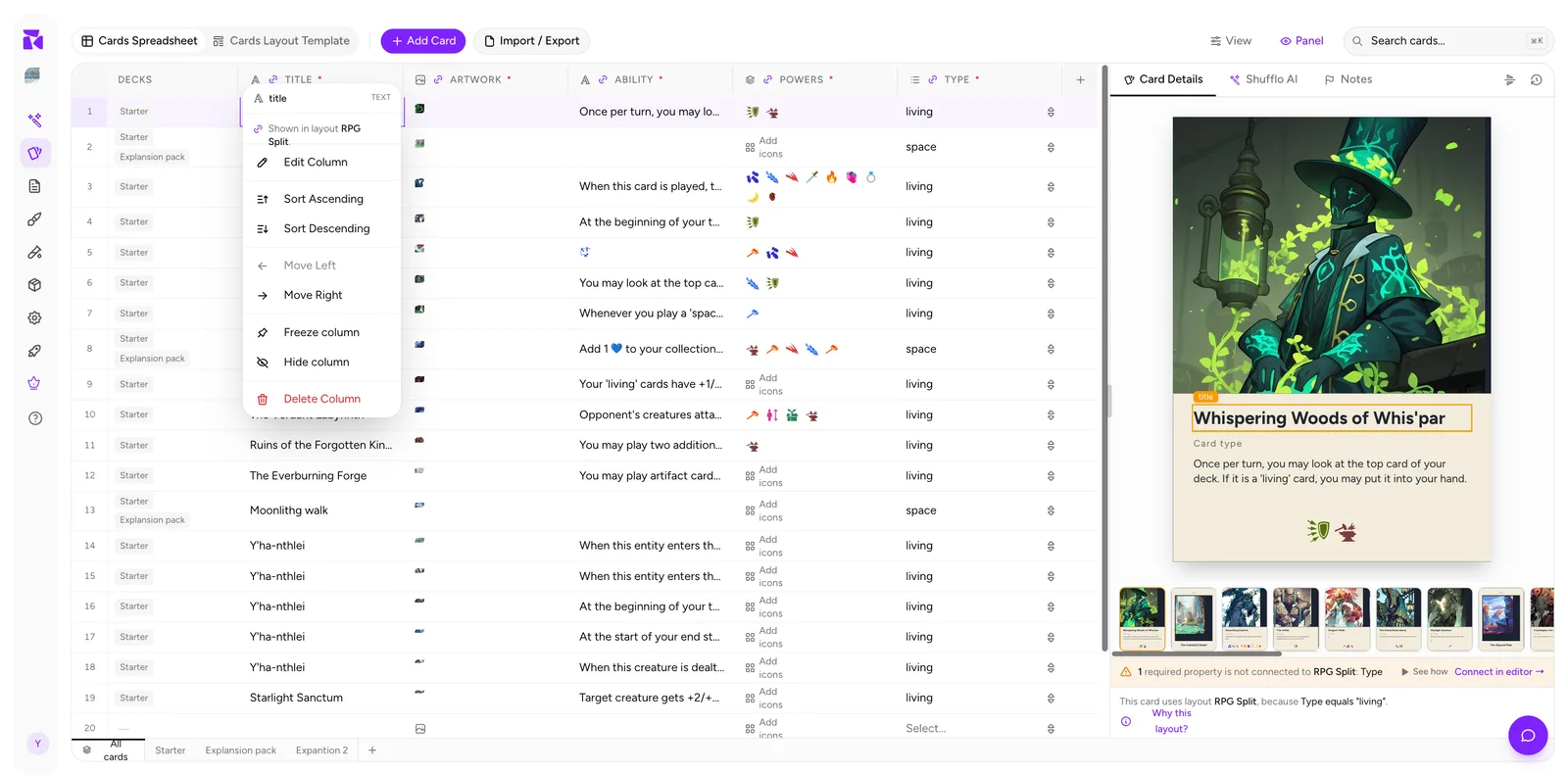
The menu also tells you two useful things at a glance: the property's type (the grey TEXT label) and which layouts it is shown in (Shown in layout RPG Split.).
In the Edit Column dialog you can rename, change the type, set a default and toggle Required.
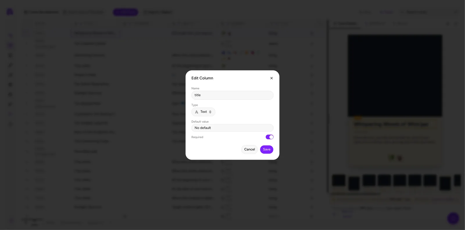
Careful with type changes. Switching a property's type doesn't convert existing values. Turn a Text column into Number and cells that aren't numeric keep showing their old text, but the moment you edit one of those cells its old value is gone. Export a CSV backup first if you're not sure.
Required properties
Toggling Required on does two things:
- An asterisk (
*) appears next to the column name. - Layouts start warning you when the property isn't connected to any element: the counter badge in the Design editor turns amber and the live preview calls out which required properties are not connected.
That warning is deliberate: a required property that isn't on the layout is data that will never reach the printed card. See Connecting Properties to a Layout.
The warning is layout-specific, not a demand that every property appear everywhere. A property used only to choose a layout, such as Type, can be intentionally unbound. If it is not meant to be printed or used by a layout, leave it optional so the connection counter does not report a false problem.
Reordering, freezing and hiding
All from the column options menu:
- Sort Ascending / Sort Descending sorts the whole grid by this column.
- Move Left / Move Right moves one position per click. (Greyed out at the ends.)
- Freeze column pins the column to the far left, where it stays visible while you scroll horizontally. One column at a time, remembered per project. Do this for
titleon wide projects. - Hide column removes it from view without deleting data. Bring it back from View → Columns.
- Delete Column permanently removes the property and every value in it. There is no undo for this.
Image cells
Image properties get their own cell menu. Hover the cell and click the ⋮:
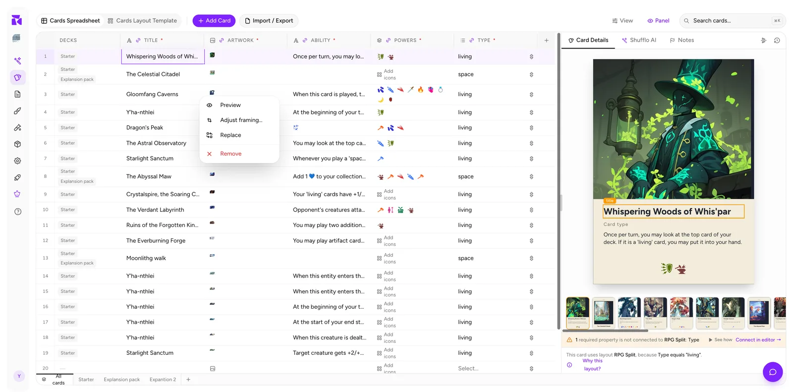
- Preview opens a full-size view.
- Adjust framing… repositions and scales the art inside its frame, without re-cropping the source file.
- Replace swaps in a different file.
- Remove clears the cell.
Empty image cells show a Double-click to upload hint. Double-clicking opens the media library, where you can upload a new file or pick one you've already added.
Column visibility is per view
The View → Columns submenu carries a note worth remembering: "Saved per view: collections follow this setup until customized." Hiding a column on All cards sets the default for card collections too, until you customise an individual collection's view.