ShuffleKit projects can hold more than cards. A collection is a named set of one component type, with the physical size and faces that type needs. Use collections to keep a card deck, a main board, token sheets, custom dice, a GM screen, and packaging in the same project without mixing their data or layouts.
Create a collection
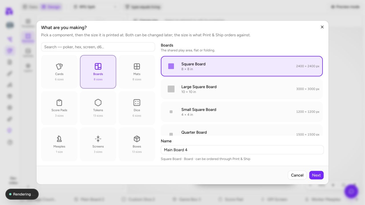
Click the + at the right end of the collection tabs (its tooltip reads New collection). The What are you making? catalog is the starting point:
- Choose a component type. The search box above the types finds a size by name, such as poker, hex or d6.
- Choose the size it will be printed at, or choose Custom size.
- Name the collection. The name field starts on a suggestion for the type, such as Starter Deck or Main Board.
- Click Next to choose a starter design when ShuffleKit offers one, then Create. Pressing
Enterin the name field does the same.
Custom size asks for Width in pixels and Height in pixels. ShuffleKit works at 300 pixels per inch, so a 3 × 3 in piece is 900 × 900.
For a card collection in a project that already has cards, a checkbox offers Add all N cards to this deck.
The size you pick is a production choice. ShuffleKit uses it to create the right layout dimensions and to match the collection to a Print & Ship product, and the line under the name says which way it went: can be ordered through Print & Ship, or export to print-ready PDF for a custom size or one TheGameCrafter doesn't make. You can change it later, but changing a finished canvas size does not reflow the design.
The component types in the catalog
| Type | Use it for | Opens as |
|---|---|---|
| Cards | Draw piles, hands, decks and player cards | Sheet (Gallery on a phone) |
| Boards | Shared play areas, including folding boards | Gallery |
| Mats | Player mats and place mats | Gallery |
| Score Pads | Tear-off score and tracking pads | Gallery |
| Tokens | Chits, tiles and standees | Sheet |
| Dice | Custom D4, D6 and D8 faces to print; D10, D12 and D20 for the playtable only | Gallery |
| Meeples | Printed worker figures | Gallery |
| Screens | Two-sided folding player or GM screens | Gallery |
| Boxes | Flat tuck-box and packaging dielines | Gallery |
View → Show as switches a collection between Sheet and Gallery, and remembers the choice for that collection.
Sizes and faces
| Type | Sizes in the catalog | Faces |
|---|---|---|
| Cards | Poker (2.5 × 3.5 in), Bridge (2.25 × 3.5), Tarot (2.75 × 4.75), Mini (1.75 × 2.5), Square (3 × 3), Large (3.5 × 5) | Front, Back |
| Boards | Square (8 × 8 in), Large Square (10 × 10), Small Square (4 × 4), Quarter (5 × 5), Half (5 × 10), Skinny (4 × 10), Bi-Fold (9 × 18), Quad-Fold (18 × 18) | Front, Back; the two folding boards print Front only |
| Mats | Square (8 × 8 in), Large Square (10 × 10), Small Square (4 × 4), Quarter (5 × 5), Half (5 × 10), Postcard (6 × 4), US Game (3.25 × 4.5), Placard (4 × 3) | Front, Back |
| Score Pads | Small (3.5 × 5.5 in), Medium (4.5 × 8), Large (8 × 10) | Front |
| Tokens | Circle chits (1, 0.75 and 0.5 in), square chits (1 and 0.75 in), square tiles (2 × 2 and 3.5 × 3.5 in), hex tiles (small, medium, large), Triangle Tile (2 × 1.75 in), standees (medium 0.75 × 1.68, large 1 × 2.25 in) | Front, Back |
| Dice | D6 (16mm), D4, D8; D10, D12 and D20 (playtable only) | One per side: 6, 4, 8, 10, 12 or 20 |
| Meeples | Printed Meeple (0.67 × 0.64 in) | Front, Back |
| Screens | Large (16 × 10 in), Medium (16 × 4.5), Small (10 × 3.5) | Outside, Inside |
| Boxes | Poker Tuck Box for 36, 54, 72, 90 or 108 cards; Bridge Tuck Box for 54 or 108; Tarot for 40 or 90; Jumbo for 90; Square for 48 or 96; Poker Booster Box | Outside (the whole flat dieline) |
Every board, mat, score pad, token, meeple, screen and box size above can be ordered through Print & Ship, and so can the D4, D6 and D8. Cards work differently: a deck picks its TheGameCrafter card size on the Print & Ship page, whatever size the collection was created at. Square, Large and custom-size card collections are marked export to print-ready PDF when you create them, but you can still publish them by picking the closest TGC size, which scales the cards. A custom size of any other type exports to PDF and images only.
The catalog only shows types ready to create. Booklets are left out for now: a project that already has a booklet collection keeps it, and it still exports and publishes.
Starter designs and gallery actions
After choosing a type and size, ShuffleKit can offer a starter design on a second step, Start your card (or board, die, and so on). It appears when the project has no layout of that type at that size yet; a second collection at a size you've already designed shares that design instead. The first starter is preselected, and No template gives you a blank canvas. A starter puts the type's normal landmarks in the right places, then you bind and style it like any other layout. This is especially useful for dice and box dielines, whose faces and printable panels are not interchangeable with a card.
Gallery-first collections are built for visual review. Click a tile to show it in the live preview; a plain click also clears any selection. Hold ⌘ (Ctrl on Windows) to add or remove tiles from the selection; hold Shift to select a range. A checkbox appears when you hover a tile and remains visible while it is selected. With a tile focused, Enter or Space acts like a click. Right-click a tile for Select, Edit fields, Edit design (or Open Design tab when nothing matches a layout yet), Duplicate and Delete. Delete asks whether to remove the item from this collection or delete it from the project, so use the collection-only option when you are only revising one component set.
The collection tab menu
Right-click a collection tab, or click the small arrow on it, for:
| Item | What it does |
|---|---|
| Rename | Edits the name in place. Double-clicking the tab does the same. Enter saves, Esc cancels. |
| Deck details… (Boards details…, and so on) | Opens the details panel, below. |
| Status | Draft, Active or Archived. The current status shows on the item. |
| Change type… | Opens the details panel on its type section. Only for flat components; dice and boxes never offer it. |
| Delete deck (Delete boards, and so on) | Asks first, then deletes the collection and its item associations. There is no undo. |
The details panel has two tabs. Details holds:
- Name (
Entersaves) and Status. - Size: choose another catalog size. The line under it says whether any of the type's layouts are now a different size; changing a collection size never resizes or reflows those designs, and Print & Ship flags any that don't match when you publish.
- Change type: pick the target type, then its size or Keep this size (W × H px). A plan lists what moves: how many items become the new type, which layouts and columns go with them, and what stays behind. Tick Copy the columns to (type) too to bring the columns along. Change to (type) asks you to confirm; nothing is deleted, and you can change the type back. A size with no TheGameCrafter product keeps the collection exportable but not orderable.
- Description and a Delete button.
History lists the collection's saved versions.
Collections keep work separate
Each collection has its own items, properties, layouts, and print scope. A board's Region property is not added as a column in your card deck, and a token layout cannot accidentally become the fallback layout for cards.
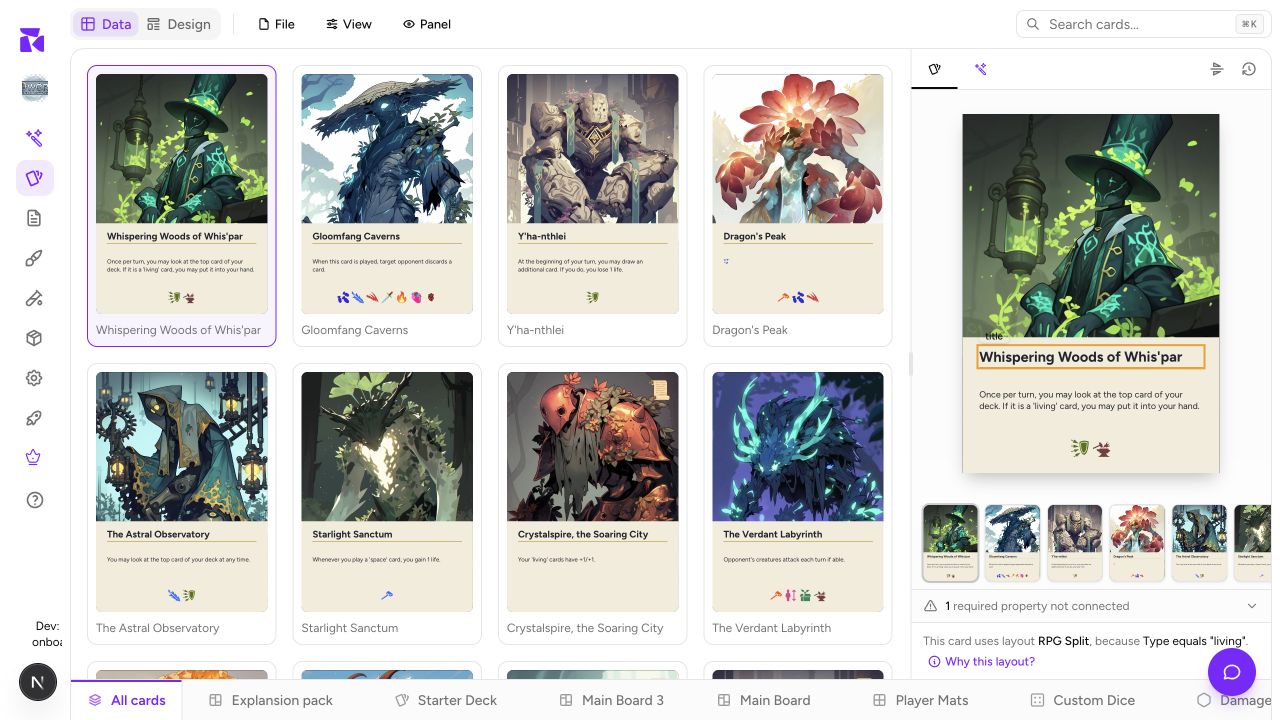
For cards, the project-wide card library remains available through All cards. A card collection is the familiar deck-like subset, with per-collection quantities. For a board, mat, die, meeple, screen, score pad, or box, the collection is the component set itself.
Faces are type-aware
The Design tab only shows layouts for the active component type and its valid faces:
- Cards, boards, mats, tokens, and meeples can have a front and back.
- Screens use Outside and Inside.
- A die uses numbered faces; a D8 has eight.
- A score pad and a box use one printable surface.
- Folding board sizes can be one-sided when that is how the physical product prints.
That means a six-face die is six coordinated designs, while one board front remains one design. The layout picker, preview, export and Print & Ship all follow the same model.
Physical previews and guides
The gallery is not always a rectangle. Circle, hex, triangle, standee, and meeple collections preview through their final cut shape. Dice render as dice and boxes stand up as boxes in the gallery, while the Design canvas remains flat because that is where you position the printable artwork.
Fold guides appear on folding boards and screens in the Design editor. They are placement guides and never print: keep important text and logos away from a crease, but do not try to draw the crease into your layout. A box canvas likewise includes the full dieline while its gallery preview hides the surrounding waste; design the flat sheet, then use the physical preview to check the result.
Slots on boards and mats
Boards and mats get a Slots section in the Design editor, beside the elements list. A slot marks a place cards snap into on the playtable. Slots are never printed or exported.
Click Add slot (it changes to Draw on the canvas… (Esc to cancel)), then drag a box on the canvas, or click once for a slot the size of the project's cards centred where you clicked. Each click of Add slot draws one slot; Esc puts the tool down. Existing slots are listed under the button; click one there or on the canvas to select it, drag it to move it, and drag its handles to resize it.
A selected slot's panel has:
| Setting | Choices |
|---|---|
| Label | Free text; starts as Slot N |
| Owner seat | None (public), or Seat 1 to Seat 6. An owned slot is a hidden zone: only that seat sees the faces in it. |
| Face | Keep as dropped, Face up or Face down |
| Capacity | A number, or empty for Unlimited |
| Rotation | 0°, 90°, 180° or 270° |
| Position & size | X, Y, W and H in pixels |
Delete slot removes it, and the × at the top deselects it. In the text fields, Enter saves and Esc drops the edit.
With a slot selected on the canvas:
- The arrow keys move it 1 px; hold
Shiftfor 10 px. ⌘/Ctrl+ arrow keys resize it.DeleteorBackspaceremoves it.Escdeselects it.
A practical project setup
Start with the pieces players interact with most:
- Make a Cards collection for the draw deck and add its card data.
- Add the Board or Mat collection players need to orient themselves.
- Add Tokens, Meeples, or Dice only once their labels and counts are known.
- Add a Screen or Box near the publishing stage, once its finished size is decided.
Rename the suggested names so each says what the set is, such as Core Deck, Forest Board or Wound Tokens. That makes the collection tabs and the Print & Ship tabs much easier to scan later.
Next, learn how card collections handle quantities in Card Collections & Quantities, or move straight to Layouts & the Design Editor to design the active component.