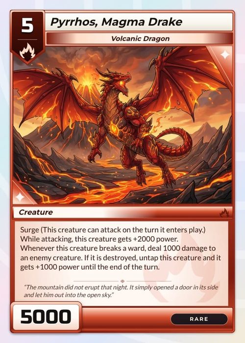
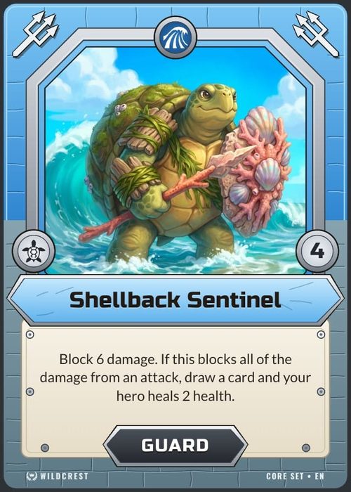
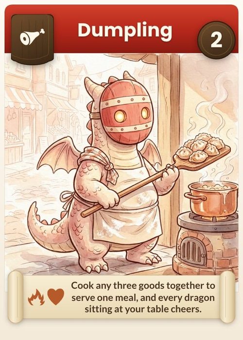
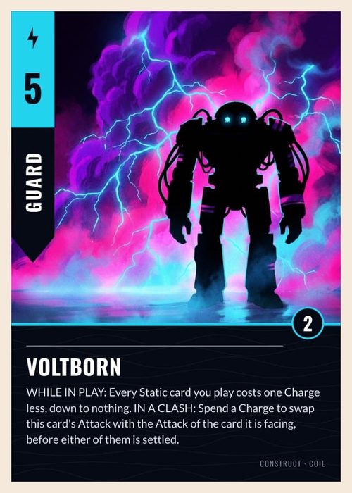
The ShuffleKit workspace is where the pieces of your game come together. Use Data to describe the items in the active collection and Design to build the layout that renders them. Cards, boards, mats, tokens, dice, screens and boxes all use the same two-part rhythm.
Start with a collection
Every project begins with a collection. A card collection gives you the familiar card grid and an All cards library; other collection types give you the data or gallery view that makes sense for the piece.
Click New collection at the end of the rail to add another component. Choose its type and physical size before you create it—the choice sets the initial canvas and the Print & Ship product match. See Components & Collections for the full walkthrough.
The quickest first pass
You do not need to learn every control before making something real. For a first card collection:
- In Data, add a Text property such as
Name, an Image property forArtwork, and a Select property such asType. - Add a few cards and give each one real values.
- In Design, choose a starter layout or begin with a blank one.
- Bind the name, artwork and any rules text to those properties.
- Turn on Preview mode and check the longest or busiest card.
For a board, mat, token or die, the sequence is the same: create the collection, give its items the properties they need, then design its valid face or faces.
The five regions
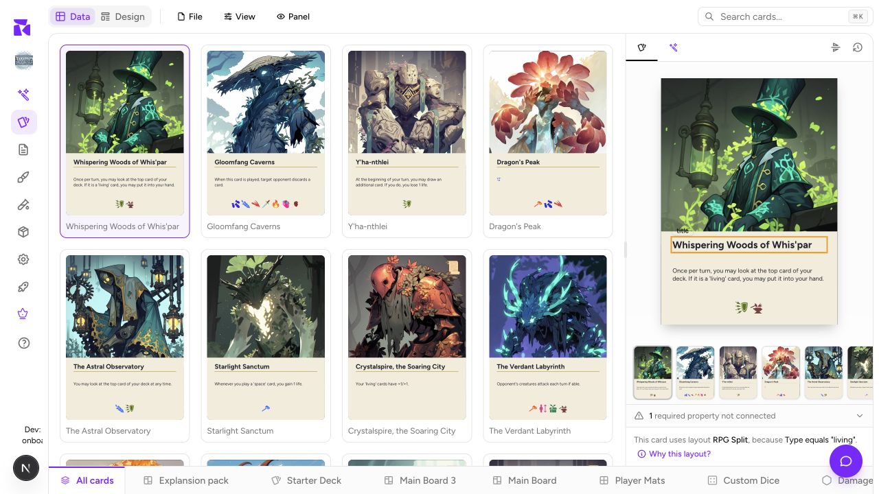
1. Data and Design
The two tabs at the top are the main mode switch:
- Data is the spreadsheet or gallery for the active collection.
- Design is the visual editor for that collection's layouts.
They show the same underlying items. Commit an edit in Data and its render updates in the preview and in Design's Preview mode.
2. The workspace controls
The top bar keeps common controls close:
- File holds import and export actions.
- View controls the way the current data view is shown.
- Panel collapses the live preview when you need more working room.
- Search finds items in the current collection.
The exact actions are type-aware. A card collection can offer card-oriented virtual-tabletop exports; a board or die collection is scoped to the component that is currently active.
3. The data view
In a card or token collection, each row is one item and each custom column is a property. The + at the end of the header adds a property. Required properties have an asterisk; the chain icon identifies a property connected to a layout element.
Gallery-first components, such as boards and dice, show rendered thumbnails by default because a handful of physical pieces is easier to review visually than as a wide spreadsheet. You can still use their properties and layouts in exactly the same way.
4. The live preview
The panel at the right renders the selected item with the layout it resolves to. Use the filmstrip to move through a card collection, and use Why this layout? when an item appears with an unexpected design.
When a component has more than one printable face, its preview can switch face. Cards, boards and mats use Front and Back; screens use Outside and Inside; dice use numbered faces.
5. The collection rail
The rail at the bottom switches the active collection. All cards is the shared card library; card collections are subsets with per-collection quantities. Other collections are separate component sets such as Main Board or Damage Counters.
Click New collection to open the component catalog. The rail only changes what you are working on—it does not move or merge the data belonging to another component type.
The mental model
| Concept | Lives in | Answers |
|---|---|---|
| Collection | Bottom rail | Which game piece am I working on? |
| Properties | Data | What data does this item carry? |
| Layouts | Design | What does this component face look like? |
| Conditions | Attached to layouts | Which layout renders this item? |
An item is the intersection: its property values flow into the layout selected for its component type and face. Once that clicks, cards and the rest of your game pieces follow the same predictable workflow.
Keyboard shortcut
⌘K (Ctrl+K on Windows) jumps straight to search in the active collection.