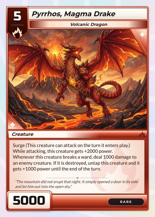
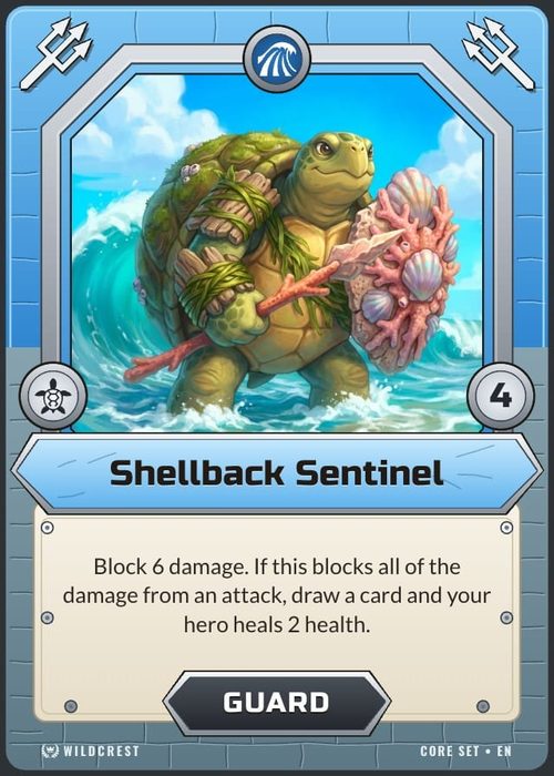
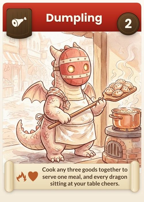
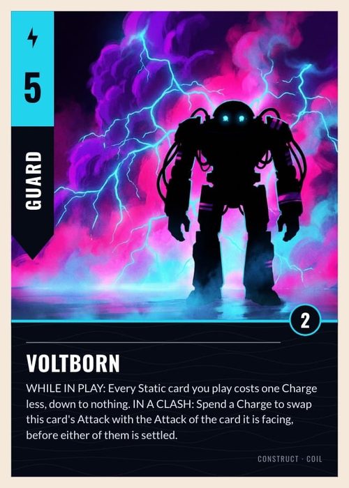
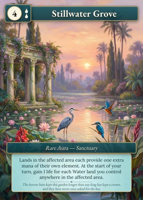
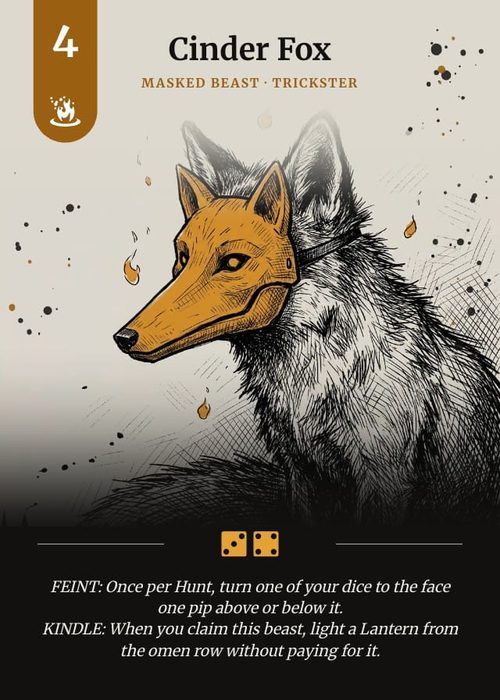
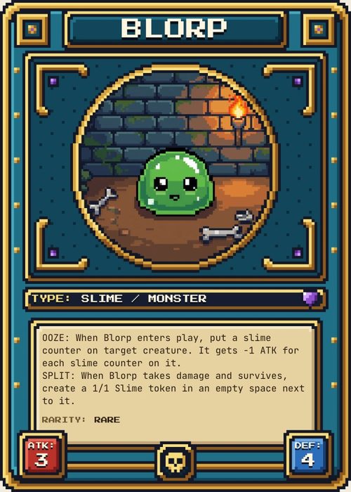
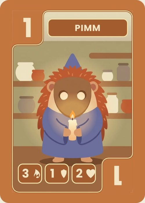
Most card games speak in symbols: a cost written as three flames, a faction emblem in the corner, a sword in the middle of a rules sentence. ShuffleKit stores those symbols as card data, the same as a name or a number, so each card carries its own and one layout draws them all. Use this page when you set up cost strips, keyword icons or faction symbols, when you want a sentence of rules text to contain an icon, or when you need to change a symbol across a whole game at once.
Three ways an icon reaches a card
Pick the one that matches what the symbol does:
| You want | Use | Where it's drawn |
|---|---|---|
| One symbol per card, such as a faction emblem or a card-type mark | An Icon column | A single icon element on the layout, connected to the column |
| Several symbols in a row, such as a cost of 2 flames and 1 drop | An Icon list column | An Icon set on the layout, connected to the column |
| A symbol inside a sentence, such as "Deal 2 {sword}" | An icon token in a Text column, written {{icon:…}} |
Wherever the text is drawn |
A symbol that is the same on every card, such as a set mark, doesn't need a column at all: place it on the layout from the icon browser in the Design editor's Elements panel. See Elements & Styling.
Icon and Icon list columns
Add a column with the + at the far right of the sheet's header row (Add property), name it, and choose Icon or Icon list as its Type. You can also turn an existing column into one with Edit Column in the column's menu. Neither type takes a default value. Both are on every plan.
An Icon cell
An Icon cell holds one symbol and, optionally, a colour for it. An empty cell shows a small star. Double-click it (or select it and press Enter) to open Edit icon:
- The icon picker fills the dialog. Click a symbol to put it in the cell; the dialog stays open, so you can click another to swap.
- Once the cell has an icon, a row at the top shows it with a colour swatch beside it. Pick a colour there to tint the icon on this card only. The hex code shows next to the swatch, or
autowhen the icon has no colour of its own and draws in whatever colour the layout gives it. Reset clears the colour. - The × at the end of that row (Remove icon) empties the cell.
Swapping the symbol keeps the colour you set. Close the dialog when you're done; every pick is saved as you make it.
An Icon list cell
An Icon list cell holds an ordered list of symbols, each with its own colour and a count. In the sheet it shows the glyphs in order, with a small ×3 after any symbol whose count is above 1. Light-coloured symbols sit on a dark chip so they stay visible. An empty cell reads Add icons.
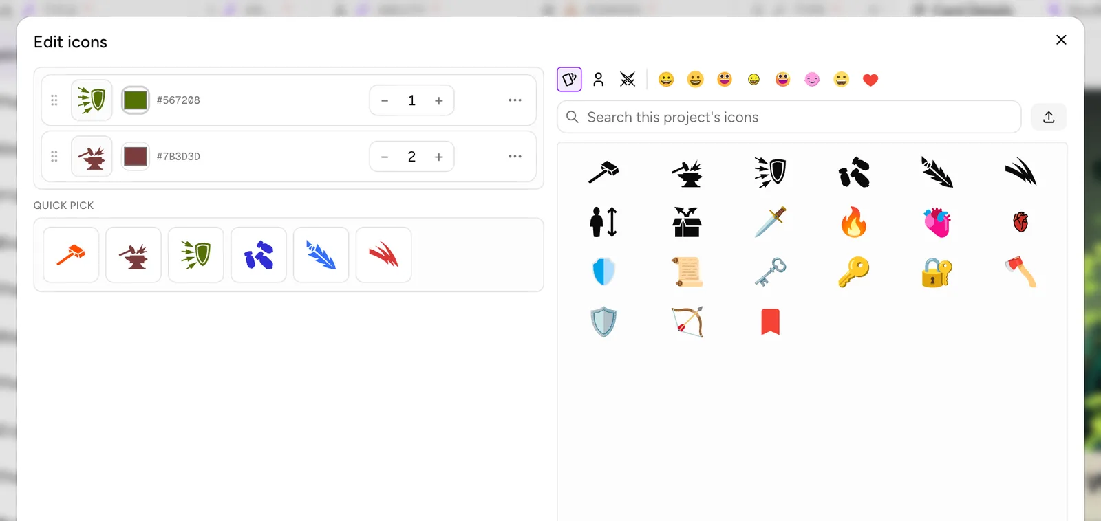
Double-click it to open Edit icons. On a wide screen it has two halves.
On the left, the card's icons, one row each:
- A drag handle (Drag to reorder) to move the row up or down the list.
- The glyph, drawn in its colour.
- A colour swatch and the hex code (
autowhen it has none). This is the colour for this icon on this card. - A count stepper,
−and+(Decrease count and Increase count), from 1 to 99. How the layout shows a count is set on the Icon set: it can draw the icon that many times or once with a ×N badge (see How an Icon set draws the list). - A × to remove the row, shown when you hover it.
- A ⋯ menu (More for this icon) with Move up, Move down and Remove.
With no icons yet the list reads No icons yet: pick from below to add. Under the list, Quick pick shows the column's presets as one-click chips, if it has any (see Presets).
On the right is the icon picker. Every icon you click is added to the end of the list. If the icon matches one of the column's presets, it takes the preset's colour. Otherwise a single-colour symbol, such as anything from Game art, starts white, and a full-colour emoji keeps its own colours.
Picking an icon
The same picker appears in every icon dialog in the app. A row of small swatches across the top picks the source:
- This project: the icons this project already uses, gathered from its column presets, its designs and its cards. It appears once the project uses any. Preset icons come first, under their preset labels, and the rest are ordered by how often they appear. The same glyph in two colours is one tile; the dialog you're in applies the colour.
- Your icons: the SVGs and pictures you uploaded. They belong to your account and work in every project (see Using your own icons).
- Game art: a library of game symbols (weapons, magic, creatures, arrows and more), all single-colour so they take any tint.
- After a divider, eight emoji styles: Noto, Twemoji, Fluent, OpenMoji, Fluent 3D, FX Emoji, EmojiOne and Flat UI. They are the same emoji drawn in different styles, in full colour.
The search field below the swatches searches the active source, with a placeholder that says which (Search game art, Search your icons and so on). With nothing typed, a category menu (All categories with a count, then the groups) narrows Game art or an emoji style. A long list shows 80 icons at a time with Load more at the end. The Upload icon button sits at the end of the search row. The picker remembers the last source you used and opens on it next time.
Icons inside text
An icon can sit inside a line of text. ShuffleKit writes it as a token, {{icon:key}}, and draws the glyph in its place on the sheet, the canvas, the preview and every export.
Inserting one
There are three places to insert an icon token:
- In a Text cell on the sheet. While you're editing the cell, a star button sits at its top right (Insert icon). Click it, pick an icon, and the token lands at the cursor.
- In the Design editor, while typing in a text box. Double-click the box to type, then use Insert an icon on the toolbar.
- In a text element's static text in the properties panel, with the star button beside Static Text (Insert an icon into this text). When the element has rich text, that button is greyed out with the hint Double-click the element to insert an icon into its rich text.
Each opens Insert icon. It has a Colour row at the top: leave it on original to keep the icon's own colours, or pick a colour to tint it (Reset puts it back). Under that, Recent lists the icons you inserted lately, with the colour you used, for one-click reuse. Then comes the full picker.
The token syntax
A token is the key, then up to two optional parts after a |: a colour and a size.
{{icon:berry}}draws the icon whose key isberry, as tall as the text, in its own colours.{{icon:berry|#c0392b}}tints it red. Any CSS colour works:#c0392b,red,rgb(192, 57, 43).{{icon:berry||1.4}}draws it 1.4 times the height of the text, in its own colours. The empty part between the two bars is the colour left out.{{icon:berry|#c0392b|1.4}}does both.
The key is the token key of one of your own icons (see Token keys). An icon from Game art or an emoji style is written with its full name instead, the set and the icon joined by a colon, which the picker fills in for you.
Size runs from 0.5 to 2.5 times the text height; a number outside that range is held to the nearest end. There is no size control in the dialogs, so type the size into the token yourself. An icon of any size stays centred on the line and doesn't push the lines above and below it apart. At large sizes it can overlap them, so raise the text's line height if it does.
A token is one unit while you edit. The cursor steps over it, and one Backspace or Delete removes the whole token, so you can't edit inside one. To change a token's colour or size, delete it and insert or type it again. A token whose key matches no icon draws nothing at all, never the raw {{icon:…}} text, so a typo shows up as a missing icon on the card.
Presets: keep symbols consistent
An Icon list column can carry a list of preset icon and colour pairs, such as Fire (a red flame), Water (a blue drop) and Nature (a green leaf). Presets make the column quicker to fill and let you change one symbol on every card in one step.
Open the column's menu (the ⋮ in its header, or right-click the header), choose Edit Column, and find Preset icons. A column with none reads No presets yet. Add icon and colour combos below, then pick them when filling cards.
- Build from icons in use, at the top right, scans every card in the project and fills the list with each icon and colour pair the column already uses. It replaces the current list. With nothing used yet, it says No icons are used in this column yet.
- Add preset opens the icon picker; the icon you click becomes a new preset. A single-colour symbol starts white.
- Each preset row has the glyph, a colour swatch and a Label (optional) field. The label is the preset's name: it shows on its chip in Quick pick and when you hover it.
The changes to the list save as you make them. Save at the bottom of the dialog applies the column's name, type and the other fields.
Changing a preset on every card
A preset is matched on cards by its icon and its colour together. Changing it changes every card that has that exact icon in that exact colour:
- Recolour. Click the preset's swatch (Recolour (applies to existing cards)) and pick a new colour. When the colour picker closes, every card with that icon in the old colour switches to the new one.
- Swap icon... in the preset's ⋮ menu (Preset actions) opens Swap icon. The icon you pick replaces the old one on every card that has it, keeping the colour and the count.
- Delete & unrestrain takes the preset off the list and turns Restrict to this list off. Cards keep the icon.
- Delete & purge takes the preset off the list and removes that icon from every card that has it.
Each of these applies at once and shows a message with the number of cards it changed and an Undo button.
A card whose copy of the icon was given a different colour in its own cell doesn't match the preset, so the preset's recolour, swap and purge pass it by. Icons added from the full picker take the preset's colour automatically, which keeps them matched.
Restrict to this list
Turn on Restrict to this list at the bottom of Preset icons to limit the column to its presets. In a restricted column's Edit icons dialog, the full picker is gone, the chips are headed Pick from list, and the per-icon colour swatch is hidden, since the colour belongs to the preset. You can still reorder icons, set counts and remove them. If a restricted column has no presets, the dialog says This column is restricted to a preset list, but none are set yet. Add presets in the column settings.
Switching the restriction on first checks the cards (the label reads Checking cards…). If some cards use an icon and colour pair that isn't on the list, Restrict to preset list opens and lists each pair with the number of cards it's on. Resolve each one:
- Add to list makes it a preset.
- Swap to... replaces it on those cards with one of the existing presets.
- Remove deletes it from those cards.
When every pair is dealt with, the dialog says All resolved. Lock the list to finish. Click Lock list. Cancel leaves the column unrestricted. Turning the restriction off needs no check.
How an Icon set draws the list
On the layout, an Icon list column is drawn by an Icon set: add one from Basics in the Design editor's Elements panel, then connect its Icons field to the column with Connect data (see Data Binding). Its settings are headed Icon box. Before it's connected, the icons you add to it are what every card shows; once connected, they become Sample icons that stand in on the canvas while no card is previewed, and each card shows its own.
The controls that decide how a card's list fits the box:
- Icon size. Auto (Shrink the icons to fit the box on one line) sizes the icons so the whole list fits in one line across the box, never taller than the box, and never smaller than 4 px. A card with two icons gets big ones; a card with eight gets small ones. Type a number of pixels instead to fix the size: every card's icons are then the same size, and icons that don't fit the box are cut off at its edge.
- Direction. Row lays the icons left to right, Column top to bottom.
- Horizontal and Vertical place the icons inside the box: left, centre or right, and top, middle or bottom. Along the direction of the list there is also Spread out, which spaces them evenly from one end to the other.
- Wrap onto more lines starts a new line when the next icon doesn't fit. It only works with a fixed size: with Auto, the switch is off and greyed out, with the note Auto size keeps the icons on one line.
- Spacing is the gap between icons, from 0 upwards (the slider goes to 64, the number field to 400).
- When an icon repeats decides what a count does. Draw it again draws a count of 3 as three icons. ×N badge draws one icon with a small ×3 on it, which saves room on a long cost.
- Icon color. Each icon's own keeps each icon's colour from the card; a box colour, if one is set, only fills in for single-colour icons that have no colour. One color paints every icon in the box's colour, overriding the colours on the cards. Picking a colour in the colour field switches the box to One color.
Size the box for the card with the most icons, then switch on Preview and step through the cards to check the longest list. With Auto, a long list shrinks rather than overflows, so watch for icons getting too small to read. The toolbar's Fit group has Trim each icon's padding, which scales each icon to its own edges so that icons from different sources come out the same size. The full list of Icon set controls is in Elements & Styling.
A single Icon element, dropped onto the layout from the icon browser, draws one symbol. Connect its Icon field to an Icon column and each card shows its own; it also has a Tint color field. If a card sets a colour on its own icon cell, that colour wins: the order is cell colour → connected colour → element colour. See Colour Cards from Your Data.
Recolouring a whole game's symbols at once
Which tool to use depends on where the colour lives:
- Icons in an Icon list column with presets: recolour the preset. Every card with that icon and colour changes, with Undo on the message. If you haven't set presets up, Build from icons in use turns what the cards already use into presets in one click, and then each one can be recoloured.
- Every icon in one Icon set: set its Icon color to One color. This is a layout setting, so it changes how the icons are drawn without touching the card data, and it applies to every card on that layout.
- A single Icon element: set its tint on the layout, or connect its Tint color to a column (see Colour Cards from Your Data). Cards whose icon cell has its own colour keep that colour.
- Icon tokens in text: each token's colour is written in the token, so there is no bulk recolour. A token with no colour draws the icon in its own colours.
Using your own icons
Upload your own symbols when Game art and the emoji don't have what your game needs. Your icons belong to your account, appear under Your icons in every picker in every project, and work everywhere the built-in ones do: Icon and Icon list cells, presets, icon tokens and the layout.
Uploading
Click Upload icon (the upload button at the end of the picker's search row). With no icons uploaded yet, Your icons also shows No custom icons yet. Upload an SVG or image to reuse it across your cards. with an Upload icon button under it. You can pick SVG, PNG, JPG, WebP or GIF files, and more than one at a time.
- An SVG is added straight away, as vector artwork that stays sharp at any size. ShuffleKit cleans it of anything that isn't drawing, and it has to be 64 KB or less after that.
- A picture (PNG, JPG, WebP or GIF) opens Crop your icon first. Icons are drawn in square slots, so you frame it to a square: drag to reposition, and scroll or use the sliders to zoom. Add icon saves the square you framed; Use original shape saves the whole picture at its own shape instead. A picture is stored at 256 pixels on its longest side, which is plenty for a symbol; for an icon printed large, an SVG stays sharper.
- Several files at once go up one after another without the crop step; hover the upload button to see how far it has got (Uploading 2 of 5…). Pictures go in whole, at their own shape.
Each file can be up to 5 MB. You can keep up to 200 icons in all, on any plan. At the limit, an upload is refused with You've reached the limit of 200 custom icons. Delete some to add more., and a batch stops there and lists the files it didn't add.
When an upload succeeds, the picker switches to Your icons so you can see it.
Removing a background
In Crop your icon, Remove background cuts the subject out of the picture. It runs in your browser, so the first time it downloads its model (Loading the model… 40%). Restore background puts the original back. You can try the cut-out on any plan. On Free, keeping it turns Add icon into Upgrade to save, which opens the upgrade offer; background removal is part of Hobby, Indie and Professional. To keep going on Free, click Restore background and save the picture as it was. If the tool can't find a subject, it says Couldn't find a clear subject in that image.
Token keys
Every uploaded icon gets a token key, made from its file name: berry.svg becomes berry, and a second icon with the same name becomes berry-2. That key is what you write in text: {{icon:berry}}.
To see or change it, hover the icon in Your icons and click the small {} badge at its top left; its tooltip shows the current token, such as Token: {{icon:berry}}, or reads Set a token key. That opens Token key, How this icon is written inside text. Renaming the icon itself doesn't change it. Type the new key, using lowercase letters, numbers and dashes only. Under the field, the dialog shows the token as it will be written and how many cards and layouts in how many projects use it. Click Save: every token that used the old key is rewritten to the new one, and the message says how many it rewrote.
Deleting your icons
Hover an icon in Your icons and click the red × at its top right (Delete {name}). It's deleted straight away, with no confirmation and no undo, from every project. Icon lists and icons placed on a layout keep the drawing they saved when you picked them. An Icon cell or an icon token that points at the deleted icon draws nothing.
On a phone
The icon dialogs open as sheets from the bottom of the screen. Edit icons stacks its halves: the card's icons and Quick pick first, the picker under them. Each icon row's remove button is always shown, since there is no hover, and the buttons are bigger to tap. On the sheet, a cell opens for editing on a second tap rather than a double-click. In the Design editor on a phone, a single icon's toolbar has Icon (to swap it), Colour and Flip, and an Icon set's has Icons (Sample icons once it is connected), Colour, Size, Arrange and Flip.
Common problems
- An icon token shows nothing on the card. Its key matches no icon. Check the spelling against the
{}badge in Your icons, or delete the token and insert it again from the picker. - A preset recolour missed some cards. Those cards gave the icon a different colour in the cell, so they no longer match the preset's icon and colour. Fix them in the cell, or restrict the column so colours can only come from presets.
- The icons on a card are tiny. The Icon set is on Auto and that card has a long list. Make the box larger, switch on Wrap onto more lines with a fixed size, or use ×N badge so repeated icons take one slot.
- The last icons are cut off. The Icon set has a fixed size and more icons than fit. Turn on Wrap onto more lines, make the box bigger, or switch the size to Auto.
- A tint doesn't change a card's full-colour emoji. On a single Icon element, a tint from the layout or from a connected column recolours a card's icon only when it is a single-colour glyph (or the element's own icon), so a multi-colour emoji keeps its colours. A colour set in the card's own cell always applies. On an Icon set, One color recolours everything, emoji included.
- Your uploaded icon looks faint in the picker. Black artwork on a dark panel is hard to see, so the picker puts a light plate behind dark icons and a dark plate behind light ones. On the card it draws in its own colours, or in the tint you give it.