You've got your card game prototype working. The mechanics feel solid, playtesting is going well, but your cards still look like a mess. Information is crammed in the wrong places, text is too small, and the whole thing just doesn't feel like a real game yet.
Good news: there's a method to designing game cards that are both functional and beautiful. These six rules have been refined over a decade of card game design, and they'll transform even a rough prototype into something that looks intentional, readable, and polished.
Whether you're designing poker-size, tarot, mini, or horizontal cards, every rule here applies.
What Goes on a Game Card?
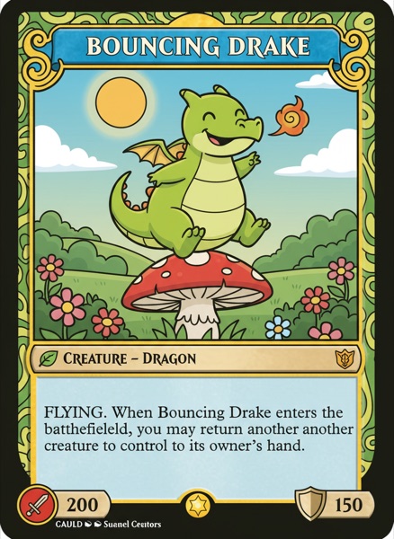
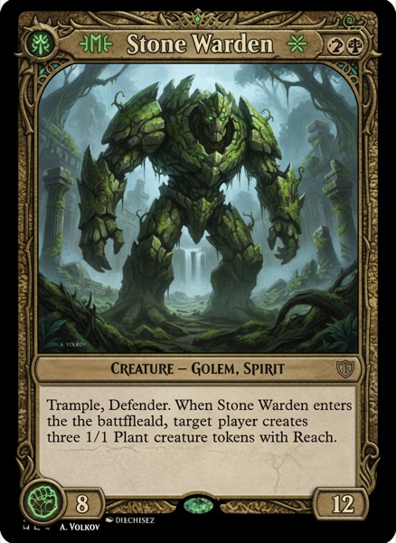
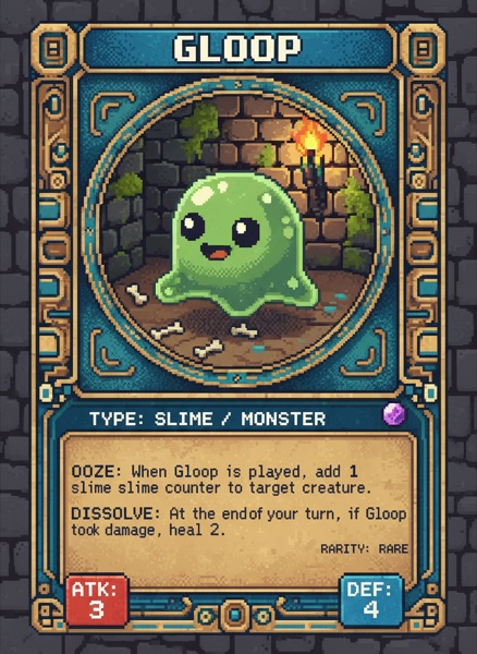
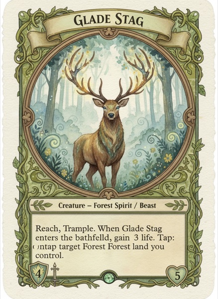
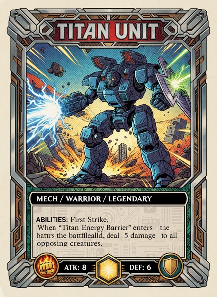
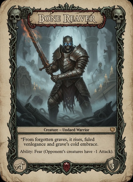
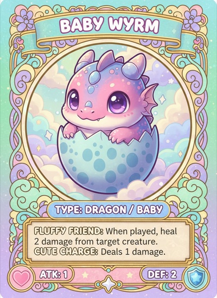
Before jumping into layout, you need to decide what information your card actually needs. At a minimum, most game cards include a name, an effect or ability, and some artwork. But depending on your game, you might also need a cost, colour indicator, card type, point value, or stats.
The challenge begins once you have all of those elements. Fitting everything onto a small card while keeping it readable and visually appealing is exactly where these rules come in.
Rule #1: Put the Important Stuff Where Players Look First
Not all information on a card is equally important. Visual hierarchy means presenting the most critical elements prominently while pushing secondary details into the background.
When you look at a well-designed card, your eye should flow naturally from the most important information to the least. The card name and key stats draw attention first. The ability or effect text comes next. Flavour text or minor details sit at the bottom or in smaller type.
This is achieved through a combination of position, size, and weight. Primary elements go at the top or centre of the card and get the largest text or boldest styling. Secondary elements sit lower and use smaller or lighter formatting. Things that rarely matter during gameplay can be tucked away almost invisibly.
The board game Everdell has a subtle example of this done well. Each card has tiny notches in the wood border that represent how many copies of that card exist in the game. It's useful information, but it's not something players need during a typical turn, so it's essentially hidden in the design. That's smart hierarchy at work.
The fix: Rank every element on your card by how often players need to reference it during gameplay. Then size and position them accordingly. If something only matters once (like a purchase cost), it can be smaller. If something is referenced every turn (like a card type), make it prominent.
Rule #2: Don't Hide Info When Cards Overlap
Think about how players actually hold cards. When you fan out a hand of cards, the left side of each card is visible while the right side gets covered. If your most important information (like a card's cost) is tucked in the top-right corner, players can't see it without rearranging their entire hand.
Magic: The Gathering is the classic example of this problem. Its mana cost sits in the top-right corner, which gets completely hidden when cards are fanned out. The game gets away with it because it was designed before this became conventional wisdom, and decades of player familiarity carry it through. Your new game doesn't have that luxury.
But it's not just about the hand. Think about every situation where cards overlap or stack. If your game has a mechanic where cards pile on top of each other, what information stays visible? What gets buried? If another card ever needs to reference something that's now hidden under a stack, you've got a design problem.
The fix: Map out every game state where cards overlap (in hand, on the table, stacked, fanned) and make sure the information players need most is always visible in each scenario. Place critical elements on the left side or top of the card whenever possible.
Rule #3: Cut Your Card Text in Half
Card text bloat is one of the most common problems in amateur card game design. When you lay out eight cards in the middle of a table and each one is packed with text, players are essentially reading a book instead of playing a game.
Compare these two approaches to the same card effect:
- Wordy: "When you play this card, you may choose to gain one additional power resource from the supply and add it to your personal resource pool."
- Concise: "Gain 1 power."
Both say the same thing. One respects the player's time and keeps the table readable from a distance. The other doesn't.
Go through every card in your game and challenge every word. Can this sentence be shorter? Can this paragraph be a single line? If a card needs more than three or four lines of text, it's worth asking whether the mechanic itself is too complicated.
The fix: Write your card text, then cut it in half. If it still makes sense, you're on the right track. Aim for the fewest words that still communicate the effect clearly and unambiguously.
Rule #4: Replace Repeated Text With Icons
This rule builds directly on the previous one. Once you've trimmed your card text down, look across your entire deck. Are there phrases that appear on multiple cards? Things like "gain one power," "increase combat value," or "draw a card." If you're writing these out on every card, you're wasting space.
Replace recurring phrases with icons or symbols. A small sword icon can replace "increase combat value." A coloured gem can replace "gain one power shard of any colour." An arrow-and-deck icon can replace "draw a card."
This does two things. First, it makes each card dramatically more scannable. Players can glance at a symbol and instantly know what it does, rather than reading a full sentence every time. Second, it frees up space on the card for other things, like bigger art or better spacing.
The fix: Make a list of every phrase that appears on three or more cards in your game. Design a simple, clear symbol for each one. Then replace the text with the symbol everywhere it appears. Include a reference card or a legend on the back of the rulebook for new players learning the icons.
Rule #5: Design for the Table, Not the Screen
Your cards will spend most of their life on a table surrounded by other cards, not centred on your monitor at 200% zoom. This sounds obvious but it catches almost every new designer.
On screen, your 8pt flavour text looks fine. Your thin 1px stat borders look clean. Your subtle colour difference between two card types is clearly visible. Then you print the cards, put them on a table, and sit in a chair across from them. Suddenly nothing works. The text is tiny. The borders disappear. The two card types look identical from a metre away.
The fix is simple: print early and print often. Every time you make a layout change, print a few cards and test them in actual playing conditions. Fan them in your hand. Lay them on a table and read them from across the room. Put them next to each other in a row and see if the types are immediately distinguishable.
The fix: After every design change, print at least three cards and test them at arm's length. If you can't read every piece of important text from 60cm away, it's too small. If two card types look the same from across the table, they need more contrast.
Rule #6: Same Layout Across Every Card Type
One mistake that creeps in as your game grows is letting different card types drift apart visually. Your creature cards might have the name at the top, but your spell cards have it centred. One type shows the cost on the left, another puts it on the right.
Every time a player picks up a card type they haven't seen before, they should already know where to look for the name, the cost, and the effect. The layout doesn't need to be identical across types, but the core information should always live in the same spot.
A simple way to enforce this: create a master template with fixed zones for name, cost, art, and rules text. Then build each card type as a variation of that template. The art style and colours can change, but the bones stay the same. Players learn one layout, and it works everywhere.
The fix: Line up three different card types next to each other. If a new player can't immediately spot the name, cost, and effect on all three without hunting, your templates have drifted too far apart.
A Few More Things Worth Getting Right
Beyond the six rules above, a few smaller things are worth getting right.
Design for colour blindness. Don't rely on colour alone to convey information. Use shapes, patterns, or labels alongside colour coding so that all players can distinguish between card types or factions.
Choose your background and font carefully. A busy background behind card text kills readability. Use solid or muted backgrounds behind text areas, and choose a clean, legible font, especially if your cards will be read from across the table rather than just in hand.
Keep rules on the cards, not in the rulebook. If a mechanic only applies to a handful of cards, find a way to fit the relevant rule text on those cards. Sending players to the rulebook mid-game breaks flow and frustrates new players. If you can't fit the rule on the card, it might be a sign that the mechanic needs simplifying, or those cards need to go.
Putting It All Together
Starting from a blank card and ending with something that looks and feels intentional comes down to layering these rules one at a time. First, position your elements so nothing vital gets hidden during play. Then arrange them by importance using visual hierarchy. Trim your text to the absolute minimum, replace repeated phrases with symbols, and build the whole layout around a central art space.
Your card won't be perfect on the first pass, or even the second. That's expected. The whole point of prototyping is iteration. But by following these six rules from the start, every version of your card will be dramatically better than it would have been otherwise.
The best time to get feedback on your card layout is during playtesting, while the design is still flexible and changes are cheap. Don't wait until you've commissioned final artwork to discover that players can't read your cards from across the table.